Landing Page vs Homepage: Understand Their Roles to Convert More Customers
This article explains why small and mid-sized businesses must treat landing pages and homepages as different tools if they want more customers. It defines a lan...

Why this distinction matters for SMBs trying to convert more customers
Many small and mid-sized businesses (SMBs) have a website. But does your website actually help you get more customers? Or is it just a pretty online brochure? For many businesses, the answer is the second one. This is where understanding the difference between a landing page vs homepage becomes super important.
Think of your website home page as the main entrance to your business. When people visit your home page, they can see everything you offer. It has your story, different services, contact info, and links to many other parts of your site. It’s a general web page meant to give a full picture of your brand.
Now, imagine a landing page. This is a very special kind of web page. It’s built for just one thing: to get a visitor to take a specific action. Maybe it’s to sign up for a newsletter, download a free guide, or ask for a price quote. A landing page does not have lots of other links or distractions. It focuses only on that one goal to help you get a lead or make a sale. This clear focus helps a business stand out and drives success in today’s crowded market, as highlighted by Ad Age: Advertising, Marketing, Media and Tech News.
For SMBs, treating your landing page and your website home page differently can change everything. Many businesses struggle because their existing websites act like a "pretty brochure" that doesn’t actually generate leads. They look good, but they don’t tell visitors what to do next. This means you’re missing chances to turn people looking at your site into real customers.
By using dedicated landing pages, you can fix this problem. Each landing page targets a specific group of people with a specific offer. This makes it much easier to guide visitors toward becoming customers. You can use a special tool, like a landing page builder, to create these focused pages easily. If you want to learn more about making your website work harder, check out how to Make Your Small Business Website Convert Visitors to Customers.
Making your website work smarter, not just look pretty, is key in 2026.
Ready to see your website bring in more business? Grow Your Traffic on Autopilot.
Making your website work smarter, not just look pretty, is key in 2026. This is especially true when we talk about a landing page.
What is a Landing Page? Purpose, elements, and conversion focus
So, what exactly is a landing page? It’s a special kind of web page designed for one main purpose: to get a visitor to do one specific thing.

This "one thing" is called a conversion. Maybe you want them to buy something, sign up for your email list, download a free guide, or ask for a consultation. Unlike a typical website home page, a landing page has a very clear, focused goal.
Think of it this way: if your website home page is like a big department store with many different items, a landing page is like a small, focused shop that sells only one item. Everything on that page is about convincing you to get that one item. This narrow focus helps people not get lost or distracted.
A landing page gets its visitors from specific places, often called "direct traffic sources." These can be from ads you run on social media or search engines, or from links in emails you send out. The idea is that someone clicks on an ad or email link because they are interested in something specific, and the landing page matches that interest perfectly.
Key parts of a good landing page
For a landing page to work well, it usually has a few important parts:
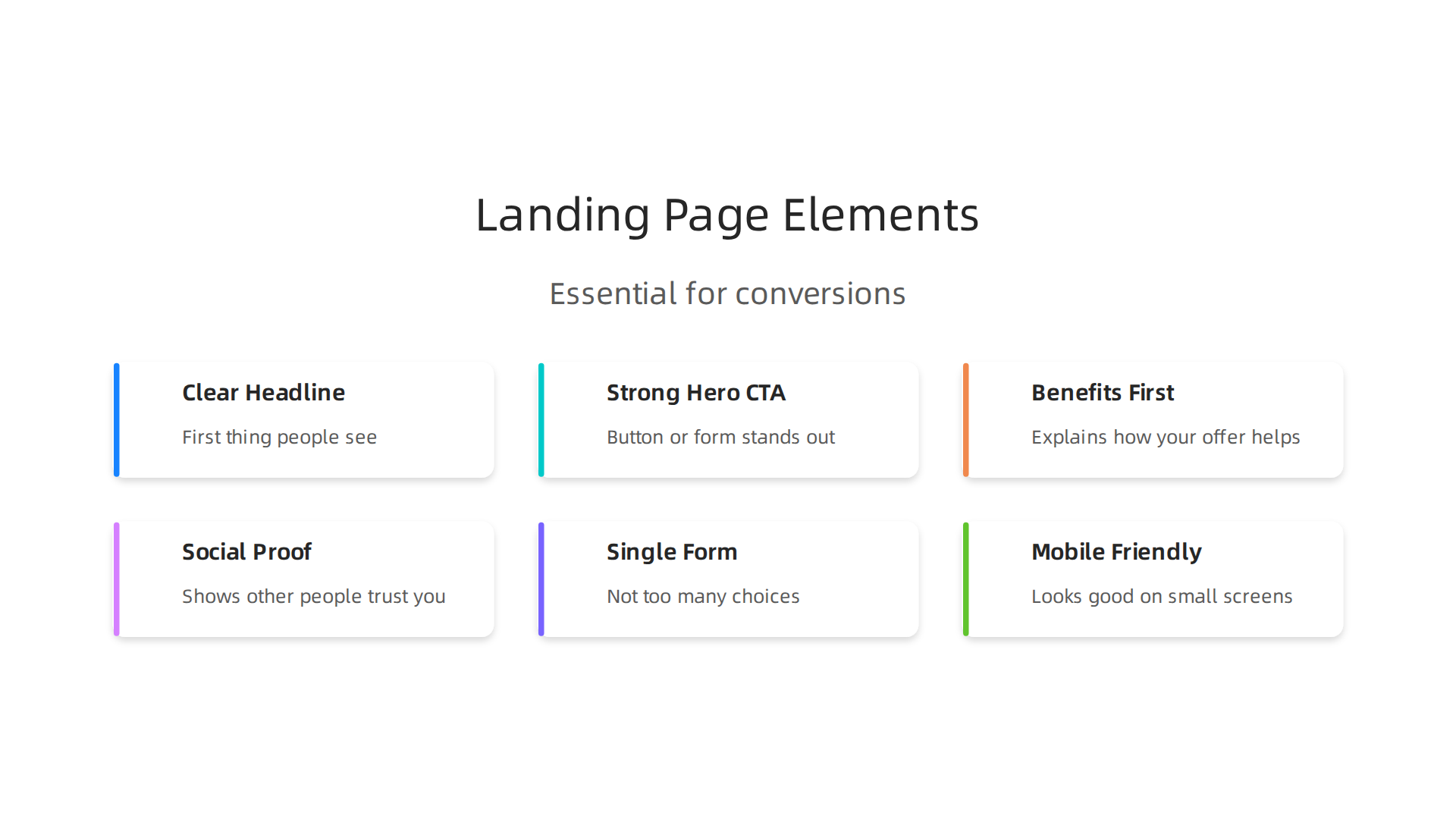
- A clear headline: This is the first thing people see. It tells them right away what the page is about and what’s in it for them.
- A strong hero Call to Action (CTA): This is the button or form that asks the visitor to take the desired action. It should stand out and be easy to understand. For example, "Download Your Free Guide" or "Get a Quote."
- Benefits, not just features: The page explains how your offer will help the visitor. It focuses on the good things they will get or the problems you will solve for them.
- Social proof: This shows that other people trust you. It could be customer reviews, short stories from happy clients, or badges from awards you’ve won. This helps build trust and encourages new visitors to take action.
- A single form or conversion action: There shouldn’t be too many choices. If you want someone to fill out a form, make it short and easy. If you want them to click a button, make sure it’s the only main button asking for an action.
These elements work together to guide the visitor smoothly towards that one conversion goal. This makes a landing page a powerful tool for generating leads and making sales for small and mid-sized businesses in 2026. If you want to dive deeper into how good design can lead to more customers, consider looking at Graphic Design Principles That Turn Your Website Into a Lead Generator. Many experts have studied what makes these pages effective, offering great insights into successful layouts and content strategies for 2026. For example, you can learn a lot from this video that breaks down What Works in Landing Pages in 2026.
Now, let’s look at the other important kind of web page, your website home page. If a landing page is a focused shop for one item, your homepage is like the front door to a big department store. It’s the main entry point to your whole business online.
What is a Homepage? Role, expectations, and audience breadth
A homepage is usually the first place people go when they type your business name into a search engine. It’s the central spot for your brand. Its main job is to welcome all kinds of visitors, not just those looking for one specific thing. Some people might be new and want to learn about you. Others might be old customers looking for support or contact info. Because of this, a website home page has to be broad and helpful to everyone.
The homepage helps people find their way around your entire site. It gives a general idea of what you offer and guides visitors to different parts of your website. This is a big difference in the world of a landing page vs homepage design. A landing page wants you to do just one thing, but a homepage wants to show you all the cool things you can do.
Common homepage elements
To help all these different people, a homepage usually has a few key parts:
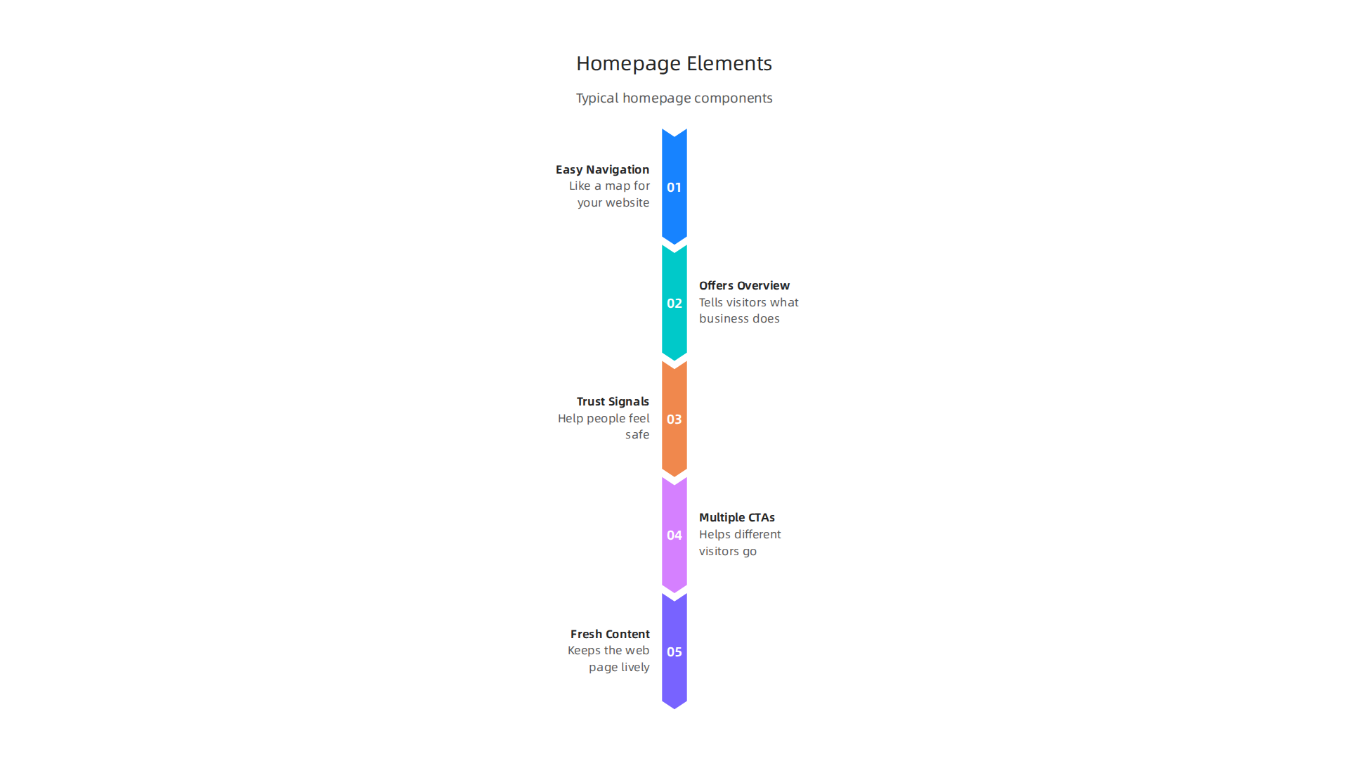
- Easy site navigation: This is like a map for your website. It has menus that show links to your services, products, "about us" page, and how to get in touch.
- A quick overview of what you offer: This could be a short paragraph or a few bullet points that tell visitors what your business does and why it’s special. It gives a good first impression.
- Trust signals: These help people feel safe and sure about your business. They can be logos of companies you’ve worked with, small awards you’ve won, or even a few short customer stories.
- Many Calls to Action (CTAs) and paths: Unlike a landing page that has one main button, a homepage usually has many. You might see buttons to "Learn More," "See Products," "Read Our Blog," or "Contact Us." Each button helps different visitors go where they want to go. This means there are multiple ways for visitors to find what they need.
- Fresh content: Often, a homepage will show recent blog posts, news, or new products. This keeps the web page feeling lively and up-to-date for returning visitors.
Good homepage design is important for any business in 2026. It helps you make a strong first impression and guides visitors to explore more. Knowing how to create an effective one is a key skill for anyone interested in online business, as experts often point out when talking about how to become a web designer today. If you want to make sure your main business website truly works to bring in customers, learning how to make your small business website convert visitors to customers is a great next step.
Now that we’ve looked at what a homepage is, let’s dive deeper into the main differences between a landing page vs homepage. These two types of web pages might seem similar, but they have very different jobs. Thinking about their layout, the messages they send, where their visitors come from, and what those visitors want to do helps us understand them better.

Structural and UX differences: layout, messaging, traffic sources, and user intent
The way a landing page and a website home page are built and how they feel to use are quite different.
These differences are key to making sure each web page does its job well.
How messages are shared
Imagine a landing page is like a special billboard with only one big message, like "Buy this new toy!" It focuses on one thing so you can’t miss it. Its main message is simple and direct, often asking you to do just one thing, like fill out a form or click to buy. This helps people quickly understand what to do, which is important for getting them to act.
On the other hand, a website home page is like a giant welcome sign for a whole town. It has many messages because it needs to greet everyone. It shares a general overview of your business and then offers many paths for visitors to explore. It might say, "Welcome to our town! Here’s where you can find the shops, the park, or the library." The goal is to show many options, not just one.
How you find your way around
A landing page usually has very few ways to navigate. Often, it doesn’t even have a menu. This is on purpose. The idea is to keep your eyes on the main message and the one action it wants you to take. Too many choices can make people confused and leave the page without doing anything. This is why good landing page design best practices often suggest removing distractions.
A website home page is the opposite. It has a full menu bar at the top, like a map for your whole website. This lets visitors jump to different sections, like "Our Services," "About Us," or "Contact." It’s all about helping people explore freely.
What catches your eye
On a landing page, everything is set up to guide your eyes to the most important button or form. There’s usually a lot of empty space around the main message and call to action to make them stand out. The design is clean and focuses on one clear path.
A home page has more going on visually. You might see sliders with different pictures, sections for new blog posts, or links to different products. It’s designed to give a broader look at your brand and its offerings, so there are more things to look at.
How fast things load
Speed is important for any web page, but it’s super important for a landing page. If a landing page takes too long to load, people might leave before they even see the offer. Because landing pages are usually simpler, they can often load very quickly, which helps improve how many people complete the desired action.
A home page, with all its different parts and pictures, might take a tiny bit longer to load. However, in 2026, most businesses still make sure their homepages load fast because people don’t like waiting for any web page.
How they act on phones
Both types of pages need to work well on phones. A landing page’s simple layout often looks great on a small screen because there isn’t much to rearrange. The main message and button remain clear and easy to tap.
A home page has more content, so making it look good on a phone can be a bigger job. Designers have to carefully plan how all the different sections will stack up and resize so that visitors can still find what they need without getting lost. To help your pages convert more visitors into leads, you might want to learn about design principle contrast to convert more website visitors into leads.
Where visitors come from and what they want
People usually land on a landing page after clicking on a specific ad or link for a special offer. They have one thing in mind already. For example, if they clicked an ad for "20% off running shoes," they expect to see a page about running shoes on sale. This is called "user intent," and it’s very focused.
Visitors come to a website home page from many places. They might type your business name into Google, or click a general link. Their reasons for visiting can be very different. Some want to learn about your company, others need customer support, and some are just browsing. The home page needs to serve all these different needs.
The way people get to your web page and what you want them to do are the most important things when deciding if you should use a landing page or a homepage. Both pages are helpful, but they work best for different tasks and goals.
When to use a landing page vs a homepage: use cases, campaigns, and goals
Picking the right type of web page means knowing what you want to achieve. Do you want someone to do one specific thing right now, or do you want them to explore your whole business?
For quick action: use a landing page
You should use a landing page when you have a very clear, single goal in mind. Think of times when you are running a special campaign or offer. This is often called "campaign-driven traffic."
Here are some good times to use a landing page:
- Paid Ads: If you are paying for ads on Google, Facebook, or other places, you want every click to count. When someone clicks an ad for a "free e-book on marketing tips," they should go straight to a page where they can get that e-book. A landing page helps turn these clicks into actions, which is why experts often share Best Practices for High Converting Landing Pages 2025-2026.
- Targeted Offers: Maybe you have a sale on specific shoes or want people to sign up for a special online class. A landing page will focus only on that one offer, without any other distractions.
- Product Launch: When you release a new product, a landing page can build excitement and collect emails from people who want to know more.
- Webinar Sign-up: If you are hosting a free online workshop, a landing page is perfect for getting people to register.
The main idea for a landing page is to make it super easy for visitors to do one specific thing, like buy something, fill out a form, or sign up for an event. This makes them great for paid promotions and direct marketing.
For general discovery: use a homepage
A homepage is best for when visitors are just exploring or looking for general information about your business. People usually find your homepage through "organic discovery," meaning they search for your business name on Google or type your website address directly.
Here are times when a homepage is the better choice:
- Brand Education: When someone wants to learn about your company, its history, or its values, your homepage is the first stop. It acts as the main welcome mat to your entire online world.
- Information-Seeking Visitors: Visitors might be looking for your contact details, a list of all your services, job openings, or links to your blog posts. A homepage offers many paths for these different needs.
- General Browsing: Some people just want to see what your business is all about without a specific goal in mind. The homepage lets them browse and find what interests them.
The homepage’s goal is to show a broad view of your brand and guide visitors to different parts of your website. It’s about giving choices and letting people explore on their own. If you want your website to truly bring in more customers, you need to make your small business website convert visitors to customers.
Choosing between a landing page vs homepage really comes down to what you want a visitor to do right then.

A landing page is like a sharp arrow pointing to one target, while a homepage is like a helpful map to your whole town. Both are important for growing your business online in 2026.
Ready to make your website work harder for you?
Connect your website with Weblish and Grow Your Traffic on Autopilot.
When you know the difference between a landing page and a homepage, the next step is to make sure these pages actually help you get more customers. It’s not enough to just have a web page; it needs to be designed to turn visitors into leads. This means focusing on lead generation for both your specific landing pages and your main website home page.
Designing pages for lead generation: templates, copy tips, and essential elements
Making a web page that gets people to act is like building a helpful sign. It needs to be clear, easy to read, and point people exactly where they need to go. For getting leads, this is super important. Whether you’re using a special landing page for a campaign or making sure your regular website home page invites people in, good design and words are key.
Making a landing page that converts
A great landing page has one job: to get a visitor to do one specific thing. To make sure it does this well, follow this checklist of helpful tips:
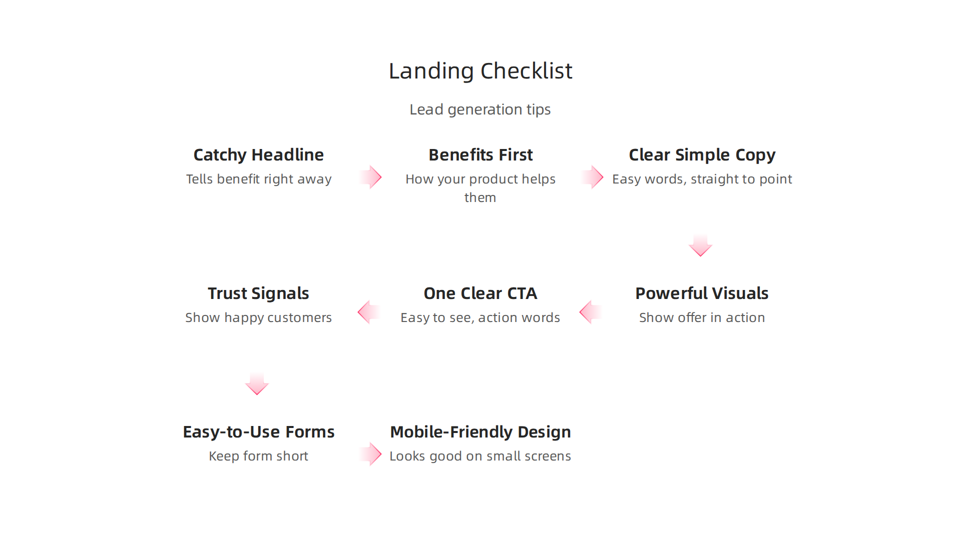
- Catchy Headline: Your headline is the first thing people see. It should tell them right away what benefit they’ll get from your offer. Think about what problem you solve for them. For example, instead of "Our New Tool," try "Save Time and Money with Our New Tool." Studies show how important headlines are for getting people to stick around, with some showing boosts of 27-104% in conversions when headlines are good. You can also explore 40 best landing page examples of 2026 for inspiration.
- Benefits First, Not Features: People care about how your product or service helps them. Don’t just list what your tool does, explain how it makes their life easier, saves them money, or solves a problem they have. This is called benefit-first copy.
- Clear and Simple Copy: Use easy words. Get straight to the point. No one wants to read a long story on a landing page. Use bullet points to make key ideas stand out.
- Powerful Visuals: Use pictures or videos that show your offer in action or clearly explain its value. A good image can tell a story faster than words. Many experts agree that the Best Landing Page Structure for 2026 includes strong visual elements.
- One Clear Call to Action (CTA): This is the button or link that tells people what to do next. It should be easy to see and use action words like "Get Your Free E-book" or "Sign Up Now." Don’t give too many choices; just one main action. This is a core part of Landing Page Design Best Practices in 2026.
- Trust Signals: People need to trust you before they give you their information. Show small logos of happy customers, short quotes from testimonials, or badges that say your site is secure. These little things build confidence.
- Easy-to-Use Forms: If you’re asking for information, keep your form short. Only ask for what you really need. Each extra box you add can make someone leave without filling it out. Some tips even suggest that reducing form fields can greatly boost how many people complete them.
- Mobile-Friendly Design: Most people use their phones to look at websites in 2026. Make sure your landing page looks good and works well on small screens. If it’s hard to use on a phone, people will leave quickly. You can find more practical advice in a Conversion Rate Optimization Whitepaper for businesses looking to gain a better marketing strategy.
Following these tips helps create a landing page that guides visitors smoothly toward becoming a lead, making your efforts much more effective.
Adjusting your website home page for lead capture
While a landing page is built for one specific goal, your website home page can also help you gather leads. It does this in a broader way, offering different paths for visitors.
Think about these simple adjustments for your home page:
- Visible Contact Information: Make it easy for people to find your phone number, email, or a link to a contact form.
- Newsletter Sign-Up: Offer a clear spot for visitors to sign up for your email newsletter. This helps you build a list of interested people over time.
- Paths to Service Pages: Your homepage should have clear links to pages about your main services or products. Each of these service pages can then have its own smaller call to action for specific lead generation.
- Simple Lead Magnets: You could offer a free guide or checklist directly on your homepage for visitors who are just exploring but want to learn more. This is a softer way to get a lead compared to a targeted landing page.
Both types of web pages play a vital role in lead generation. The key is understanding their different purposes and designing each one to be as effective as possible. If you want to see how to make your website work harder, check out how Wix website design for lead generation that actually works.
To truly know if your web pages are working for you, it’s not enough to just put them out there. You need to keep an eye on how well they perform.

This means looking at certain numbers, trying out different ideas, and making changes to get better results. It’s about figuring out what helps turn visitors into leads for both your landing page and your website home page.
Measuring success: KPIs, A/B testing, and optimization workflows
To see if your pages are doing their job, you track Key Performance Indicators (KPIs). These are like scorecards that tell you if you’re winning at getting leads.
Key numbers for your landing page and website home page
The numbers you watch depend on your page’s main goal.
For Landing Pages:
Since a landing page has one job, its main number to watch is the conversion rate. This is the percentage of people who visit your page and complete the single action you want them to take, like filling out a form or downloading a guide. A good conversion rate often falls between 2-5%, but it can change based on your industry and offer. Experts say tracking this is key to success, along with other numbers like bounce rate and how long people stay on the page. You can find out more about Landing Page Metrics: What to Track & Why It Matters in 2025.
Other important landing page numbers include:
- Bounce rate: How many people leave your page very quickly without doing anything else. A high bounce rate means something might be wrong with your page or offer.
- Time on page: How long visitors spend reading or looking at your content. More time often means more interest.
- Click-through rate (CTR): If you have any links on your landing page (though usually you want just one main action), this tells you how many people clicked them.
For Website Home Pages:
Your website home page has a broader role, so you look at different kinds of numbers.
- Micro-conversions: These are smaller actions that show interest, even if they don’t convert right away. Examples include signing up for your newsletter, clicking to a service page, or using your search bar.
- Overall website conversion rate: This is the total percentage of visitors who become leads or customers across your whole website.
- Pages per session: How many other pages a visitor goes to after landing on your home page. More pages usually means they are exploring your business more.
- Engagement signals: This could be how far down the page people scroll, if they watch a video, or interact with different parts of your site. These show how much interest they have. You can analyze individual content performance to understand these better for your website home page. Learning how to Analyze individual content performance helps a lot.
A simple plan for small businesses to test and improve
If you run a small business, you might not have a big team or lots of money for testing. But you can still improve your pages with a simple workflow:
- Set Clear Goals: Before you do anything, know what you want to achieve. Do you want more sign-ups, calls, or downloads?
- Pick Your Top Numbers: Based on your goals, choose 2-3 KPIs that matter most. Don’t try to track everything at once.
- Use Basic Tools: Tools like Google Analytics are free and help you see these numbers. Many website builders and landing page builder platforms also have their own easy-to-use reports.
- Try A/B Testing: This is where you create two slightly different versions of a page, like changing the color of a button or a sentence in your headline. Then, you show each version to half your visitors to see which one works better. Most modern landing page software makes A/B testing simple to set up.
- Check Regularly: Look at your numbers once a week or month. Don’t wait too long.
- Make Small Changes: If something isn’t working, don’t redo the whole page. Change one small thing at a time and see if it helps. This way, you know exactly what made a difference.
- Keep Learning: The online world changes fast. Always be open to new ideas and keep testing to make your pages better over time. Building a website that generates leads is an ongoing task. If you want to make your website a stronger lead generator, consider a full web development tutorial to learn more.
By keeping an eye on these numbers and making small, smart changes, you can make sure your website and landing pages keep getting better at bringing in new customers.
Summary
This article explains why small and mid-sized businesses must treat landing pages and homepages as different tools if they want more customers. It defines a landing page as a single-purpose page built to drive one conversion and lists the key elements—headline, focused CTA, benefits-first copy, social proof, short forms, and mobile speed—that make it work. It contrasts that with a homepage, which serves broad discovery, site navigation, multiple CTAs, and general trust signals. The piece walks through structural and UX differences (messaging, navigation, visuals, load time, mobile behavior, and traffic sources), gives clear use cases for when to run landing pages versus rely on a homepage, and offers practical design and copy checklists to capture leads. Finally, it covers how to measure success with KPIs like conversion rate, bounce rate, micro-conversions, and a simple A/B testing workflow so SMBs can iterate and improve results over time.