How Wizard UI Design Boosts Your Small Business Lead Generation
This article explains how wizard UI design—breaking long forms into simple, step-by-step screens—can dramatically reduce form abandonment and generate more qual...

Introduction: Why Wizard UIs Are the Secret Weapon for SMB Lead Generation
Think about the last time you tried to fill out a long online form. You know the kind. Name, email, phone, company size, budget range, a dozen dropdowns, and a giant text box asking for your life story. Did you finish it? Probably not.
Here is the truth that keeps small business owners up at night. About 70% of online forms get abandoned before completion.

In fact, recent data shows the average shopping cart abandonment rate in 2026 sits at 70.22% across all industries. That number has barely budged for years. The travel industry loses a staggering 81% of potential leads to form abandonment.
The core problem is simple. Most small businesses treat their website like a static brochure. They dump every question they could ever ask a prospect into one overwhelming wall of fields. And then they wonder why visitors leave without converting.
That is where wizard ui design changes everything.
A Wizard UI is a design pattern that breaks complex tasks into small, sequential steps.

Instead of one scary long form, users see one simple question at a time. Step one asks for their name. Step two asks for their email. Step three asks what they need help with. Each step feels easy. Each click feels like progress. The user moves forward naturally, guided by visual cues and clear feedback.
According to design experts at the Nielsen Norman Group, wizards are a powerful pattern for simplifying processes that users do infrequently or for the first time. When you apply solid ui ux design thinking to your lead generation forms, you turn friction into flow.
The shift from static pages to interactive, guided experiences does more than just look modern. It builds trust. It reduces anxiety. It makes visitors feel like your business understands them. That feeling matters more than ever in 2026, when customers expect websites to work as smart partners, not just digital business cards.
This guide walks you through proven wizard patterns, ui/ux design principles that actually move the needle, and real results small businesses are seeing right now. You will learn how to apply ui design thinking that turns casual browsers into qualified leads, step by step.
If you want a deeper look at how good ui ux design directly impacts your bottom line, check out our guide on turning your website into an epic user portal that drives revenue.
And here is the best part. You do not need a massive budget or a full design team to make this work. With the right strategy and tools, even a small business can build a wizard that converts. Want to see how we help businesses just like yours build high-converting websites without the upfront cost? Explore the Weblish approach to done-for-you growth services and claim your free trial.
What Is a Wizard UI? Definition, Core Principles, and Why SMBs Need It
Let’s get specific. A Wizard UI is a design pattern that breaks a big, scary task into small, simple steps. Instead of showing a visitor a long form with twenty fields, you show them one question at a time. Each screen gives them a clear job to do. When they finish that step, they click "Next" and move forward.
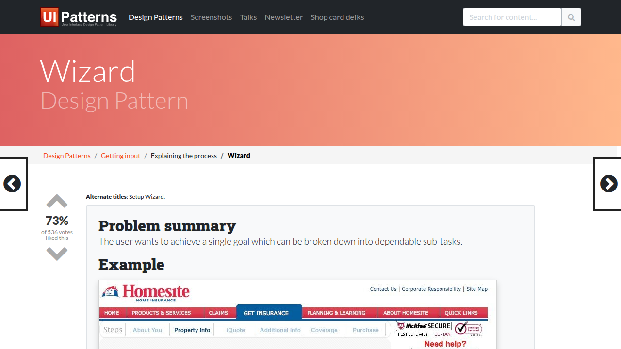
The core idea is simple. You guide the user step by step from start to finish. The famous design resource UI-Patterns.com describes it as splitting a complex goal into separate sub-tasks that depend on each other.
And according to the Nielsen Norman Group, wizards are a powerful pattern for processes that users do infrequently or for the first time.

That’s exactly the situation your website visitors are in. They don’t fill out lead forms every day. So you need to make it feel easy.
The four core principles of a successful wizard
Every effective wizard UI shares a few key traits. These principles are what separate a great experience from one that still frustrates users.

Linear progression. Each step builds on the last. The user knows where they are and what comes next. There’s no jumping around or hidden surprises. The path is straight and clear.
Progress indicators. People hate the unknown. A progress bar or step counter tells the user how far they’ve come and how much is left. That small visual cue cuts anxiety and increases completion rates. Research from Lollypop Design confirms that breaking complex actions into simple steps keeps users moving forward.
Clear navigation. Give the user control. Let them go back to a previous step if they need to change something. But keep the forward momentum strong. The "Next" button should be prominent, and the "Back" button should be available but less emphasized.
Context preservation. Don’t lose what the user already typed. If they accidentally hit "Back," their answers should still be there. Respect their time and effort. Good ui ux design builds trust, and trust leads to more conversions.
Why SMBs need this pattern right now
As a small business owner, you face three big challenges every day. You have limited time. You don’t have a huge design or marketing team. And you need predictable lead generation to keep your business growing.
A wizard UI directly solves all three.
It saves your visitors’ time because they don’t have to stare at a wall of fields. It reduces the expertise you need because the wizard does the guiding for you. And it makes your lead generation more predictable. When you follow solid ui/ux design principles, more people complete your forms. That means more qualified leads landing in your inbox.
The beauty is that you don’t need to be a design expert to get started. Good ui design is about making things simple, not fancy. And wizards are one of the simplest patterns to implement.
If you want a deeper look at how ui ux design thinking can improve your entire website, check out our guide on what UI design really means for your bottom line.
And here’s the honest truth. Most small businesses know they need a better website experience. But they don’t have the time or expertise to build one themselves. That’s exactly why services like Weblish exist. They handle the design, development, and ongoing optimization so you can focus on running your business. A wizard UI built by experts can turn your website into a lead generation machine without you lifting a finger.
Top 5 Wizard UI Design Patterns for High-Converting Forms
Now that you know what makes a wizard UI work, let’s look at the five most useful patterns.
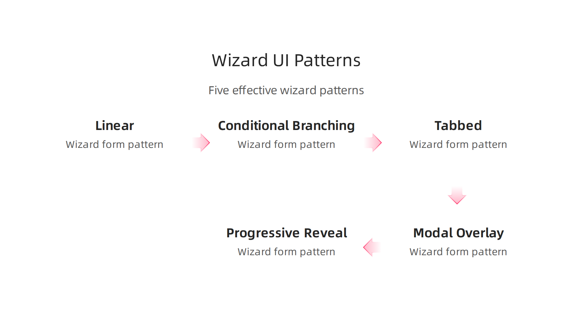
Each one serves a different goal. Picking the right pattern depends on your visitors, your form length, and what you want them to do next. These are the real ui/ux design principles you can apply today.
1. Linear Wizard: The Classic Step By Step
This is the pattern most people think of when they hear "wizard." You take the user through a fixed path. Step one, click next. Step two, click next. Step three, submit. No skipping around. No hidden sections.
Best for: Checkout flows, account registration, and any process where data needs to come in a specific order.
The beauty of a linear wizard is its predictability. The user never wonders what to do next. As the Nielsen Norman Group points out, wizards are ideal for processes users don’t do often. And since most visitors don’t buy from you every day, a clear linear flow removes all guesswork.
2. Conditional Branching Wizard: Smart and Adaptable
This pattern changes based on what the user tells you. If someone says "I need a new website," the next step asks about their budget. If they say "I need SEO help," the next step asks about their current traffic. The wizard literally rewrites itself.
Best for: Lead qualification, service selection, and complex sales processes.
According to Eleken’s guide on wizard UI patterns, this adaptiveness keeps users engaged because they only see relevant questions. Your conversion rates go up because you’re not wasting anyone’s time. This is where ui ux design thinking really pays off.
3. Tabbed Wizard: All Steps Visible
Instead of hiding the steps behind a progress bar, a tabbed wizard shows every section at once. Users can click between tabs to review or jump ahead. They see the full picture from the start.
Best for: Short forms with three to five sections, settings pages, and profile completion.
The key here is low cognitive load. When the form is short, showing everything can actually feel easier than clicking "Next" multiple times. Good ui design is about matching the pattern to the task.
4. Modal/Overlay Wizard: Stay on the Page
This pattern appears as a window on top of your current page. The user doesn’t navigate away to a new screen. They fill out the wizard steps inside a box that floats above your content.
Best for: Micro-conversions like newsletter signups, quick surveys, or discount offers.
Because the user never leaves the page, they feel less commitment. That reduces friction. As Lollypop Design explains, breaking complex actions into simple steps keeps users moving forward. A modal wizard does exactly that while keeping visitors on your main page.
5. Progressively Revealed Wizard: Show on Demand
This pattern hides most of the form until the user asks for more. You start with just two or three questions. When the user answers, more fields appear below. It feels like a conversation unfolding, not a checklist.
Best for: Long onboarding forms, detailed quotes, or multi-step signups.
The trick is to never overwhelm. Each new section only appears when the user is ready. This follows the ui/ux design principles of preserving context and reducing anxiety. Nothing is lost. Everything the user typed stays visible as new sections open.
Which Pattern Should You Choose?
Here’s a simple way to decide. If your form has fewer than five steps, try the tabbed wizard. If you’re asking more than five questions, go linear or progressively revealed. If different customers need different things, use conditional branching. And if you want a quick conversion without leaving the page, use a modal.
The best wizard ui design is the one your visitors actually finish. So test your pattern, watch your completion rates, and adjust. If this all sounds like a lot of work, you’re right. It takes time and expertise to get right. That’s where Weblish comes in. They build and optimize these patterns for small businesses so you get the leads without the headache.
Want to go deeper? Check out our guide on how to turn your website into a lead generation machine for more practical tips.
How to Design a Wizard UI That Reduces Drop-Off Rates
Picking the right pattern is only half the battle. Even the best wizard UI design can fail if people quit halfway through. The real trick is making each step feel easy, safe, and worth finishing. Here are three design choices that directly cut down on drop-off.
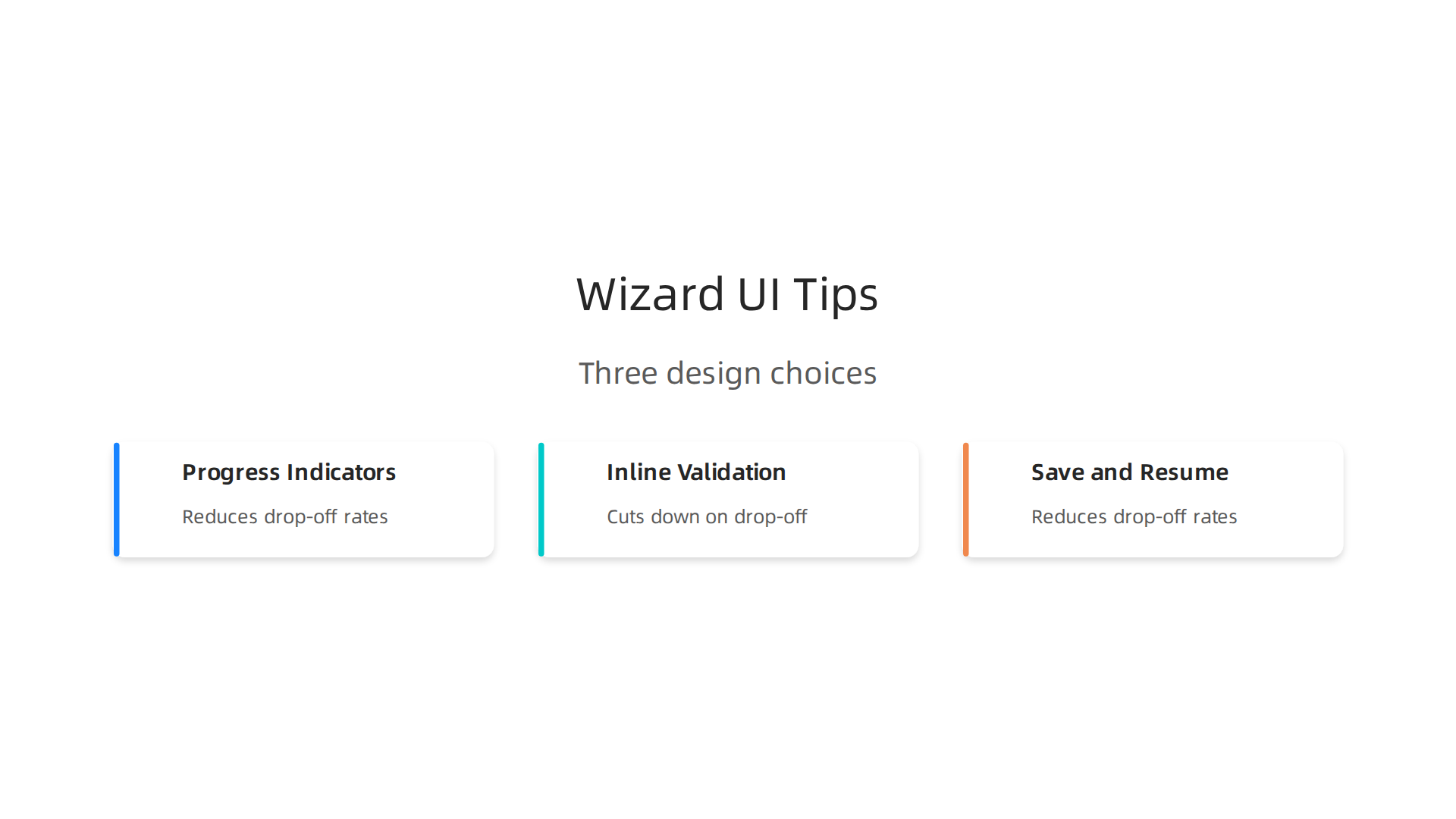
1. Use Progress Indicators That Build Commitment
When people see how far they’ve come, they’re more likely to finish. A simple progress bar with step labels tells users: "You’re almost there." It sets expectations and reduces the urge to leave.
According to Venture Harbour’s form design best practices for 2026, progress indicators significantly reduce abandonment in multi-step forms by showing users how much work remains. That little visual cue taps into a psychological principle called the "commitment effect." Once someone completes step two of four, they feel invested. Walking away feels like wasting effort.
Do this: Show step numbers ("Step 2 of 4") plus a clear label ("Contact Info"). Never hide the end point. If the user has no idea how many steps remain, they’re more likely to bail.
2. Add Inline Validation to Prevent Frustration
Nothing kills a wizard flow faster than a user typing their phone number, clicking "Next," and seeing a giant error message on a new page. They have to scroll back, fix the mistake, and re-enter fields. That’s friction you don’t need.
Inline validation checks each field as the user types. A green checkmark appears when the email format is correct. A red warning shows up immediately if the ZIP code is wrong. The user fixes it right there, on the spot, without losing momentum.
The NN/G group’s principles on reducing cognitive load highlight how clarity and support in form design minimize user confusion. Inline validation delivers both. It supports the user in real time and keeps the wizard flowing smoothly. This is a core ui/ux design principles best practice for 2026.
Do this: Validate each field as the user types. Show clear, friendly error messages like "Please enter a valid email address." Never use vague errors like "Invalid input."
3. Build Save and Resume for Long Forms on Mobile
Here’s a scenario you’ve probably lived through. You’re filling out a long quote request on your phone. Halfway through step three, your boss calls. You hang up, go back to the wizard, and the entire form is blank. All that work, gone.
This is devastating for mobile users. According to the IvyForms guide on multi-step form examples, you can improve completion rates by making the flow feel manageable. But for forms that stretch beyond five steps, you need a safety net.
Save and resume functionality lets users leave and come back later without losing their data. The wizard remembers their name, their selections, their progress. When they return, they pick up exactly where they stopped.
Do this: For any wizard longer than three steps, especially on mobile, save progress to local storage or a user account. Add a clear "Save and Finish Later" button. Show a confirmation message telling them their work is safe.
Putting It All Together
Here’s the real formula for a wizard that converts. Start with a progress indicator so people know where they stand. Layer in inline validation so every step feels clean and error-free. Then add save and resume for safety.
These three design choices work together to drop abandonment rates drastically. They make your wizard ui design feel less like a chore and more like a guided conversation.
If this all sounds like a lot of technical work, you’re not alone. Most small business owners don’t have time to code these features themselves. That’s where Weblish comes in. They handle the entire design and development process for you, from wizard flow to inline validation to save and resume. You get the leads, they do the heavy lifting.
Want to learn more about how ui design affects your bottom line? Check out our guide on what UI design really means for your business growth.
Accessibility and Mobile Responsiveness in Wizard Interfaces
Designing a wizard ui design that reduces drop-off is a smart start. But what if a whole chunk of your audience cannot even use the wizard at all? Maybe they rely on a keyboard to navigate. Maybe they are on a phone with a cracked screen. If your wizard only works for "perfect" users, you are leaving money on the table.
In 2026, following the right ui/ux design principles means designing for everyone. Let’s look at two areas where wizards often break. Fixing these will grow your lead pool and make your business more inclusive.
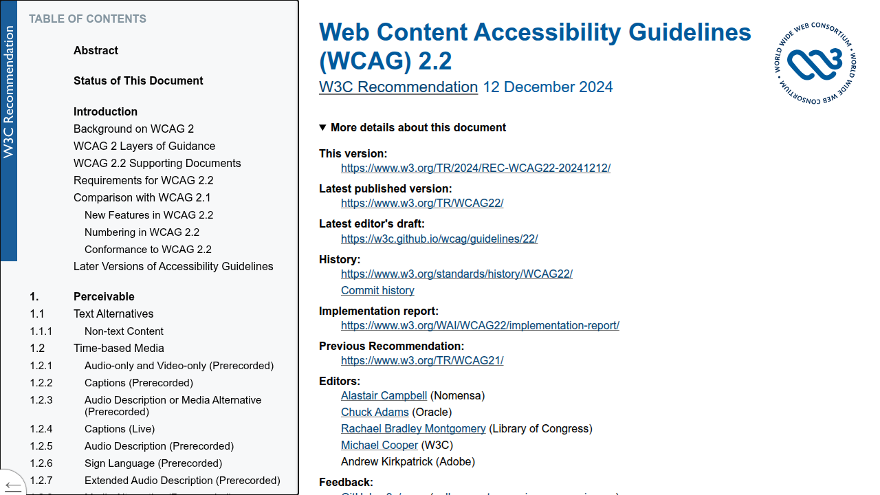
1. Follow WCAG 2.2 for Keyboard and Screen Reader Support
The latest web standard is WCAG 2.2.
It includes strict rules for multi-step forms. Some users cannot use a mouse. They tab through fields and rely on screen readers to hear the labels.

Here is what a well-coded wizard ui design does for accessibility:
- It manages focus. When you click "Next," the cursor jumps to the first field of the next step. The screen reader announces: "Step 2 of 4. Shipping address."
- It uses proper labels. According to the VA.gov design system accessibility guidelines, proper form structure is essential for multi-step flows. Every field must have a clear label.
- It announces errors. If a user misses a field, the screen reader reads the error out loud so they can fix it without guessing.
These small coding choices make a huge difference. They turn a confusing process into a smooth conversation.
2. Design Mobile-First with Touch Controls
Most web traffic comes from phones now. If your wizard requires pinching and zooming, users will quit.

The fix is mobile-first design.
The W3C tutorial on multi-page forms recommends splitting forms into logical groups. This is even more critical on mobile.
Key mobile best practices:
- Use single-column layouts. Two columns force users to zoom in. One column is easier to scan and tap.
- Make buttons touch-friendly. A "Next" button should be at least 48 pixels tall. Thumbs need room to tap without fat-finger errors.
- Keep progress bars simple. On a small screen, long step labels get cut off. Use short labels like "Info" or "Payment."
3. Accessibility Is a Secret Conversion Driver
Here is something most business owners miss. Accessible design does not limit your reach. It expands it.
The AudioEye guide on WCAG 2.2 explains that preserving user input in multi-step forms is a new success criterion. This protects anyone who needs to refresh their page or walk away. It helps people with cognitive disabilities. It also helps a busy parent filling out your form in the car line.
When you build a ui design that works for everyone, you open the door to customers your competitors ignore. You attract:
- People with visual impairments.
- People with motor disabilities.
- People using older phones or slow internet.
- People filling out the form in a bright room.
All these people have real needs. All of them could be your customers.
Making your wizard fully accessible and mobile responsive takes careful setup. It involves code, testing, and constant updates. That is a lot to manage alone.
That is where Weblish comes in. They build ui ux design that follows WCAG 2.2 standards and works perfectly on every device. You focus on your business. They handle the technical heavy lifting.
Want to learn more about building a website that converts? Check out our guide on how to turn your website into a lead generating engine.
Common Mistakes SMBs Make When Implementing Wizard UIs
Getting the technical side right is one thing. But even a perfectly coded wizard can fail if the design pushes people away. Most small business owners do not mean to make these mistakes. They simply do not see them until the damage is done. Here are the three most common issues you need to watch out for.
Mistake 1: Too Many Steps Without a Progress Bar
Think about filling out a long form with no clear end in sight. That is what a wizard without a progress indicator feels like. Users get anxious. They start wondering if it is worth their time.
A simple "Step 2 of 5" fixes this. It gives the user a mental roadmap. According to the experts at FigPii, one of the biggest A/B testing mistakes to avoid is running tests without clear business objectives. Your wizard’s objective should be to guide the user comfortably to the finish line. A progress bar does exactly that.
Mistake 2: Forcing Mandatory Fields Too Early
The second mistake is asking for sensitive information upfront. A phone number or a company name feels like a big ask to a stranger. It kills the momentum before you have built any trust.
Start with easy fields. A first name and an email address are often enough to begin the conversation. You can ask for more details later in the funnel. Building trust throughout the user experience is a core part of good ui/ux design principles. You can learn more about this in our guide on how to make your small business website convert visitors to customers.
Mistake 3: Ignoring Mobile Breakpoints and Touch Targets
Mobile traffic is huge in 2026. Yet many wizards still have tiny buttons and cramped fields. This forces users to zoom and scroll just to tap "Next." That friction causes high abandonment.
Every button should be at least 48 pixels tall. Layouts should be single column. The Unbounce team wrote about A/B testing mistakes that are killing conversion rates, and ignoring mobile segmentation is a common culprit. You cannot fix mobile issues if you never test your wizard on a real phone.
The Smart Fix
These mistakes are common, but they are also easy to avoid if you know what to look for. The best approach is to bake these checks into your wizard ui design from day one.
You can spend time testing and rebuilding, or you can work with a partner who already knows the shortcuts. That is where Weblish comes in. They build ui design that follows modern conversion rules so you do not have to guess. You focus on closing your leads. They handle the design and development.
Measuring Success: KPIs and A/B Testing for Wizard UIs
You fixed the common mistakes your wizard was making. Good job. But how do you know your changes are actually working? You cannot just guess. You need data. The right numbers tell you what is helping and what is still hurting your wizard ui design.
Think of these numbers as your dashboard. They show you the health of your wizard. Here are the most important ones to watch.
Step completion rate tells you how many people finish each step. If a step has a low completion rate, something is wrong there. Maybe the question is confusing or the form field is too long. Overall conversion rate is the big one. It shows how many people start the wizard and actually finish it. Time to complete reveals if your wizard feels too long or just right. If people take too long, you might have too many steps. Error rate catches technical problems. A high error rate means your validation rules or backend code need fixing.
Now you have the numbers. The next step is to run experiments. That is where A/B testing comes in.
A/B Testing Ideas for Your Wizard
Running tests is how you find your best design. But you have to test the right things. A common mistake is testing without a clear goal. The experts at FigPii warn that one of the biggest A/B testing mistakes to avoid is not linking tests to a specific objective. For your wizard, that objective might be "increase step completion rate by 10%."
Here are three A/B test ideas you can run today:
- Number of steps vs. step length. Try a 5-step wizard with short forms against a 3-step wizard with longer forms. See which one more people finish.
- Progress indicator styles. Test a simple "Step 2 of 5" bar against a more detailed one that shows each section name. The different designs can change how people feel about the process.
- Button copy. Switch "Next" for "Continue" or "I’m ready." Words matter. A small change can lift your completion rate.
Use Funnel Analysis to Find Leaks
Your wizard is a funnel. People enter at step one and leave at different points. Funnel analysis shows you exactly where they drop off. The ui/ux design principles behind a good wizard focus on removing friction at each stage.
For example, the travel industry sees the highest form abandonment rate at 81%, according to form abandonment statistics from Insiteful. If your wizard has a step asking for a credit card or a phone number, that might be your leak. Look at your own data. If step 3 has a 60 percent drop off, that step needs a redesign.
Tracking and testing your ui design is an ongoing process. You do not have to become a data expert to do it well. If you want a partner who handles the metrics, tests, and optimization for you, Weblish builds and manages wizards that are built to convert. You can focus on your business while they watch the numbers.
For more on building an interface that drives action, check out our guide on what is ui design. It covers the basics of design that works.
Implementation Considerations for SMBs: Cost, Tools, and Expertise
So you want a wizard UI for your business. But you are not a big company with a huge budget. You are a small or mid sized business owner. You need something that works without breaking the bank. The good news? In 2026, you have options.
Low Cost Tools That Work
You do not need to build a wizard from scratch using code. Several no-code tools can create a solid wizard ui design for you. The market for affordable form builders has grown a lot this year. A roundup of the best online form builders from EmailToolTester shows that tools like Jotform, Typeform, and Google Forms all support multi step forms. You can get professional features without paying enterprise prices.
For a deeper look at the top options, the Jotform team published a guide to the best online form builder software tools in 2026. They cover which tools are best for scaling operations versus simple lead capture. If you are on a tight budget, Antforms offers unlimited responses and logic features at a low cost, as described in their article on finding a low-cost form builder for small business in 2026.
Here is what your options look like based on cost and effort:

| Approach | Cost | Time to Launch | Flexibility |
|---|---|---|---|
| No-code tool (template) | $0-$50/month | A few hours to 1 day | Limited to tool features |
| No-code tool (customized) | $50-$200/month | 1 to 3 days | Moderate |
| Custom development | $2,000-$15,000+ | 2 to 8 weeks | Full control |
| Done-for-you service | Subscription based | 1 to 3 weeks | High, with expert design |
Time Investment: Template vs. Custom
If you use a template from a tool like Typeform or Jotform, you can have a working wizard in a few hours. You drag and drop fields, set up conditional logic, and you are live. That is fast. But templates have limits. You cannot always match your brand exactly or add complex rules.
Custom development gives you full control. You can build exactly what you want. But it takes weeks and costs thousands. Your ui ux design will be unique. Yet the time and money might not make sense for a simple lead capture form.
When to Hire Help vs. Do It Yourself
Here is the real question. Should you handle this yourself or bring in experts? It depends on your goals and your team.
Use in-house resources when:
- Your wizard is simple with just a few steps
- Someone on your team knows basic ui/ux design principles
- You have time to test and tweak the design
Hire a design agency or done-for-you service when:
- Your wizard is central to your lead generation
- You need a polished, branded experience
- You want ongoing optimization without managing it yourself
- Your team is already stretched thin
This is where a service like Weblish makes sense. They handle everything from the ui design to the development to the ongoing performance tracking. You focus on your business. They make sure your wizard actually converts visitors into customers. You can get started with Weblish by signing up and claiming your free trial.
For a refresher on how good design supports your bottom line, read our beginner friendly guide on what is ui design. It covers the core ideas that make a wizard feel easy to use.
Summary
This article explains how wizard UI design—breaking long forms into simple, step-by-step screens—can dramatically reduce form abandonment and generate more qualified leads for small businesses. It defines wizard UIs, outlines four core principles (linear progression, progress indicators, clear navigation, context preservation), and presents five practical wizard patterns to match different goals. You’ll learn specific design tactics that cut drop-off—progress bars, inline validation, and save-and-resume—plus accessibility and mobile-first rules that expand your audience. The guide covers common mistakes to avoid, measurable KPIs to track, A/B tests to run, and realistic cost and tool options from no-code templates to custom builds. Finally, it helps you decide when to DIY and when to hire a service to implement and optimize your wizard for reliable lead generation.