What Is UI Design The Simple Definition That Boosts Your Bottom Line
This article explains what UI design really means for small and mid-sized businesses and why it's more than just making a site look good. It defines UI as the i...

Introduction: Beyond the Surface of UI Design
You might think UI design is just about making your website look pretty. Picking nice colors. Choosing clean fonts. Adding some smooth animations.
And that is where a lot of small business owners get stuck.
Here is the thing. When most people ask "what is ui design," they picture a designer tweaking buttons and adjusting margins. They see it as decoration. Something you add at the end after the real work is done.
But that way of thinking could be costing you real leads.
A poor user interface silently kills your conversion rates.

Even when your website looks good on the surface, small friction points can stop visitors from taking action. A confusing button here. A cluttered layout there. Before you know it, people leave without buying, calling, or signing up.
The data backs this up. Research shows that a well designed user interface can boost your website conversion rate by up to 200%. Better user experience design can push that number even higher, up to 400% according to recent industry studies.
Let that sink in. Your site design might be leaving three out of four potential customers on the table.
In 2026, the difference between a site that generates leads and one that collects dust comes down to how well you understand ui ux design. It is not just about looks. It is about strategy. It is about guiding visitors from point A to point B without making them think.
This article will help you define design in a way that actually matters for your business. We will break down what UI design really means, how it connects to user experience, and why small businesses can use it to compete with much bigger brands.
If your current site feels more like a digital brochure than a sales machine, you are in the right place. Let us dig into what UI design actually is and how it changes everything.
Defining UI Design: More Than Just Pretty Buttons
Let us get one thing straight. When people ask "what is ui design," the answer is not "making things look nice." That is like saying a car engine is just for making noise. It is technically true, but it misses the whole point.
So let us define design properly.
The international standard ISO 9241 defines user interface design as the part of a system that users interact with. It is the bridge between a human and a computer. Every button you click. Every form you fill out. Every menu you navigate. That is the interface in action.
The International Organization for Standardization breaks this down further. ISO 9241-110 outlines seven interaction principles that apply to any user interface, whether it is a website, a mobile app, or a smart refrigerator. These principles cover things like suitability for the task, self-descriptiveness, and conformity with user expectations. Think of them as the rules that make an interface feel intuitive rather than frustrating.
So what does ui ux design actually include? Here is the short list:
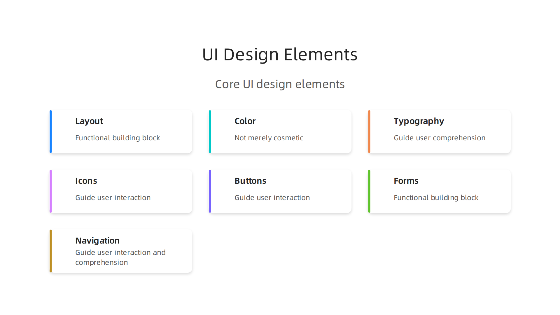
- Layout and spacing. Where things sit on the screen and how much breathing room they get.
- Color and contrast. The palette that guides your eye and signals what is clickable.
- Typography. Font choices that are readable and set the right tone.
- Icons and imagery. Visual clues that help users understand without reading.
- Buttons and interactive elements. The clickable parts that make things happen.
- Forms and inputs. Fields where users type, select, or upload.
- Navigation and menus. The system that helps users move around.
Every one of these pieces either helps or hurts the person using your site. There is no neutral ground here.
Now here is where most small business owners get tripped up. They confuse "what is ui design" with "what is user experience." These are not the same thing.
Think of it this way. UI is the interface. The screen. The buttons. The layout. UX is the overall experience. How the user feels when they move through your site.

Whether they find what they need without getting lost or annoyed.
The Nielsen Norman Group, one of the most respected voices in the field, makes this distinction clear.
UI is the specific point of interaction. UX covers the entire journey from start to finish. You can have a beautiful interface with a terrible experience if the buttons lead nowhere useful. And you can have a clunky interface with a great experience if the content is exactly what the user needs.
For your business, understanding this difference is huge. When you define design strategically, you stop treating it as decoration and start treating it as a tool. One that either drives leads or chases them away.
Here is the good news. You do not need a design degree to make smart choices about your website interface. You just need to understand the principles. And if building a high-converting interface feels out of reach, services like Weblish handle the whole process for you. Professional UI built around strategy, not decoration.
Next we will look at how UI and UX work together in practice. Because that is where the real magic happens for your business.
The Core Components of User Interface Design
Now that you know what is ui design and how it differs from UX, let’s open the hood and look at the parts that actually make an interface work. These core components are what turn a screen into something people can use without a manual.
Visual Design Elements: Color, Typography, Whitespace, and Icons
Visual design isn’t just about making things pretty. It’s about creating a clear hierarchy so users know where to look first, what’s clickable, and what’s important. The ISO 9241-110 standard describes seven interaction principles that apply to any user interface, and many of them rely on visual cues. For example, “conformity with user expectations” means your buttons should look like buttons, your headings should be bigger than body text, and your colors should signal meaning.
- Color guides the eye and creates emotional tone.
- Typography makes text readable and sets brand personality.
- Whitespace gives elements room to breathe, reducing mental load.
- Icons offer instant visual clues that speed up recognition.
When these work together, they form a design synonym for “clarity.” Your visitors know instantly what to do. If you want a deeper look at how visual principles turn a site into a lead generator, check out our guide on graphic design principles that turn your website into a lead generator.
Interaction Design: Microinteractions, Feedback, and State Changes
This is where the interface comes alive. Interaction design covers what happens when someone clicks a button, submits a form, or hovers over an image. Good interaction design feels responsive and intuitive. For example, when you click a “Save” button and it briefly flashes green, that’s feedback. It tells you the system heard you.
One of Jakob Nielsen’s famous 10 usability heuristics is “Visibility of system status.” This means the system should always keep users informed about what’s going on. Microinteractions like loading spinners, hover effects, and button state changes (disabled vs active) are all part of that. Without them, users feel lost or frustrated.
Accessible UI Design: Usability for Everyone
A truly great ui design works for all users, including those with disabilities. That means sufficient color contrast, readable font sizes, keyboard navigation, and screen reader support. Accessibility isn’t an extra feature. It’s a core component that affects how many people can actually use your site.
If you ignore accessibility, you’re shutting out a significant portion of potential customers. And in many countries, it’s also becoming a legal requirement. The ISO 9241-110 principles emphasize suitability for the task and self-descriptiveness, both of which directly tie into making interfaces easier for everyone.
Putting It All Together
These three areas visual design, interaction design, and accessibility are the building blocks of any professional interface.
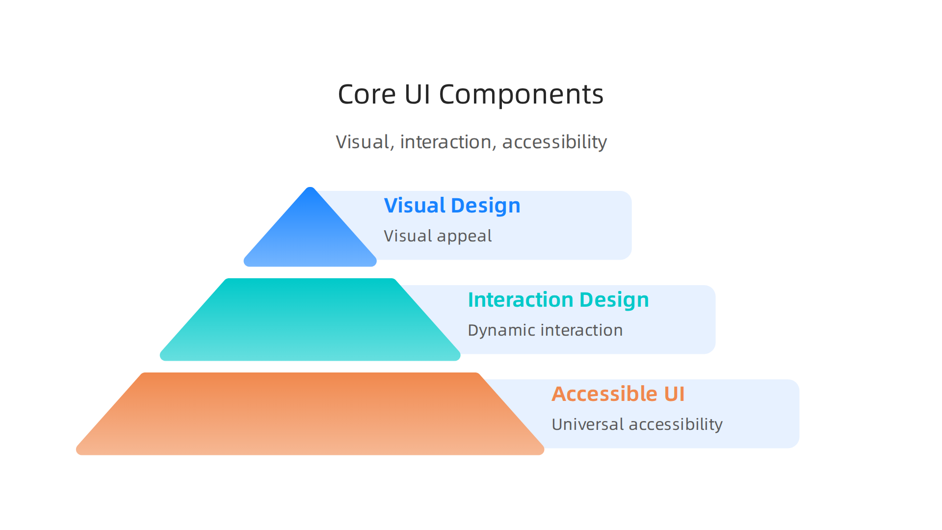
Each one matters. Ignore one, and the whole experience suffers.
But here’s the good news: you don’t have to master all of this yourself. A done-for-you service like Weblish can build a clean, accessible, high-converting interface for your business. They handle the visual design, the interaction details, and the accessibility standards so you can focus on running your business. No design degree required. Just a site that actually works.
How UI Design Directly Impacts User Experience & Business Outcomes
So we’ve covered what is ui design and the pieces that make an interface work. But you might be wondering: does this stuff really make a difference for your business? The short answer is yes. A huge yes.
Here’s the thing: people judge your website in just 50 milliseconds. That’s faster than a blink. In that tiny window, the visual quality of your ui design decides whether they trust you or click away. If your layout is messy, colors clash, or buttons look broken, you lose them instantly. That first impression is everything.
But the impact doesn’t stop there. A clear, well-organized ui design also reduces cognitive load. That’s a fancy way of saying your visitors don’t have to think hard to figure out what to do. When they land on your site and know immediately where to click, what to read, and how to buy, they complete tasks faster. And faster task completion means more sales.
The numbers back this up. Research shows that a well-designed user interface can boost your website’s conversion rate by up to 200%. Some studies even put the number higher when ui ux design works together, saying better UX can lift conversions by 400%. A 2026 report from MindInventory confirms these stats are still holding strong. That’s not just a small bump. That’s doubling or quadrupling your results.
Now let’s talk about something many business owners overlook: speed. Speed is a ui design issue. If your images take too long to load, your buttons lag, or your page feels sluggish, that’s a failure of the interface. And the cost is real. Studies show that even a 1-second delay in page load time can cut your conversions by 7%. Data from Abbacus Technologies points out that ui ux design determines up to 70% of your conversion rate. So a slow, clunky interface is literally leaving money on the table.
Think about what that means for your business. If you’re getting 1,000 visitors a month and losing 7% of them because of a one-second delay, you’re losing 70 potential customers every month. Over a year, that’s 840 people who wanted to buy but couldn’t because your site was too slow.
The good news? You don’t have to define design failure as your reality. When you invest in professional ui design, you remove those friction points. You make it easy for people to say yes. And when the interface feels smooth and trustworthy, visitors stay longer, explore more, and convert more often.
If all of this feels overwhelming, you’re not alone. Many business owners know they need a better site but don’t have the time or skills to build one. That’s where a service like Weblish comes in. They handle everything from visual design to performance optimization, so your site loads fast, looks great, and actually drives results. No headaches. No guesswork. Just a ui design that works for your bottom line.
Ultimately, what is ui design really about for your business? It’s about turning first impressions into lasting customers. And the numbers prove it pays off.
Essential UI Design Principles for High-Performing Websites
Now that you know ui design directly impacts your bottom line, let’s get practical. What separates a site that converts from one that frustrates? It comes down to a few core principles that experts have relied on for decades.
Jakob Nielsen, one of the godfathers of usability, created what are called the 10 usability heuristics. The Nielsen Norman Group has maintained these principles for years, and they remain the gold standard in 2026. You don’t need to memorize all ten. But three of them matter most for your business website.
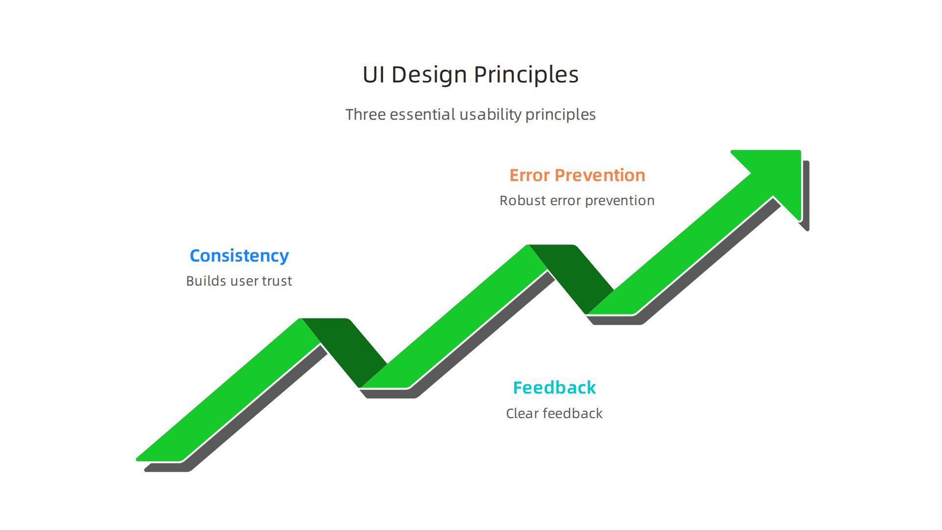
Consistency and Standards Save Your Visitors’ Brains
Here’s a simple test. Think about the last time you visited a website and couldn’t find the shopping cart icon. Frustrating, right? That’s because our brains expect certain things to work the same way everywhere.
When you use a magnifying glass icon for search, a house icon for home, or place your navigation at the top of the page, you’re using design synonym patterns people already know. UX247 explains that consistency reduces the learning curve significantly. Visitors don’t have to figure out how your site works. They just use it.
The same goes for your button styles, color usage, and typography. If every page looks like it belongs to a different company, you confuse people. And confused people leave. Stick to a predictable layout. Use the same action colors everywhere. Make your navigation behave the same on every page.
Feedback Keeps Users from Feeling Lost
Have you ever clicked a button and wondered, "Did that work?" That moment of uncertainty is deadly for conversions. Your visitors need to know the system heard them.
Feedback comes in many forms. A loading spinner tells people something is happening. A hover effect on a button shows it’s clickable. A success message after a form submission confirms the action went through. UX Tigers explains that feedback is one of the most overlooked heuristics, yet it has a massive impact on trust.
When you define design that includes clear feedback loops, visitors feel in control. They know what’s happening at every step. This reduces anxiety and keeps them moving forward toward a purchase or signup.
Error Prevention and Recovery Build Real Trust
Nobody likes making mistakes. But even worse is making a mistake and having no way to fix it.
Good ui ux design prevents errors before they happen. Here’s what that looks like in practice:
- Clear form validation that catches mistakes before submission
- Grayed-out "submit" buttons until required fields are complete
- Confirmation dialogs before destructive actions like deleting an account
But even the best designs can’t prevent everything. That’s why recovery matters just as much. Give people an "undo" option. Let them edit their cart easily. Show clear error messages that explain what went wrong and how to fix it. UX Pilot notes that error recovery is closely tied to user satisfaction and repeat visits.
Think about what happens when a customer enters their email wrong on your signup form. If they get a generic "something went wrong" message, they’ll probably leave. But a clear message saying "please enter a valid email address" keeps them engaged. That small difference can save a conversion.
Putting These Principles Into Practice
You don’t need to become a usability expert to apply these principles. Start by looking at your own site through a critical lens. Ask yourself:
- Does my navigation look the same on every page?
- Do my buttons provide visual feedback when clicked?
- Can users easily undo or correct their mistakes?
If the answer to any of those questions is no, you have room to improve. And each improvement makes your site more usable, more trustworthy, and more profitable.
If this sounds like a lot of work, you’re right. It is. But you don’t have to do it alone. A service like Weblish handles all of these details for you. Their team builds sites that follow proven usability principles from day one. No guesswork. No trial and error. Just a ui design that works the way your customers expect it to.
Common UI Design Mistakes That Hurt Lead Generation
Knowing the right principles is one thing. Actually applying them is another. Even good intentions can lead to ui design choices that quietly kill your lead flow. The good news is these mistakes are easy to fix once you know what to look for.
Let’s walk through three of the biggest offenders.
Cluttered Layouts Confuse and Drive People Away
Here’s a common scene. You land on a website and your eyes don’t know where to look. Banners, popups, text blocks, flashing animations. It’s visual chaos.
When a layout lacks clear visual hierarchy, visitors get overwhelmed. They can’t find your main offer or your call-to-action because everything is competing for attention. Studies on common web design mistakes show that confusing navigation is one of the top reasons businesses lose leads.
Think about your own site. Is your primary CTA the most visually prominent element on the page? Or is it buried under extra text, decorative graphics, or sidebars? If visitors don’t know where to click first, they won’t click at all.
The fix is simple. Remove anything that doesn’t directly support your goal. Give each element a clear purpose. Use size, color, and spacing to guide the eye naturally toward your most important action.
Poor Mobile Responsiveness Kills Your Traffic
In 2026, mobile traffic dominates. If your site doesn’t work perfectly on a phone, you’re essentially turning away the majority of your potential leads.
Yet many business sites still have tiny buttons, text that requires pinching to read, and forms that are impossible to fill out on a touchscreen. Research on lead generation mistakes confirms that poor mobile experience directly kills conversions.
Test your site on an actual phone right now. Can you tap your main CTA button with your thumb? Does your contact form resize properly? If you have to zoom or scroll sideways, you’ve got a problem.
Mobile responsiveness isn’t optional anymore. It’s a core requirement of good ui ux design.
Hidden or Confusing CTAs Block Lead Capture
This mistake is sneaky because it often looks fine to the person who designed it. But to a first-time visitor, the path to becoming a lead is unclear.
Maybe your contact form is buried on a separate page with no obvious link. Maybe your "sign up" button uses vague language like "learn more" instead of something direct. Maybe your form asks for too much information upfront.
Common lead generation pitfalls include weak calls-to-action and unclear messaging that leave visitors unsure of what to do next. Every page on your site should have one clear next step.
Make your forms visible. Use action-oriented button text. Only ask for the information you truly need. The easier you make it to convert, the more leads you’ll capture.
How to Fix These Mistakes Without Overhauling Everything
You don’t need a complete redesign to fix these issues. Start with one thing at a time. Declutter your homepage. Test your mobile experience. Move your contact form above the fold.
If you’re short on time or expertise, you don’t have to guess. A done-for-you service like Weblish can audit your site, identify these exact mistakes, and fix them with proven ui design techniques. They handle the details so you can focus on running your business.
And if you want to go deeper on specific fixes, check out this guide on graphic design principles that turn your website into a lead generator. It covers the visual rules that make your define design efforts actually work.
The bottom line is simple. Small ui design mistakes add up to big losses in lead generation. But each mistake is fixable. And each fix puts more leads in your pipeline.
Implementing Effective UI Design: A Strategic Approach for SMBs
So now you know the mistakes. How do you actually build a better experience? You don’t need a big budget or a team of specialists. You just need a clear, repeatable process.
Understanding what is ui design starts with realizing it’s not just about making things look pretty. It’s about making things work for real people. And when you get it right, the payoff is real. Research shows that user-centered design directly improves conversion rates, customer retention, and long-term business growth source.
Here’s a three-step approach that works for small and mid-sized businesses in 2026.
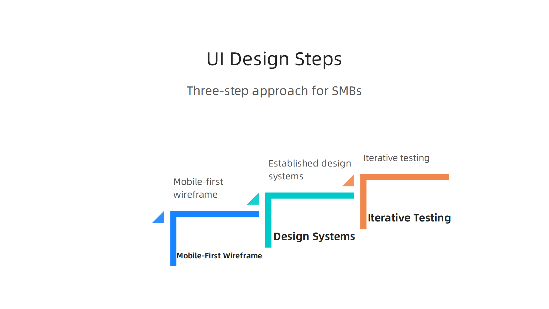
Start with a Mobile-First Wireframe Focused on Content
Here’s the thing. Most people start designing by picking colors and fonts. That’s backwards.
Start with a wireframe. A wireframe is a simple, no-frills sketch of your page layout. It shows where each element goes without any visual decoration. This forces you to focus on what matters most: your content and your user’s journey.
And always design for mobile first. In 2026, most of your traffic comes from phones. If your wireframe works on a small screen, it will naturally work on a desktop. Layouts that start on desktop often fall apart when you shrink them down.
Let define design mean starting with structure, not style. Your wireframe should answer one question: what does the user need to see and do first? Everything else comes after.
Use Established Design Systems for Consistency
You don’t have to invent everything from scratch. That’s a waste of time and money.
Established design systems like Bootstrap or Material UI give you a ready-made set of components. Buttons, forms, navigation menus, grid layouts. They’re all pre-built and tested across devices. This ensures your site looks consistent without needing a full-time designer.
Think of it like this. A design system is a set of building blocks. You still get to arrange them in your own way. But you don’t need to craft each block from raw materials. This saves hours of work and reduces mistakes. For SMBs, this alone can cut development time in half.
If you’re wondering what’s worth your investment in 2026, focusing on consistent, accessible design systems is a smart bet source. A clean ui ux design built on a solid framework converts better because it feels professional and trustworthy.
Adopt Iterative Testing to Keep Improving
Here’s the part most people skip. They launch their site and call it done. But great ui design is never finished.
The smartest approach is to keep testing and tweaking. A/B testing is the simplest way to do this. You show two versions of the same page to different visitors and see which one performs better. Maybe it’s a button color. Maybe it’s the wording on your headline. Maybe it’s the placement of your form.
The Interaction Design Foundation explains that A/B testing is a quantitative research method that helps you identify which design version users prefer

source. Real companies have used this method to double their conversion rates by changing just one element on a form source.
Start with one small change at a time. Test it for at least a week. If it wins, keep it. If it loses, try something else. This cycle of continuous improvement turns your site into a lead generation machine over time.
And if you want expert guidance without handling the testing yourself, Weblish can manage the entire process for you. They build, test, and optimize your site using proven ui design techniques so you don’t have to guess.
To go even deeper, check out this guide on graphic design principles that turn your website into a lead generator. It covers the visual rules that make your design synonym efforts actually pay off.
The bottom line is simple. You can implement effective ui design without overcomplicating it. Wireframe first. Use ready-made systems. Test constantly. Each step builds on the last. And each step brings you closer to a website that doesn’t just look good, it actually works.
Summary
This article explains what UI design really means for small and mid-sized businesses and why it’s more than just making a site look good. It defines UI as the interface users interact with, breaks down core components like layout, color, typography, interaction feedback and accessibility, and distinguishes UI from the broader UX journey. The piece shows how good UI reduces cognitive load, speeds task completion, and can materially improve conversion rates—sometimes doubling or quadrupling results when paired with strong UX. You’ll find practical design principles (consistency, feedback, error prevention), common mistakes that silently lose leads, and a three-step strategic approach: mobile-first wireframes, design systems, and iterative A/B testing. The article also explains quick fixes you can apply immediately and when it makes sense to hire a done-for-you service to handle design and optimization. After reading, you’ll be able to audit your site for UI problems, prioritize fixes that boost leads, and plan a repeatable process to improve conversions over time.