Use Design Principle Contrast to Convert More Website Visitors into Leads
This article explains how the design principle of contrast turns a pretty but ineffective website into a lead-generating tool. It shows why visual hierarchy mat...

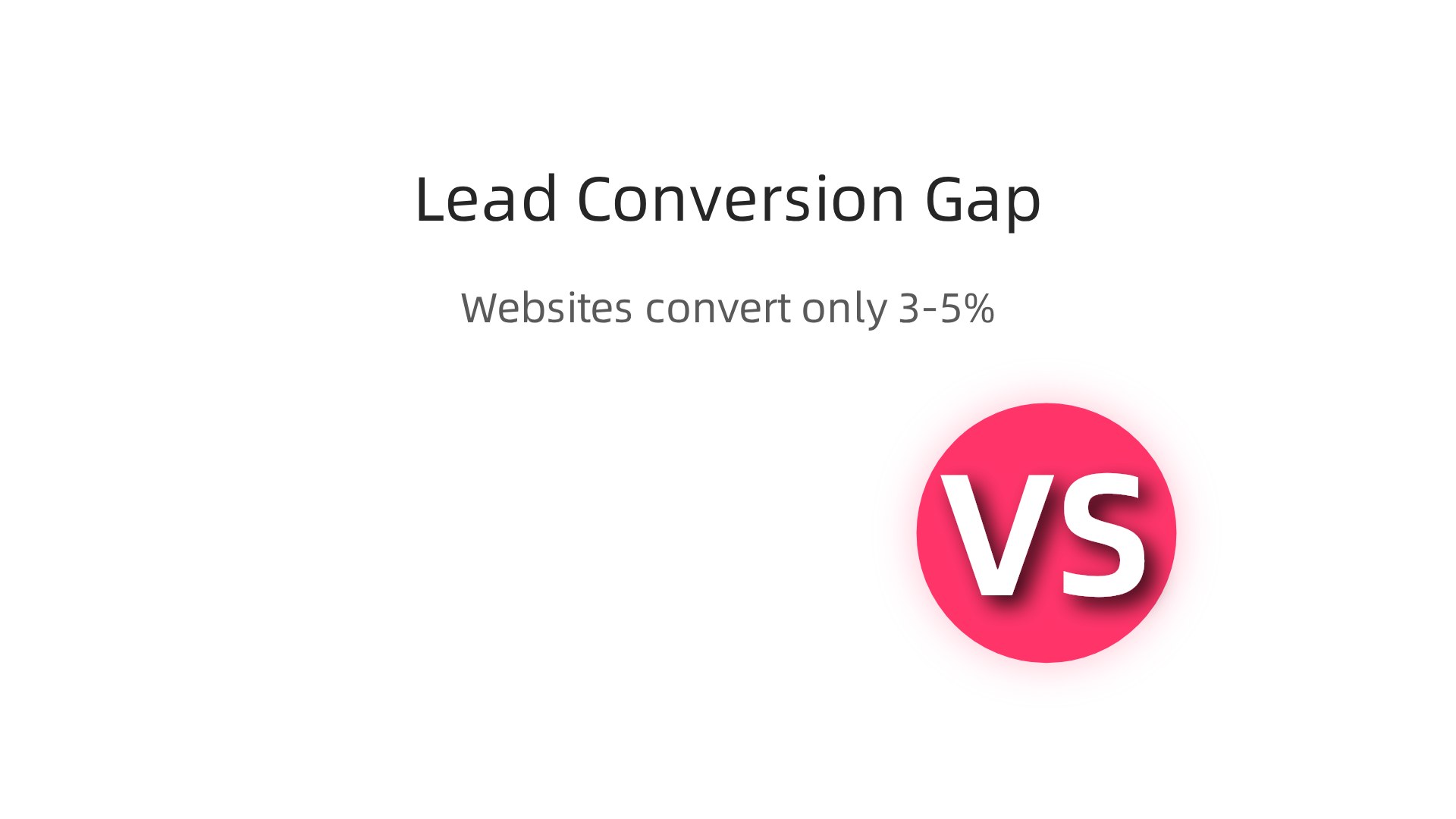
You have a beautiful website. But is it bringing in new customers? Many small business websites look great but still fail to generate leads. In fact, the average website converts only 3 to 5 percent of visitors into leads. That is a huge missed opportunity.
The issue often comes down to how the site is built. A pretty design is not enough. You need a design that guides people’s eyes and tells them what to do. That is where the design principle contrast comes in. Contrast is one of the core elements of design that helps create visual hierarchy. When used well, it makes important elements like your call-to-action buttons stand out and drives action.
By understanding and applying contrast, you can improve readability, grab attention, and boost conversions without a big budget. This article will show you how to turn your website into a lead generation engine using this foundational principle. For more on how design drives leads, check out our guide on graphic design principles that turn your website into a lead generator.
Ready to stop losing visitors and start winning leads? Start your FREE Trial with Weblish and let our experts build a website that converts.
The Hidden Cost of a ‘Pretty Brochure’ Website
Imagine a storefront with beautiful windows and fresh paint. But there is no sign outside. No one knows what you sell. No one walks in.
That is exactly what happens when your website looks good but ignores design principle contrast. It becomes a "pretty brochure" with no real purpose.

Many small business owners think a clean, attractive design is enough. They confuse aesthetics with effectiveness. But without the right elements of design working together, visitors don’t know where to look or what to do next.
The numbers prove this. Across industries, websites convert only 3 to 5 percent of visitors into leads. That means 95 of every 100 people leave without taking action.
Here is the thing. Without contrast, even your best content gets ignored in seconds. The design principles that actually drive action are missing. Your site has no visual hierarchy. No clear path.
If you are tired of a pretty site that brings in no business, it is time for a change. Learn how to make your small business website convert visitors to customers by applying contrast and other core principles.
Ready to build a site that actually works? Start your FREE Trial with Weblish and get a design that turns visitors into leads.
Why Pretty Brochures Fail
Here is the hard truth. People do not read your website. They scan it. Across industries, only 3 to 5 percent of visitors convert into leads, according to lead generation statistics for 2026. That means 95 of every 100 people leave without acting.
Without strong design principle contrast, your headlines and buttons blend into the background. Nothing stands out. There is no focal point guiding visitors forward.
Even worse, aesthetics without hierarchy reduce trust. Visitors sense something is off. They see a pretty shell with no clear purpose.
If you worry your site is a pretty brochure, find out why your business website is useless and how to fix it.
The fix starts with applying real design principles that create contrast and clarity. Get Started for FREE with Weblish and turn your site into a tool that actually works.
The Opportunity Cost of Poor Design
Every lost visitor from a low contrast page is a missed lead. For small businesses, that wasted traffic hurts. Professional website design in 2026 can cost between $8,500 and $10,000 according to industry forecasts. You cannot afford to throw that investment away on pages that do not convert. The fix is improving design principle contrast. It is one of the highest return changes you can make, and it rarely requires a full overhaul. Start by revisiting your graphic design principles to create clear focal points. If you want expert help, Get Started with Weblish for a site built to convert. Start your FREE Trial today.
Why Design Contrast Matters More Than Ever for Lead Generation
Here is the thing. We are living in an attention-scarce economy. Your visitors make snap judgments in milliseconds.

If your page looks flat or muddy, they leave. That is where design principle contrast comes in.
Contrast is the visual shout that says "look here first." It creates a clear visual hierarchy. Strong contrast guides the eye straight from your headline to your call to action. No confusion. No guessing.
Think about it this way. When there is low contrast, the brain works harder to figure out what matters. That extra work is called cognitive load. And cognitive load slows down decision making. For a small business owner trying to turn visitors into leads, speed is everything.
Neuroscience backs this up. Creative visual content triggers memory encoding 74% faster and generates significantly more emotional engagement, according to the State of Visual Communication Report. That means better design principles help people remember your brand and act faster.
When you understand the elements of design, you can use contrast intentionally. Light text on a dark background. Bright buttons next to muted colors. Big headlines next to small body copy. These choices define design quality on your site.
If you want expert help applying graphic design principles the right way, Weblish builds sites that get the details right. Get started with Weblish and let a team handle the design while you focus on growing your business.
Start your FREE Trial today and see how proper contrast can change your conversion rate.
The Psychology of Contrast
Our brains are wired to notice differences. High contrast in size, color, or spacing triggers the orienting response. Your eye moves to the biggest, brightest thing automatically. Research shows that visual communication design parameters directly shape user experience. Understanding this psychology helps SMBs design with intention. Instead of guessing, you can control attention. For more on applying these principles, see our guide on graphic design principles. Want expert help? Get started with Weblish and let us handle the contrast. Start your FREE Trial today.
Contrast vs. Consistency: Finding the Right Balance
So how do you use the design principle contrast without making your site look like a messy garage sale? The answer is simple. You pair contrast with consistency.
Consistency builds brand familiarity. When visitors see the same fonts, colors, and layout patterns page after page, they learn to trust you. Research shows that consistent visual content directly boosts brand engagement on social media source. That same idea applies to your website. Consistency is your foundation.
But here is the trick. You use contrast sparingly. Save it for the most important parts. Your call to action button. Your main headline. The single thing you want people to click.
Think of it this way. Most design principles say you should define design through repetition and alignment. Those create the peaceful background. Then contrast grabs attention exactly where you need it. When you understand the elements of design this way, you stop guessing and start controlling what your visitors see first.
If you want to see more ways to apply graphic design principles on your own site, check out our full guide on graphic design principles. And if balancing all of this feels overwhelming, let us help. Get started with Weblish to get a site that uses contrast and consistency the right way. Start your FREE Trial today.
Core Elements of Contrast in Web Design
Most people think contrast is only about color. But that is just one piece of the puzzle. The design principle contrast actually covers six different areas.
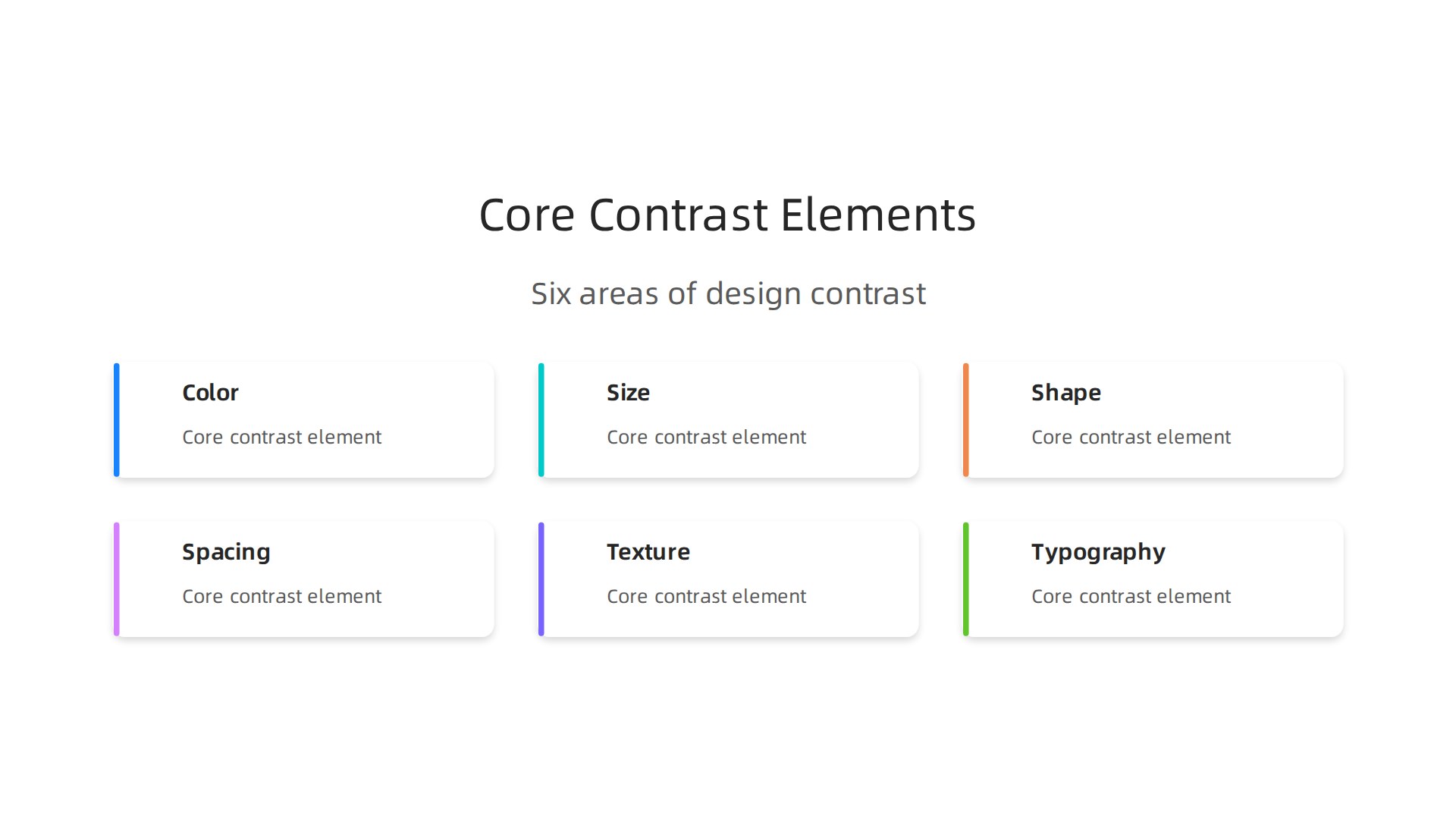
Each one helps you guide visitors where you want them to look.
Color contrast is the foundation. WCAG rules say you need a ratio of at least 4.5:1 for normal text and 3:1 for large text source. This keeps your site readable and accessible.
Size contrast makes big things grab attention. Your headline should be larger than your body text. Your button should be bigger than surrounding elements.
Shape contrast adds visual variety. A round button next to square boxes will stand out. Use this for your main call to action.
Spacing contrast uses white space. Lots of space around an element tells the brain "this is important."
Texture contrast adds subtle depth. A slightly textured background behind your headline can make it pop without using more color.
Typography contrast pairs different font styles. A bold sans-serif headline with a lighter serif body text creates a clear hierarchy.
When you define design with these types of design principles, you build sites that actually guide visitors. SMBs can start small. Pick color and size first. Then layer in shape or texture next month.
Want to see more graphic design principles in action? Check out our 9 Graphic Design Ideas for Small Business Websites. And if you want a site that uses contrast the right way without the guesswork, Get started with Weblish today. Get Started for FREE.
Color Contrast
Of all the contrast types, color has the biggest effect on how people feel and interact with your site. This design principle contrast shapes readability, accessibility, and emotional response.
WCAG guidelines require a ratio of at least 4.5:1 for normal text and 3:1 for large text against its background Understanding Success Criterion 1.4.3. This is the Level AA standard businesses target in 2026 WCAG AA vs AAA.
Meeting these ratios reduces cognitive load and can double readability. That is a huge win.
Want to apply these graphic design principles easily? Our guide on building a lead-generating website walks you through it. For a done-for-you solution, Get started with Weblish today. Ready to launch? Start your FREE Trial.
Size, Spacing, and Typography Contrast
Size contrast tells your eyes where to look first. Big headlines next to smaller body text create a clear hierarchy. WCAG guidelines say large text (18pt or 14pt bold) only needs a 3:1 contrast ratio, while normal text needs 4.5:1 WCAG AA vs AAA. That size difference alone guides readers naturally.
White space is the silent hero of this design principle contrast. Empty areas around your content make everything easier to scan. No one wants a wall of text.
Typography contrast uses bold, italic, or different font weights to highlight key phrases without changing your layout. It keeps things clean while still drawing attention.
Want these graphic design principles working for your site? Check out our guide on graphic design principles that turn your website into a lead generator. Or let us build it for you. Get started with Weblish today. Ready to launch? Start your FREE Trial.
Applying Contrast Principles to Conversion-Focused Design
So how does this design principle contrast actually help you get more leads and sales? Here is the thing: contrast is the fastest way to guide visitors to the action you want them to take. When you understand the elements of design, you use contrast as a tool, not just decoration.
Make your CTAs impossible to miss. Your primary call to action button needs to be the boldest thing on the page. Use a bright color that stands out from your background and keep the text short. Real world examples show that changing the contrast of a single button can boost clicks dramatically. Check out these 12 real CRO case studies to see how small design tweaks lead to big revenue jumps.
Give your forms room to breathe. A form that blends into the background is a form people ignore. Use a white card on a grey background, or vice versa. This clear visual separation reduces friction and makes signing up feel easier. Learn how to apply this in our guide on building a lead-generating website.
Design one clear path. Don’t use high contrast for everything. If every element is shouting, nothing is heard. Use your contrast strategically to create a single, unambiguous action path. Following a solid CRO playbook helps you build a contrast hierarchy that removes confusion and leads the eye straight to the conversion point.
Want to stop guessing and start converting? Let the experts at Weblish build a designed-for-conversion website for you. Get started with Weblish today. Or, put our principles to the test for yourself. Start your FREE Trial now.
CTA Buttons and Contrast
Your CTA button is the star of the show when it comes to design principle contrast. Use a bold color that stands out from your background and from every other element on the page.

Real world tests from brands like Walmart show that a simple button color change can lift conversions significantly, as seen in this CRO case study. Make your button bigger than surrounding elements, but keep it proportional. A contrasting border or shadow adds that extra visual separation that draws the eye. For a deeper look at how these design principles work together, check out our guide on graphic design principles for lead generation. Want a team to handle this for you? Weblish builds conversion-focused websites that get results. Start your FREE Trial today and see the difference contrast makes.
Forms and Visual Hierarchy
Now apply design principle contrast to your forms. Use strong contrast to separate form fields from labels, instructions, and error messages. This speeds up completion and reduces mistakes. The submit button must have the highest contrast on the form. Make it the boldest element. For longer forms, use progress indicators that contrast completed steps against remaining ones. Real A/B tests confirm these tactics work. See examples in these CRO case studies. Learn more about these elements of design for form optimization. Want professional help? Weblish builds conversion-focused websites. Get Started for FREE today.
Common Contrast Mistakes That Kill Conversions
Getting the design principle contrast right is not just about looking good. It is about making sure visitors can actually use your site. But many small business owners make three common mistakes that hurt their results.
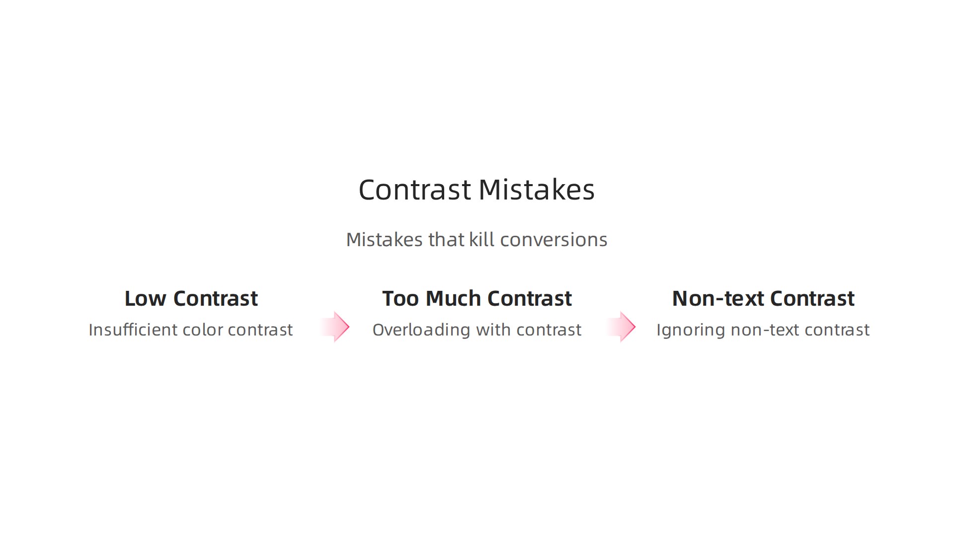
First, they use insufficient color contrast. Think light gray text on a white background. It looks clean, but it is hard to read. This is a big problem on mobile screens. The WCAG guidelines say normal text needs a contrast ratio of at least 4.5:1 level AA standard. If your text is too light, people leave without taking action.
Second, some designers overuse contrast. They use too many bright colors everywhere. This creates visual noise. Users get confused and do not know where to look. Strong contrast works best when it is used sparingly. Save the boldest colors for your main buttons and headlines.
Third, many people ignore contrast for non-text elements. Icons, dividers, and backgrounds also need enough contrast. If a dividing line is too light, the flow of the page breaks. The same goes for form fields and progress indicators. These small details matter.
The best way to avoid these mistakes is to follow proven graphic design principles. Learn how to apply design principles to turn your website into a lead generator. And if you want professional help building a site that converts without the guesswork, check out Weblish for affordable, done-for-you web design and optimization.
Insufficient Color Contrast
Here is a common problem. Think light gray text like #9B9B9B on a white background. It looks clean, but it is very hard to read. This is called insufficient color contrast.
The WCAG guidelines say normal text needs a contrast ratio of at least 4.5:1 to meet the level AA standard. When you use colors that are too close together, older users and people with visual impairments struggle the most. They lose the ability to read your content.
But here is the thing. Even if you are not legally required to follow these rules, meeting the 4.5:1 ratio makes your site better for everyone. It reduces eye strain and helps visitors read faster.
Good contrast is a core part of the design principle contrast toolkit. Want to learn more about the full set of rules? Check out this guide on graphic design principles that turn your website into a lead generator.
Need a site that gets this right from the start? Weblish builds high-converting websites with proper contrast built in.
Overloading with Contrast
Too much contrast can backfire. When every headline, button, and image uses bold colors or large sizes, nothing stands out. This overload causes visual fatigue and confusion.
The fix? Use contrast with purpose. Highlight only one or two elements per page. The rest should be quieter. This is where the design principle contrast truly shines.
Not sure how to apply this? Learn more in our guide on what nobody tells you about your website experience in 2026. And to get a website that masters contrast from day one, try Weblish.
Measuring the Impact: Contrast and Key Performance Indicators
So you have improved contrast on your website. That is great. But how do you know it actually works? You need to measure the results. Good contrast should move the needle on real business numbers.
Here is what to track.
Start with conversion rate. This is the percentage of visitors who take a desired action like signing up or buying something. Across all industries, the average website visitor to lead conversion rate sits between 3% and 5%. If your contrast changes push that number higher, you know your design principle contrast is doing its job.
Next, watch your bounce rate. When people land on your page and leave quickly, that often means they could not find what they needed. Poor contrast makes text hard to read and buttons hard to spot. Better contrast keeps people exploring.
Time on page matters too. If visitors stay longer, they are engaging with your content. And click through rate on your calls to action tells you if your buttons actually stand out.
The best way to prove contrast helps? Run an A/B test. Create two versions of a page. Keep everything the same except the contrast on your headline or CTA button. Then compare the results. Learn more about testing in our guide on how to turn your website into an epic user web portal that drives revenue.
Tools like heatmaps and eye tracking give you even deeper insight. They show you exactly where people look first and what they ignore. This qualitative data helps you tweak contrast for maximum impact.
Want to see these metrics improve on your own site without the guesswork? Try a service that handles design and optimization for you. Get Started for FREE and let the pros apply these principles to your business.
Implementing Contrast in Your Digital Strategy
Now that you know how to measure success, let’s talk about actually making changes. You do not need a complete website rebuild to see meaningful improvements. Most businesses can apply contrast fixes in a single afternoon.
Start with a high impact audit of three things.
First, check your calls to action. Can you spot every button on the page within two seconds? If not, the contrast is too low. Try a bolder background color or thicker borders.
Second, examine your headline readability. Open your site on a phone. Hold it at arm’s length. If you squint, your headline text color and background color are too similar. Increase the color difference until the text feels obvious.
Third, look at form field separation. When form fields blend together, people make mistakes or give up. Add subtle background shading or clear borders between each field.
Here is the best part. Many contrast fixes require almost no development work. Changing a button color takes minutes. Increasing font weight on your headlines is even faster. These small tweaks to the elements of design can have an outsized impact on conversions.
The 2026 website design trends for small businesses emphasize clarity and accessibility. Brands that prioritize these graphic design principles are seeing better engagement across the board, according to recent industry analysis. This is not a one time project. You should integrate contrast checks into your regular website maintenance. Every time you refresh content or plan a redesign, run a quick contrast review.
For a complete breakdown of these design principles in action, check out our guide on graphic design principles that turn your website into a lead generator. It covers the full set of visual rules that keep your site working hard for you.
If you want to stop guessing and start seeing real results, a managed approach might be your best bet. Weblish handles the design, testing, and ongoing optimization so you can focus on running your business.
Start your FREE Trial and let the pros apply these principles to your site today.
Summary
This article explains how the design principle of contrast turns a pretty but ineffective website into a lead-generating tool. It shows why visual hierarchy matters, how contrast reduces cognitive load, and which types of contrast (color, size, shape, spacing, texture, typography) you should use to guide attention toward your primary call to action. The post covers practical rules like WCAG color ratios for readability, how to balance contrast with consistency, and common mistakes that kill conversions. You’ll learn quick, high-impact changes you can make in an afternoon—such as boosting CTA contrast, improving headline legibility, and separating form fields—and how to measure results with conversion rate, bounce rate, time on page, and A/B tests. The article emphasizes low-cost wins and when to bring in experts to build conversion-focused pages.