9 Graphic Design Ideas for Small Business Websites That Generate Leads
This article presents nine practical graphic design ideas to turn a pretty website into a consistent lead generator for small businesses. It explains why design...

Have you ever poured your heart into a website, only to watch visitors leave without taking action? You are not alone. Many small business owners spend time and money making their sites look beautiful. But here is the hard truth. A pretty website is not the same as a profitable one. According to recent data, the global graphic design market is worth over $59 billion in 2026, and over 90% of businesses say graphic design is essential for success. Yet most SMB websites still work like fancy brochures instead of lead generation machines.
That is a big missed opportunity.
The right graphic design ideas can change everything. When you choose the right colors, layouts, and visual cues, you build trust instantly. You guide visitors toward a clear action. You turn casual browsers into paying customers. Design trends for 2026 are moving fast, and businesses that keep up get results. Those that fall behind? They get ignored.
This article shares nine practical graphic design ideas that work for real small businesses. These are not abstract concepts. These are proven tactics backed by data and real world experience. Each idea focuses on one goal. Turning your website into a consistent lead generator.
If you want to explore the foundation of these ideas first, check out our guide on graphic design principles that turn your website into a lead generator. It covers the core concepts that make these strategies work.
Ready to make your design work harder for you? Let us walk through each idea step by step. And if you want a complete done for you solution that handles everything from design to SEO and ongoing management, Weblish offers a subscription service that builds premium websites designed to generate leads. The best part? No big upfront costs. Get started with Weblish and see how simple growth can be.
1. Design for Immediate Value Proposition
First impressions happen fast. Visitors decide in seconds whether your site is worth their time. Your design must answer one thing clearly: "What can you do for me?"
The most powerful graphic design ideas start with a clear value proposition. Place a compelling headline and subheadline above the fold. That means the part people see before scrolling. Your headline should state your unique benefit. Your subheadline can add a short promise or proof point. Together, they show visitors why they should stay.
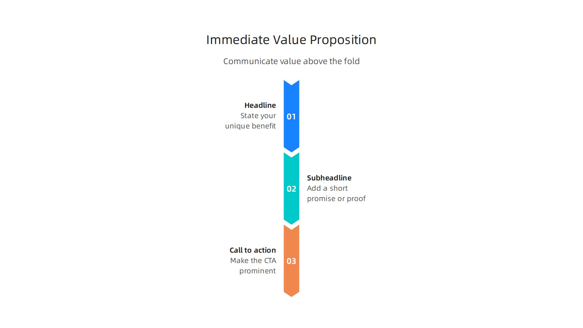
High-conversion UI patterns work because they guide the eye toward a single action. According to Lead Marketing Strategies, your interface should guide the visitor toward a logical conclusion. That means one clear call-to-action (CTA) button. Make it bold. Use a contrasting color. Use action words like "Get Started" or "Book Your Free Call."
Now remove distractions. Less is more. Hide extra navigation links. Turn off auto-play videos. Kill pop-ups that block your main message. Every element should support your value proposition, not compete with it.
Look at graphic design examples from top brands. You will notice their hero sections are clean and focused. They highlight one offer. They use simple backgrounds. They lead the eye straight to the CTA.
You do not need complex graphic design styles to make this work. Simple and clear beats fancy every time. Even basic templates can succeed if you follow this structure.
If you want a step-by-step guide to building a focused landing page, read our web development tutorial to build a lead generating website.
Want someone to handle this for you? Weblish builds premium websites that nail your value proposition and drive leads. Their subscription includes design, SEO, and ongoing management. Get started with Weblish and let the experts do the heavy lifting.
2. Strategic Use of White Space
Now that you have a clear value proposition, how do you make sure visitors actually read it? The answer is white space. Also called negative space, white space is the empty area around text, images, and buttons. It is not wasted space. It is one of the most powerful graphic design ideas you can use.
White space improves readability. When content has room to breathe, visitors can scan and understand your message fast. It also directs attention to your call-to-action. A CTA surrounded by clean white space stands out more than one buried in clutter.
According to Lead Marketing Strategies, high-conversion UI patterns guide visitors toward a logical conclusion. White space helps achieve that by reducing visual noise. It lowers cognitive load, meaning your audience does not have to work hard to process your page. They can decide quickly whether to take action.
This is why top graphic design examples from brands like Apple and Google use generous white space. Their layouts feel open and trustworthy. Over 90% of businesses believe graphic design is essential for their brand image. White space is a huge part of that professional look.
Think about it this way: a cramped page full of competing elements feels chaotic. A page with intentional white space feels calm and reliable. That sense of trust makes visitors more likely to convert.
Professional graphic design styles often emphasize breathing room. If you are working on a tight budget, you can still apply this principle. Even basic templates can look premium when you leave enough empty space around key elements.
For a deeper look at how design principles turn your site into a lead generator, check out our guide on graphic design principles that turn your website into a lead generator.
If you want expert help implementing these graphic design ideas, Weblish builds clean, white-space-rich websites that drive leads. Their subscription includes design, SEO, and ongoing management. Get started with Weblish and see how simplicity can boost your conversions.
Ready to put this into practice? Get Started for FREE and let the platform handle the heavy lifting.
3. Apply Color Psychology to Build Trust
Ever wonder why some websites feel trustworthy the second you land on them? The colors you choose are a big part of that. Color psychology in web design shows that specific colors like blue and green are strongly tied to trust, safety, and professionalism. Blue is a go-to for banks and healthcare sites because it feels secure. Green works perfectly for eco-friendly or wellness brands.
But picking the right color is only half the battle. You also need high contrast between your page background and your call-to-action buttons. That contrast makes your CTA pop and encourages clicks. Without it, visitors might miss your main offer entirely.
Consistency matters just as much. When you use the same colors across your entire site, you build brand familiarity. Studies show that color increases brand recognition by up to 80 percent. And nearly 85 percent of consumers say color is the main reason they choose one brand over another.
According to Toimi.pro, choosing your brand colors based on strategy rather than stereotypes leads to better results. So take time to pick shades that match your brand personality.
For a deeper look at how design choices including color can drive leads, check out our guide on wizard UI design for small business lead generation.
If you want professional help getting your color palette right, Weblish offers a subscription that includes expert design and conversion optimization. Get started with Weblish and see how simple, trustworthy design can work for you.
Ready to put these graphic design ideas to work? Start your FREE Trial and watch your site build trust faster.
4. Design for Mobile-First Visual Hierarchy
You picked great colors for trust. But if your site looks messy on a phone, you lose people fast. More than half of your visitors will come from a mobile device in 2026. So your site must work perfectly on small screens.
Mobile-first design is not just about shrinking your desktop layout. You need to rethink how content flows on a tiny screen.
Start with a single-column layout. Stack your content from top to bottom. This makes scrolling easy and natural. Put your most important message and your call-to-action button near the top, right where thumbs rest.
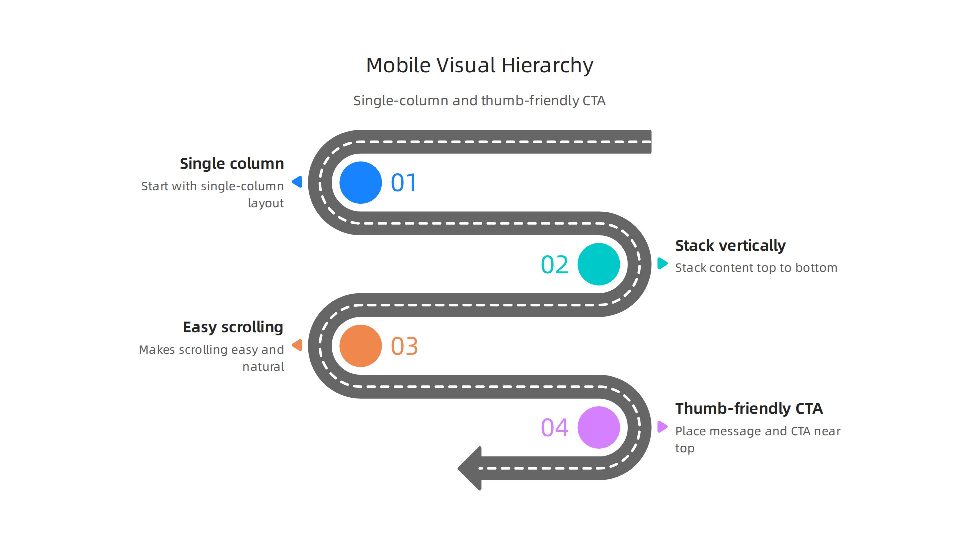
Keep key buttons in the bottom thumb zone, the easy-to-reach area. Mobile UX best practices show that placing CTAs in thumb-friendly zones can boost conversions.
Next, focus on speed. Mobile users are impatient. If your page takes more than three seconds to load, most people leave. Use responsive images that scale down. Compress files. Cut heavy scripts. Following mobile-first design best practices keeps visitors engaged and reduces bounce rates.
Font size matters too. Use at least 18 pixels for body text. Headlines should be larger and bolder. This clear hierarchy guides visitors straight to your key points and your CTA. Clean, readable text builds trust instantly.
Think about your service page. On mobile, the headline comes first. Then a short benefit. Then a button that says "Get a Free Quote." No clutter. No tiny links. Just a clear path to action.
For more on this, check out our guide on how to turn your website into an epic user portal that drives revenue. And if you want expert help, Weblish handles everything from mobile-friendly layouts to fast hosting. These graphic design ideas work best when applied consistently.
Ready to put these graphic design ideas to work? Start your FREE Trial and watch your mobile traffic convert.
5. Integrate Social Proof Visually
Your mobile layout is solid. Nice work. But here is the thing. A fast site is great. But a site that feels safe? That is what wins in 2026.
People are naturally cautious online. They wonder: "Is this business real? Can I trust them?"
That is where social proof comes in. And it is one of the most powerful graphic design ideas you can use.
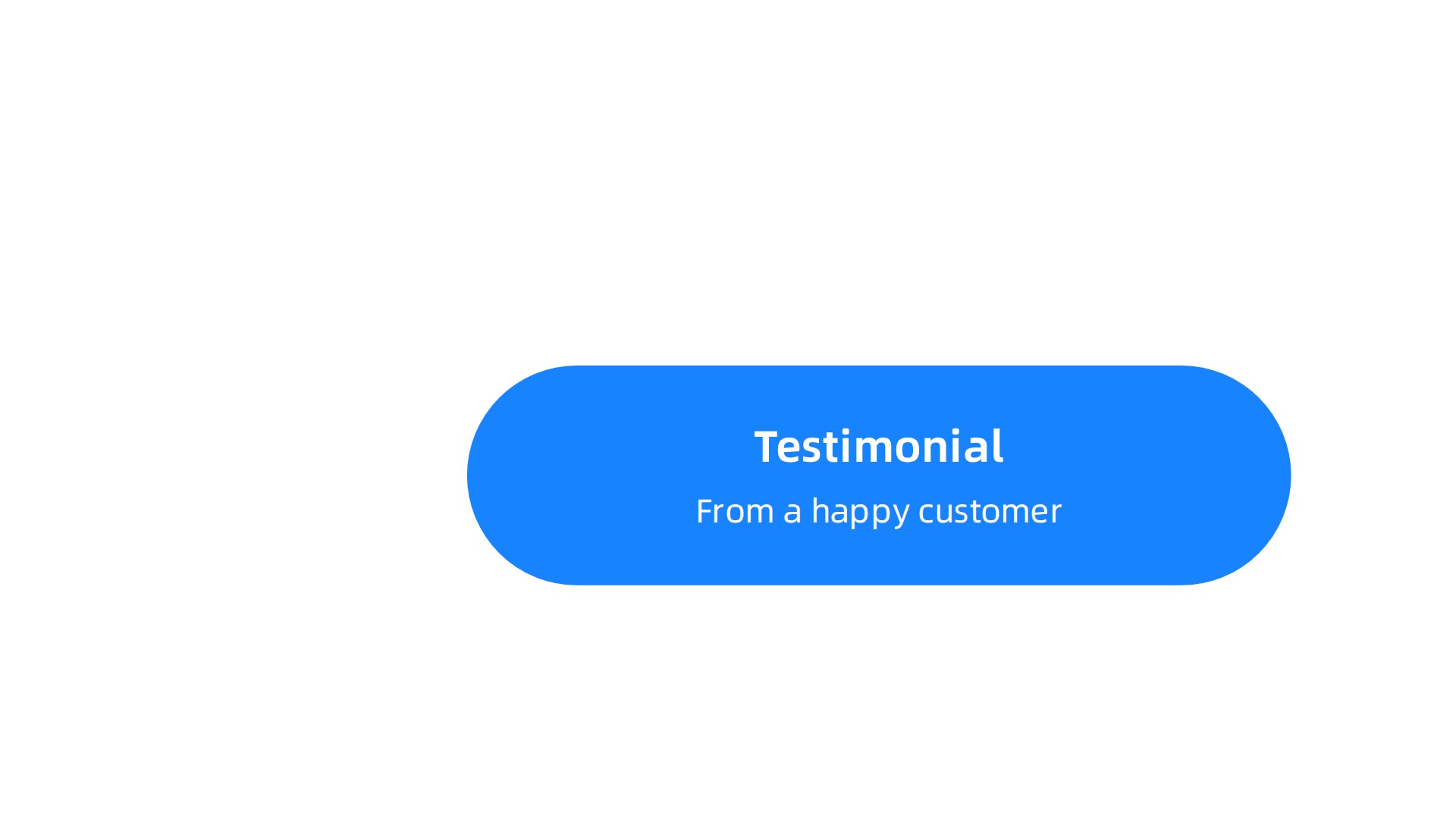
Social proof is proof that other people already trust you. It could be a testimonial from a happy customer. A logo from a brand you worked with. Or a trust badge that shows your site is secure.
Why does this matter? Because in 2026, the biggest conversion gains come from building trust signals. When visitors see that others trust you, they feel safer clicking that buy button. Website conversion psychology experts confirm that reducing hesitation is the key to higher sales.
Where to place social proof
Put your social proof right next to your main call-to-action button. Do not hide it in the footer. Place a row of client logos near your "Get a Quote" button. Put a 5-star rating right above your "Buy Now" button.
When a visitor hesitates, a quick glance at that proof can be the nudge they need.
Make it look real
Here is the secret. Social proof must feel authentic. Avoid blurry stock photos. Use clear, real photos of actual customers. Include their first name, job title, or location. Real names build real trust.
Scannable designs work best. Think bold quotes, star ratings, and clean logos. These are graphic design examples that create instant credibility.
Video proof works best
Video testimonials are the strongest form of social proof. A 30-second clip of a happy client explaining how you helped them is hard to ignore. Place these near your service descriptions or pricing tables.
For more ways to build trust through layout, check out our guide on graphic design principles.
Tying it all together
Designing these trust sections takes skill. You need the right fonts, spacing, and colors. Many business owners prefer a done-for-you approach. Weblish helps businesses integrate these trust signals seamlessly into their overall graphic design styles.
The result is a site that feels human, professional, and trustworthy.
Ready to turn your site into a trust machine? Get Started for FREE and let the experts handle the design.
6. Use Data Visualization to Showcase Expertise
Social proof shows that others trust you. But data visualization shows that you know your stuff. It is one of the most effective graphic design ideas for 2026.
Charts, graphs, and infographics turn boring numbers into stories. They help visitors understand complex information fast. And when people understand your data, they trust your expertise more.

Here is a simple truth. A page with a clear chart converts better than a page with a paragraph of stats. Great data visualization examples show that clear visuals help people spot bottlenecks and compare results quickly.
Make it scannable and on brand
Keep your visualizations clean. Use your brand colors, fonts, and spacing. Do not overload charts with too many labels. A simple bar chart or pie graph works better than a cluttered infographic.
Think about what your audience cares about. Show revenue growth, customer satisfaction scores, or time saved. These are graphic design examples that build confidence fast.
Go interactive when you can
Interactive charts let visitors hover, click, and explore. They increase time on page and engagement. If your platform supports it, use tools that create clickable graphs. This turns static data into a mini experience.
You do not need to say "graphic design is my passion" to make this work. You just need to present real numbers in a clean, honest way. That is what builds authority.
Use data to back up claims
When you make a bold statement, back it up with a visual. For example, if you say "our clients see a 30% increase in leads," show a before and after chart. Real A/B testing case studies prove that data-driven pages perform better than opinion-driven ones.
Need help creating these visuals?
Designing custom charts and infographics that match your graphic design styles takes skill. Many business owners prefer to focus on running their business. Weblish can help you build professional data visualizations that fit your brand and drive trust.
If you want to learn more about design principles for trust, check out our guide on graphic design principles.
Now you have two powerful ways to earn trust: social proof and data visualization. Put them together, and your site will feel like an expert you can rely on.
Ready to turn your data into a trust builder? Start your FREE Trial and let the experts handle the design.
7. Incorporate Micro-Interactions for Delight
You have shown visitors your data and your social proof. But do you make them smile while they browse? That is where micro-interactions come in.
Micro-interactions are small, subtle animations that respond to what someone does on your site. Think of a button that changes color when you hover over it. Or a form field that glows green when you type correctly. Or a little spinning icon that shows a page is loading.
These tiny moments do something powerful. They make your site feel alive and responsive. They tell your visitor, "I see you. I am working for you." And that feeling of being taken care of builds trust fast.
In fact, website design trends that drive conversions in 2026 rely heavily on these micro-moments. When done well, they turn a static page into a conversation.
Keep them lightweight
Here is the catch. Micro-interactions should not slow your site down. A heavy animation on mobile can ruin the experience. One of the most important mobile UX best practices in 2026 is keeping interaction patterns snappy and lightweight. If your animation takes too long, people leave.
So use CSS transitions instead of heavy JavaScript. Keep animations under 300 milliseconds. On mobile, test the speed with real devices.
Use them where they help most
You do not need to animate everything. Pick a few key places:
- Hover effects on buttons so visitors know they can click
- Form feedback like a checkmark when an email is valid
- Loading indicators so people know content is coming
- Scrolling effects like a progress bar that shows how far they have read
These are great graphic design examples of tiny details that feel professional. They do not scream "graphic design is my passion." They whisper "this site was built with care."
Let the experts build them
If coding these interactions feels overwhelming, you are not alone. Many business owners focus on running their companies. Weblish can help you add polished, fast micro-interactions that match your brand and delight your visitors.
For a deeper look at how these principles work, check out our guide on graphic design principles.
Micro-interactions are one of those graphic design ideas that feel small but make a big difference. Use them wisely, and your site will feel like a helpful friend, not a cold brochure.
Ready to build a site that delights your visitors? Start your FREE Trial and let the experts handle the details.
8. Design with Accessibility First
Those micro-interactions you just added feel great. But they only work if everyone can see and use them. That is where accessibility comes in.
Accessible design is not just about helping people with disabilities. It makes your site better for everyone. And it also helps your SEO and brings in more leads. So it is a win on all sides.
Start with color contrast
The WCAG 2.2 guidelines set a minimum contrast ratio of 4.5:1 for normal text. That light gray text on a white background you liked probably will not pass. Use a contrast checker to test your color pairs. The W3C also reminds us not to use color alone to share information. Add icons or labels alongside colors.
Use readable fonts and clear headings
Pick fonts that are easy to read at small sizes. Sans-serif fonts work well on screens. Use proper heading structure with H1, H2, and H3 tags in the right order. This helps screen readers and also helps search engines understand your page.
These are simple graphic design ideas that make real improvements. Good typography and hierarchy are some of the best graphic design examples of accessibility done right.
Add alt text and captions
Every image on your site needs alt text. Describe what the image shows. For videos, add captions. This helps people who cannot see or hear your content. Search engines read alt text too, so your SEO gets a boost.
Accessibility works with any style
Some people think accessibility limits your graphic design styles. But the truth is different. You can make any style accessible. Even if you hired someone from Fiverr graphic design services, you can still follow these basic rules.
Making your site accessible shows that graphic design is more than just a passion for pretty pictures. It shows you care about every visitor. And visitors notice that care.
It all leads back to trust
When visitors can easily read, navigate, and understand your site, they trust you more. Trust leads to conversions. Accessible design is not just the right thing to do. It is smart business.
Need help making your site accessible without starting from scratch? Weblish can audit your site and fix the key issues that hold back your visitors.
Ready to build a site that works for everyone? Start your FREE Trial and let the experts handle the details.
9. Test and Iterate Your Design with A/B Testing
You made your site accessible. The colors pop. The fonts look clean. But here’s the real question: Does your design actually get people to click, sign up, or buy? You won’t know unless you test it.
That’s where A/B testing comes in. It’s a simple way to compare two versions of the same page element to see which one works better. You show version A to half your visitors and version B to the other half. Then you check the numbers.
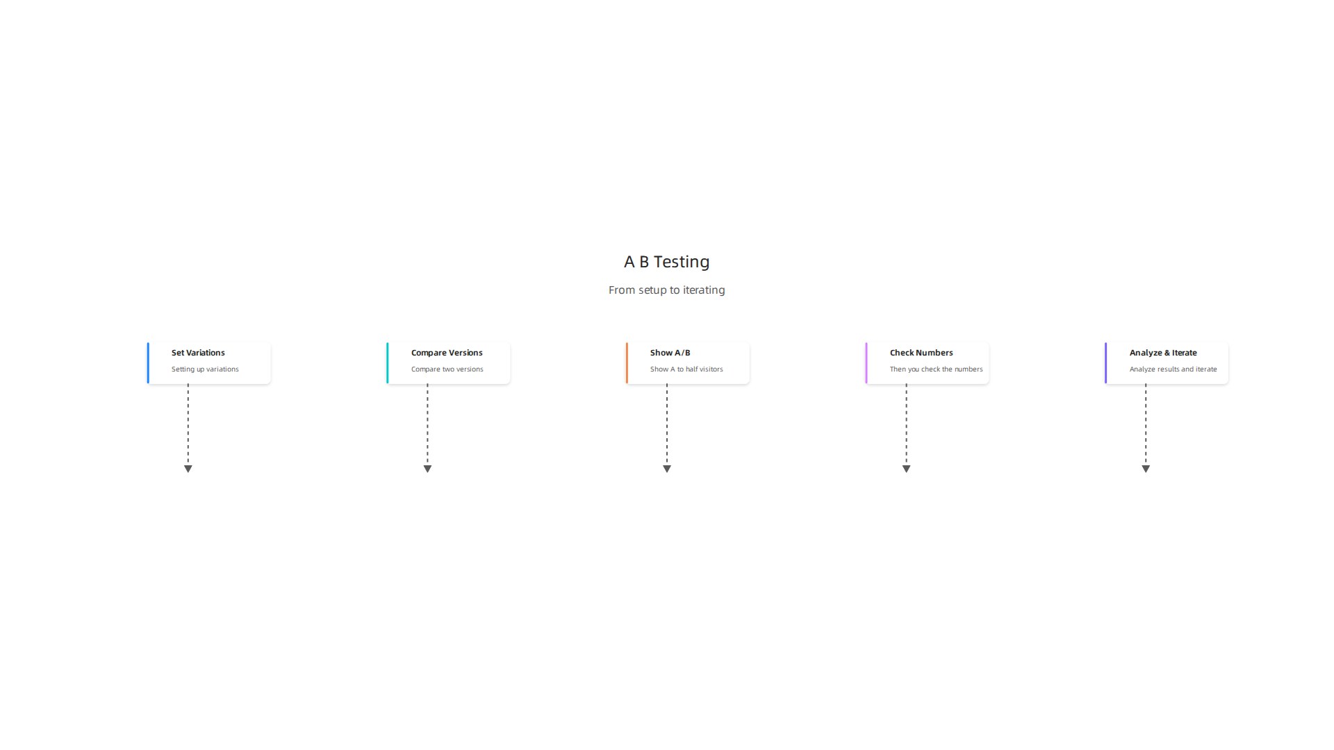
The version that gets more conversions wins.
According to the Interaction Design Foundation, A/B testing is a quantitative user research method that helps you make data-driven decisions. And the good news is that small changes can lead to big results.
What should you test?
Start with the elements that have the biggest impact on conversions:
- Call-to-action button color and text
- Hero images or videos
- Headline copy
- Layout variations
For example, one case study showed that simply changing the button text from "Get Started" to "Try It Free" boosted signups by over 30%. You can find more real-world examples from VWO that show similar wins.
Start small, then go bigger
Don’t try to test everything at once. Pick one high-impact, low-effort change. Run the test until you have enough data to reach statistical significance. Tools like Optimizely or Google Optimize can help you set up experiments quickly.
Once you know what works, apply that lesson across your site. Then test the next thing. This is how you turn your website into a lead generation engine over time.
Testing also helps you avoid costly mistakes. Instead of guessing that a new layout will improve your numbers, you can run smarter experiments with a solid plan. Data beats hunches every time.
Apply what you learn
Every test teaches you something about your audience. Use those insights to refine your graphic design styles and choices.
For example, if a red button outperforms a blue one, you know your visitors respond to urgency. Use that knowledge in your next design update.
Want to learn more about turning visitors into customers? Check out our guide on how to make your small business website convert visitors to customers.
Ready to start testing?
You don’t need to be a data scientist to run A/B tests. With the right tools and a little patience, you can start improving your conversion rates today. If you’d rather have experts handle the testing and optimization for you, Weblish can help. Our team runs experiments on your site so you can focus on running your business.
Start your FREE Trial and let us turn your design into a lead-generating machine.
Summary
This article presents nine practical graphic design ideas to turn a pretty website into a consistent lead generator for small businesses. It explains why design decisions—like a clear above-the-fold value proposition, generous white space, strategic color choices, and mobile-first layout—directly affect trust and conversions. The guide shows how to use social proof, data visualizations, and lightweight micro-interactions to build credibility and engagement, and why accessibility and contrast improve both usability and SEO. It also walks through testing with A/B experiments so you can make data-driven improvements over time. Each tactic is presented as an actionable step, backed by examples and best practices, and the article points to hands-off options (like Weblish subscription services) if you prefer expert implementation. After reading, you’ll know which design changes to prioritize, how to measure their impact, and where to get help executing them.