Useless Websites Hold Powerful Lessons to Boost Your Website Engagement
Many business websites look polished but fail to hold attention or convert visitors. This article analyzes 10 quirky

You know the feeling. You spend weeks perfecting your website. You pick the right colors, write the copy, and hit publish. Then nothing happens. Visitors show up, look around for a few seconds, and leave. No emails. No calls. No sales.
It is frustrating. And you are not alone. Many small and mid-sized businesses struggle with low engagement and high bounce rates. Their sites look good on the surface but fail to hold attention or drive action. You might even wonder if your website is truly helping your business grow.
Here is the thing. Some of the best lessons in digital engagement do not come from fancy corporate redesigns. They come from places you would least expect. I am talking about "useless websites". You know the ones. A site that lets you poke a virtual cake. A button that does nothing. A page that tracks how many seconds you waste staring at a blank screen.
These random websites seem silly at first. But the useless web holds powerful secrets. It teaches us about user psychology, simplicity, and why people stay or leave. In 2026, users want sites that feel intuitive and fast without unnecessary complexity. Stripping away the unnecessary is exactly what these quirky pages do best.
This is not just a list of cool websites. In this article, I break down 10 of the most engaging useless sites on the internet. For each one, I show you the specific lesson it holds and how you can apply it to your own business. If your site feels more like a digital brochure than a lead engine, you need to pay attention. These tiny tricks can flip your engagement overnight.
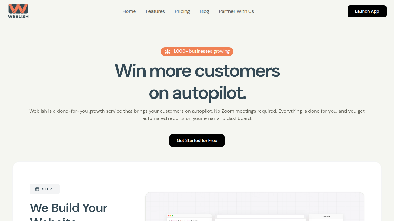
And if you are ready for a full overhaul, you can get started with Weblish by signing up and claiming your free trial to turn those lessons into a site that actually converts.
But first, let us see what the "useless" internet can teach us about building something that works.
1. The Infinite Scroll of Random Facts – A Lesson in Curiosity Loops
You have probably landed on a random websites page that serves up one odd fact after another. Did you know that honey never spoils? Or that octopuses have three hearts? You click for one fact, then another, then another. Before you know it, ten minutes have passed and you are still scrolling.
This works because unpredictable facts trigger small "aha" moments.
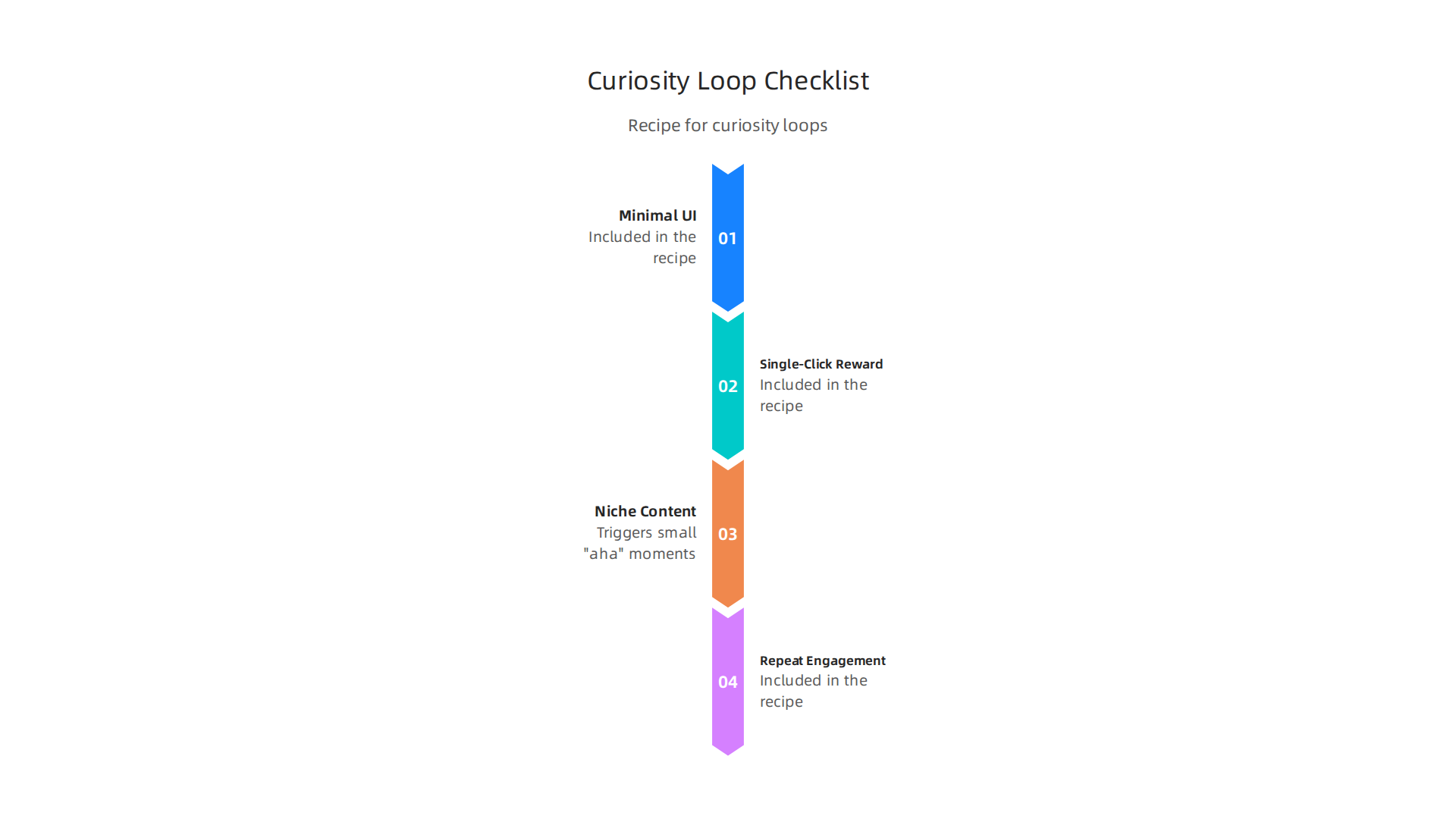
Your brain craves that little reward. The same principle applies to your business website. If you can keep visitors curious, they will stay longer and engage more.
Here is how the useless web teaches us to build curiosity loops. First, keep it simple. A clean, minimal design leaves room for the content to shine. In 2026, users want websites that feel intuitive and fast without unnecessary complexity. Second, use niche topics. A site about random facts draws traffic from people searching for specific, quirky questions. That is the power of long tail keywords. Instead of writing a generic blog post, try one that answers a very specific question your audience asks.
You can apply this right away. Add a "Did you know?" widget to your site, or create a quick quiz that reveals a helpful tip. Make the interaction simple. One click. One fact. One reason to stay.
The loop does not need to be complex. It just needs to feel rewarding. If you want help building a site that keeps visitors curious and converts them into leads, check out how Weblish can help you get started with a free trial.
2. The Rice Purity Test for Business Ethics – Interactive Quizzes Drive Engagement
You have probably seen the Rice Purity Test floating around social media. It is one of those useless websites where you check off things you have done and get a score. People share their results for fun. But here is the thing: this same format can work wonders for your business.
Interactive quizzes work because they feel personal.
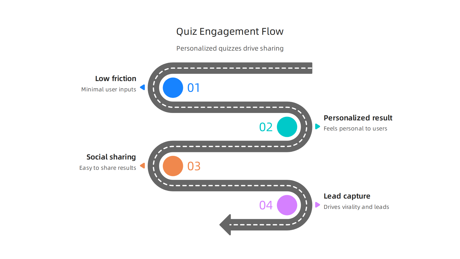
When someone answers a few questions, they get a result that seems made just for them. That sense of personalization keeps people engaged. And because the inputs are simple checkboxes or sliders, almost no one drops off. Low barrier means high completion.
The real magic happens after the quiz. People love to compare scores. They share results on social media, tagging friends and starting conversations. That is free virality for your brand. In 2026, cool websites that use interactive tools get more traffic because they give users something fun to do.
You can apply this today. Create a short quiz for your audience. It could be "What is your marketing style?" or "How ethical is your business?" Keep the questions simple. Use a clean, minimal design so the focus stays on the answers. Many of the random websites that go viral use this exact formula.
Want to build a quiz that drives leads? Weblish helps small businesses create interactive tools that convert visitors into customers. Sign up for a free trial and see how easy it can be.
3. The Logo-to-ASCII Generator – Turning Boring Assets into Shareable Art
You have a logo. It sits on your homepage, your business cards, maybe your invoices. Pretty boring, right? Now imagine someone takes that logo and turns it into a piece of ASCII art made from keyboard characters. Suddenly your brand looks fresh and fun. That is exactly what a logo-to-ASCII generator does. It is one of those useless websites that feels silly at first but creates real engagement.
Here is how it works. You upload your logo or paste a URL. The tool converts it into a grid of letters, numbers, and symbols. The output looks like a retro computer graphic. It is low effort for the user but feels highly original. People love sharing these results on social media because they stand out. A simple logo becomes a conversation starter.
In 2026, users want websites that feel intuitive and responsive without unnecessary complexity Kontra Agency.
But a little novelty goes a long way. A logo-to-ASCII generator gives your audience a reason to interact with your brand in a playful way. And because the tool is free and fast, almost no one hesitates to try it. That is the magic of the useless web – it turns a static asset into a viral asset.
The business payoff is clear. You get user-generated content, social shares, and brand visibility without spending a dollar on ads. Many random websites that go viral use this exact formula: take something ordinary, make it weird, and let people share it.
Want to build a tool like this for your own brand? Weblish helps businesses create interactive features and high-performing websites that drive real leads. Sign up for a free trial and turn your boring assets into engaging experiences.
4. The Useless Clock That Tells You When to Take a Break – Gamifying Downtime
You know that feeling when you have been staring at a screen for three hours and your eyes feel like sandpaper? You know you should get up, but the guilt of "wasting time" keeps you glued to your chair.
Now imagine a clock on your screen that pops up at totally random moments.

It does not tell you the time. It just says, "Hey, stand up for two minutes." Or "Go stretch your neck." It feels useless at first. But here is the thing: the unpredictability makes it exciting. You never know when it will chime.
That is the power of useless websites that use subtle gamification. In 2026, brands are discovering that random, non‑intrusive interactions keep visitors coming back. According to recent research on 2026 interactive experience engagement strategies, unpredictable rewards boost curiosity and anticipation.
You start to wonder, "When will the clock tell me to pause?" That tiny spark of mystery turns a boring break reminder into a mini game.
The health benefit is real too. Taking short breaks improves focus and reduces eye strain. But the brand benefit might be even bigger. When a random website genuinely cares about your well-being, you remember it. You feel positive about that brand. It builds what experts call gamification in customer engagement – using playful elements to deepen how customers feel about you.
The best part? This kind of feature costs almost nothing to build. A few lines of JavaScript. A friendly message. No complex rewards or points systems needed. And yet it creates the same psychological triggers that gamification statistics show improve customer loyalty by encouraging repeat engagement.
Want to know a secret that most businesses miss? Your website does not need to be serious all the time. Adding a tiny, "useless" touch like a break clock makes your brand feel human. It gives people a reason to smile. And that small moment of joy keeps them coming back to your cool websites again and again.
If you want to add smart, playful features like this to your site without hiring a full tech team, Weblish can help. Their done-for-you growth service builds websites that balance clean design with unexpected touches that drive real engagement. Check out their guide on improving your website experience in 2026 to see how small changes make a big difference.
5. The Random Color Palette Generator – Minimalist Tools That Solve a Real Problem
Staring at a blank screen looking for color ideas is hard. A random color palette generator fixes this in a simple way. It looks like a basic gimmick. You click a button, and it gives you five colors. But this tiny tool solves a big problem: creative block.
The extreme simplicity is what makes it so valuable. One button. One output. It lowers your mental effort to almost zero. You just click and react. This matches perfectly with the top minimalist web design trends of 2026.
People want fast tools that do not make them think. A palette generator is exactly that. It is one of those cool websites you love to bookmark and revisit when you need fresh ideas.
There is a hidden business bonus here too. Tools like this drive real search traffic. People search for "random color palette" when they start new projects. That is a high-intent keyword. According to research on high converting websites in 2026, adding a simple utility tool to your site helps keep visitors engaged and boosts your visibility. It is a perfect example of the useless web bringing real value to your brand.
Want to build simple tools that attract the right customers? Start with a strong design foundation. Weblish helps small businesses create sites that are both beautiful and genuinely useful. Instead of a boring brochure, your website can become a trusted resource people share. Learn more about applying these ideas in our graphic design principles that turn your website into a lead generator.
6. The Emoji Story Creator – Tapping into Visual Communication Trends
Emojis are everywhere now. You use them every day in texts and social media. So why not build a whole story with them? An emoji story creator lets you pick a few emojis and turn them into a short tale.

It is simple, fun, and very shareable.
This tool works great with the top minimalist web design trends of 2026. The interface is clean. You pick emojis, and the tool arranges them. No clutter. No confusion. It is one of those cool websites that feels playful but has real purpose.
Here is why this matters for your business. Younger audiences love visual communication. They think in pictures and symbols. An emoji story creator speaks their language. When they create their own stories, they feel emotionally invested. That user co-creation keeps them on your site longer.
Plus, the stories are easy to embed in social media posts. People share them with friends. That gives you organic reach without spending a dime. According to research on web design trends, tools that encourage interaction are becoming more important than ever.
Want to add something like this to your site? You can. It does not take a big budget. You just need a smart design that focuses on engagement. Check out our guide on graphic design principles that turn your website into a lead generator. It shows how small interactive elements make a big difference.
If you want a professional site that includes these kinds of playful tools, Weblish can help. They build beautiful, fast websites designed to keep visitors interested and ready to act. Start with a free trial and see the difference.
7. The ‘Will It Blend?’ Web Edition for File Compression – Demonstrating Value Through Experimentation
Remember those old "Will It Blend?" videos where they dropped an iPhone into a blender? That same spirit of fun experimentation works great for the useless web. Imagine a website where you upload a large file, and the tool compresses it right in front of your eyes. It shows the before and after sizes, the quality difference, and the time saved. No boring explanations. Just a live demonstration.
Here is why this matters. When you let people see your product in action through a playful test, you build trust.
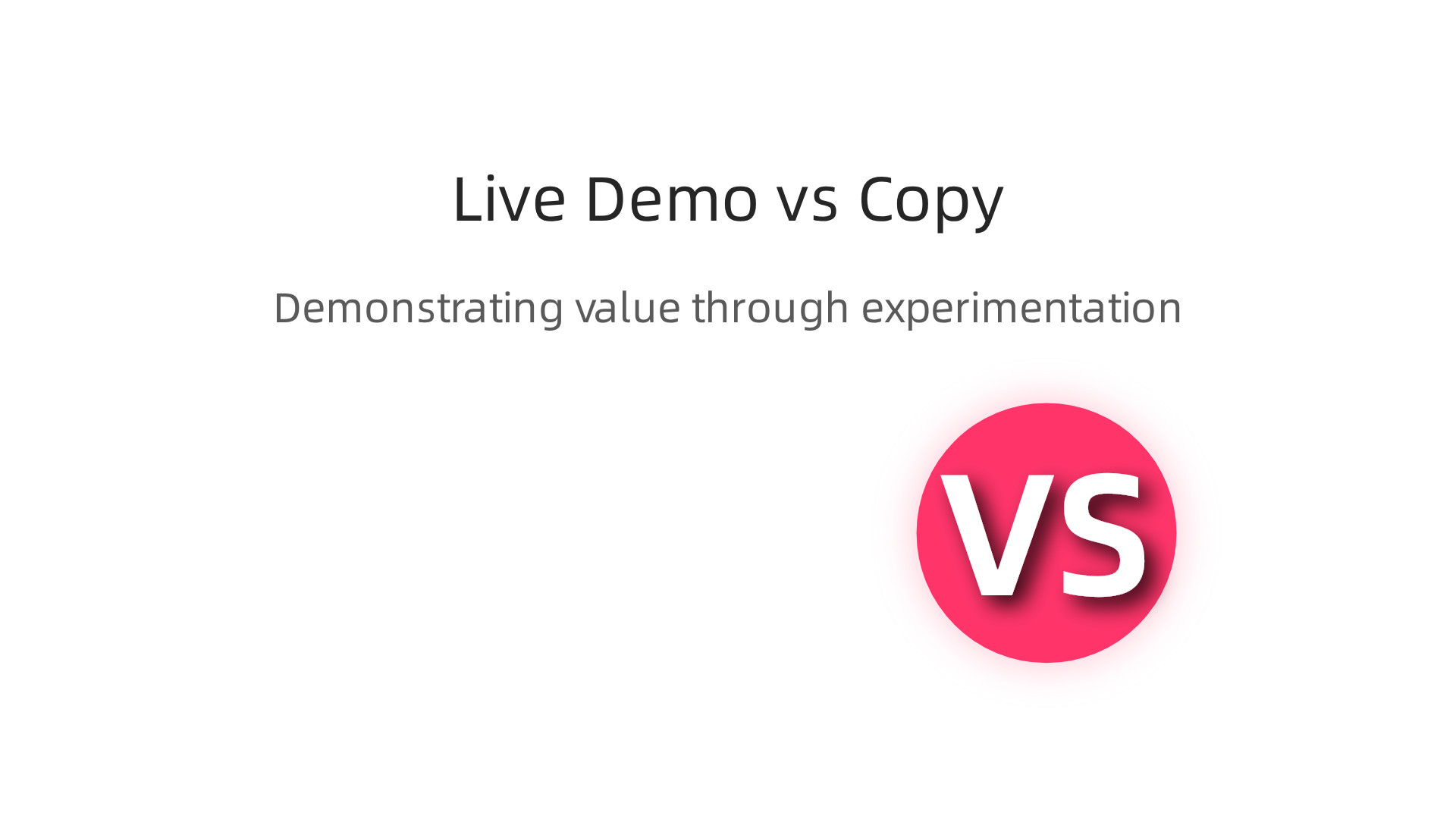
A transparent, entertaining comparison proves your value better than any sales page ever could. According to the top web design trends for 2026, users want websites that feel intuitive and responsive without unnecessary complexity. A file compression demo fits that perfectly.
This kind of tool also fits right in with random websites that go viral. People love to test things. They will upload their own PDFs or images just to see what happens. Then they share the results with coworkers and friends. That is free word-of-mouth marketing for you.
Want to build a website that shows off your product in a fun way? Check out our guide on making your small business website convert visitors to customers. It explains how small interactive experiments can turn casual browsers into loyal buyers.
If you want a professional site that includes these kinds of engaging tools, Weblish can help. They build beautiful, fast websites designed to keep visitors interested and ready to act. Get started with Weblish by signing up and claiming your free trial.
8. The Website That Counts Every Second You Waste – The Power of Awareness & Accountability
Have you ever landed on a random website only to realize 20 minutes later that you have no idea what you just did? Now imagine a site that makes that pain visible. You visit, and a timer starts ticking. Every second you stay, the number goes up. It shows you exactly how much time you are wasting on one of those useless websites.
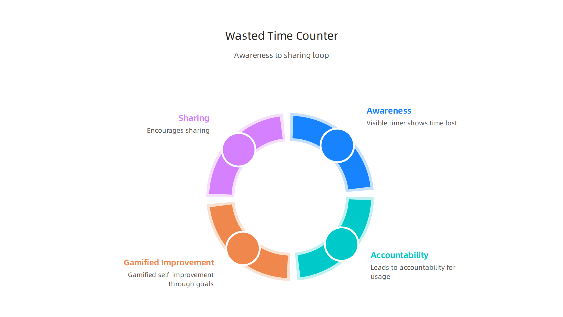
It sounds harsh. But here is the surprising part: that real time counter actually keeps people hooked. Why? Because it creates accountability. You can see your wasted time in the moment, and that makes you think, "Do I really want to keep going?" According to the latest 2026 interactive experience engagement strategies, this kind of transparent feedback boosts user retention because it feels honest and playful.
The gamification layer takes it further. You try to "beat" your previous score by spending less time or by noticing when you should leave. The useless web becomes a game of self control. Even negative reinforcement works when you present it with a wink. People share their "time wasted" numbers with friends, turning a boring counter into a viral challenge.
This is a perfect example of how cool websites can serve a real purpose. They make you aware of your habits without being preachy. If you want to build a site that grabs attention and changes behavior, try adding an honest counter. It turns a simple visit into a moment of self reflection.
Want to learn more about turning a simple idea into a lead generating website? Check out our guide on how to make your small business website convert visitors to customers. It shows how small interactive tricks can boost engagement and trust.
And if you want a professional website built fast with tools like this, Weblish can help. Their done for you service takes care of design, development, and optimization. Get started with Weblish by signing up and claiming your free trial.
9. The Parody Product Page Generator – Using Humor to Build Trust and Virality
But other useless websites take the opposite approach. Instead of shaming you with a timer, they make you smile. Have you ever landed on a random website selling a "Premium Digital Air" subscription or a "Pet Rock 2.0"? These are parody product page generators, and they are masters of viral marketing.
Here is how they work. You land on a sleek ecommerce page. It has a fake product, glowing star ratings, and a big "Buy Now" button. The gag is that nothing is real. But the surprise makes you laugh. You feel smart for getting the joke, so you share it with a friend. According to 2026 interactive experience engagement strategies, this kind of positive surprise is a powerful psychological trigger that drives massive social sharing.
These pages also use subtle trust signals to make the joke land better. Fake "verified purchase" badges, limited time countdowns, and even silly price discounts trick your brain for just a second. Research shows that trust signals like security badges and review scores can increase conversions and willingness to interact, even when the context is playful. The humor lowers your defenses. When the site asks for your email to "unlock the secret recipe," you happily give it up because you are having fun.
This is the useless web teaching us a real lesson. You do not need a serious face to build trust. Sometimes, a little absurdity creates the perfect hook.
If you want to build a site that grabs attention and collects leads, humor might be your secret weapon. Read our guide on how to make your small business website convert visitors to customers for more creative strategies.
And if you want a professional website built fast with a clever hook, Weblish can help. Get started with Weblish by signing up and claiming your free trial.
10. The Virtual Bubble Wrap Popper – The Ultimate Stress Reliever & Sharing Magnet
Remember the simple joy of popping bubble wrap as a kid? The useless web turned that into a digital experience, and it became an unexpected hit.
You land on a plain screen covered in rows of gray bubbles. You click one. A satisfying pop sound plays.

The bubble vanishes. You click another. Then another. Before you know it, you have popped fifty bubbles and your shoulders feel lighter.
This is not an accident. These low effort interactions trigger a small dopamine release in your brain. You get instant gratification without logging in, signing up, or committing to anything. According to 2026 web design standards, purposeful micro-interactions like these create emotional engagement and keep visitors on your site longer.
Here is the thing. The virtual bubble wrap popper teaches a valuable lesson about the the useless web. Mindless fun can actually be a gateway to something bigger. When a visitor has a positive experience on your site, even a silly one, they associate that good feeling with your brand. They are more likely to explore further or share the page with a friend.
Many random websites have used this trick to grow their traffic fast. No login required. No sales pitch. Just pure, satisfying fun that spreads naturally through word of mouth.
Your business site might not need bubble wrap. But it can definitely use a small, playful interaction that makes visitors smile and stick around. If your current site feels too serious, check out our guide on why your business website is useless and how to fix it to get ideas for adding charm.
And if you want a team to build a professional site that still feels human and fun, get started with Weblish by signing up and claiming your free trial.
Summary
Many business websites look polished but fail to hold attention or convert visitors. This article analyzes 10 quirky