
Single-Page Websites for Small Businesses Drive Leads and Growth
This article explains what a single‑page website is, why many small and mid‑sized businesses (SMBs) choose them in 2026, and how to make them work as lead‑gener…

What this guide covers and why single-page websites matter for SMBs
Imagine a website where all the important information fits on just one screen. You don’t click around to different pages. Instead, you just scroll down to see everything. This is what we call a single-page website. It’s like a focused story about your business, all neatly laid out in one place.
In 2026, many small and mid-sized businesses (SMBs) are finding these simple websites to be very helpful.

They are perfect for things like showing off a single product, announcing an event, or letting people see your work if you are a freelancer. Many great website design examples prove that less can be more.
For many SMBs, getting new customers is a big worry. Their old websites might just look nice but don’t actually help them get leads. Also, paying for a big, fancy website can be costly, and the bills might not be clear. Keeping a large website updated with many pages can also take a lot of time.
This is where single page website examples can make a real difference. Because they are simple, they can cost less to build and are easier to keep fresh. They also guide visitors clearly to what you want them to do, like filling out a form or calling you. This makes them great for turning visitors into new customers. Think of it as a clear path for your customers, without any confusing detours.
We know how important it is for your website to work hard for you. If you’re looking to turn your website into a tool that brings in steady leads and helps your business grow, consider working with a partner who understands your needs. For more tips on choosing the right help, check out how to choose the best small business web design company for lead generation.
If you want a team to handle your web design, SEO, and social media without big upfront fees, you can Get started with Weblish today.
Ready to see your business thrive online?
Grow Your Traffic on Autopilot
Continuing from how a single-page website simplifies your online presence and boosts lead generation, let’s explore the specific reasons why this approach is a smart choice for small and mid-sized businesses (SMBs) in 2026.
Why choose a single page website? Key advantages for SMBs
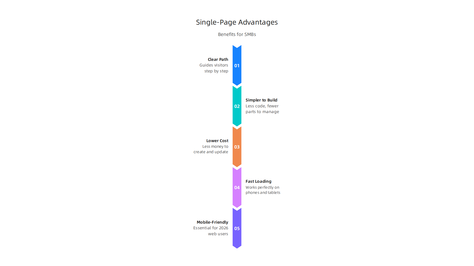
One of the biggest helpers a single-page website offers is a clear, simple path for your visitors. Imagine you want someone to sign up for your service or buy one special product. On a website with many pages, people can click around and get lost. But with a single-page design, you guide them step by step down one scrollable page. This makes it super easy for them to follow along and take the action you want, like filling out a form or making a purchase. This direct journey reduces friction, helping turn more visitors into customers. For this reason, a well-made single-page site focuses on one main goal, making every part of the page work towards that goal.
Another big plus is how much simpler these websites are to build and keep up. Unlike big websites with many pages, a single-page site has less code and fewer parts to manage. This often means it costs less money to create at the start and less time and effort to update later on. This is great news for SMBs that might not have a huge budget or a whole team to manage their website. To make sure your site stays easy to manage and visible, it’s important to set up your content with clear headings and structure, as explained in guides like Single Page Website SEO: When One URL Wins (2026).
Finally, when these single page website examples are made correctly, they are often very fast and work perfectly on phones and tablets. In 2026, most people look at websites on their mobile devices. A fast-loading, mobile-friendly website is not just nice to have; it’s a must. Search engines like Google also favor websites that load quickly and offer a good mobile experience, which can help more people find your business online. Fast websites also convert better, turning more visitors into leads. This speed and mobile readiness are key for SMBs who need to get the most out of their online presence without spending a lot. You can explore how to make your small business website convert visitors to customers to see these benefits in action. For even more tips on getting found online, check out how SEO web design generates consistent leads for SMBs.
While single-page websites offer many great benefits for simplifying your online presence and attracting new customers, they are not always the best choice for every business.
It’s smart to know when a single-page site works best and when a website with many pages would be a better fit.
When single-page sites work — and when they don’t
Single-page websites shine brightest for certain kinds of businesses and goals. Think of them like a sharp, focused message. For example, if you have just one main service, one audience, and one clear action you want people to take, a single-page site can be perfect. This includes:
- Launching something new: If you’re introducing a new product, a special offer, or a one-time event, a single-page site can act as a great "launch page" or campaign site. It lets you quickly tell people what they need to know and guide them to sign up or buy.
- Service-focused small businesses: If your business offers a very specific service, like a single type of consulting, a single-page site can clearly show what you do, who you help, and how to contact you. Many small service businesses find a well-made one-page website works better than a messy multi-page site, especially when they are just starting out or only have one main service to offer One-Page vs Multi-Page Website: Which Is Better for Small Businesses?.
- Portfolios for creative pros: Artists, photographers, or writers can use a single-page site to show off their best work and quickly direct potential clients to contact them. These are great website design examples for focused goals.
- Simple "business card" sites: For local businesses that mainly rely on word-of-mouth but need an online spot for contact info and basic services, a one-page site is easy to manage and effective. It can act as a digital business card Single-Page vs Multi-Page Website — Which One Does Your Small Business Actually Need?.
However, there are times when a single-page approach isn’t the best idea. If your business has lots of information, different services, or big plans for growing online, a multi-page website might be better. Here are some signs a single-page site might not be enough:
- You have lots of content: If you need to share a large amount of information, offer many different products, or have a big gallery of work, trying to cram it all onto one page can make the site feel long and messy. A multi-page site can spread this content out across different sections, giving each topic its own space.
- Complex SEO goals: If you want your business to show up in search results for many different keywords, services, or locations, a single-page site can make this harder. Each page on a multi-page site can be set up to target specific keywords, which helps more people find you through search engines Multi-page vs single-page website: impact on SEO and UX. As some experts point out, a multi-page site is often better if you need to rank for more than a couple of search terms One-Page vs Multi-Page Website UK — Honest 2026 Guide.
- Many different services or products: If you offer several distinct services or products, each needing its own detailed explanation, a single-page site will struggle. For example, a business offering web design, SEO, and social media marketing would benefit from having separate pages for each service. You can learn more about finding the right online presence for your needs by understanding what is web design how to build a lead generating website.
- Regular blog posts or news: If you plan to share new articles, updates, or news often, a multi-page website with a blog section is much more suitable.
Choosing the right kind of website helps your business grow. It is an important part of your overall digital marketing strategy.
Ready to make your website a powerful tool for attracting customers?
Grow Your Traffic on Autopilot
Now, let’s look at some real "single page website examples" to see how they actually work. These "website design examples" can help you understand how to make a single-page site that gets results. We will focus on sites that do a great job of turning visitors into customers.
High-performing single page website examples (with analysis)
Good single-page websites are built with a clear purpose. They guide visitors step-by-step down the page, like telling a story. Each part of the page has a job, from grabbing attention to asking for action. Experts say that for SEO, a single-page site needs one main heading (H1) that matches the page’s goal, with other sections using clear sub-headings (H2s) for different topics. This makes it easier for search engines and people to understand the page’s message Single Page Website SEO: When One URL Wins (2026).
Here are some "single page website examples" based on what they want to achieve:
-
Lead Capture Pages: These are designed to get someone’s contact information, like an email address or phone number.
- Layout: They usually have a big, clear headline at the top that states a problem or a great offer. Below that, there’s a simple form to fill out. You might also see short reasons why someone should sign up, maybe a quick review or two, and a strong image.
- Call to Action (CTA) Placement: The "Sign Up Now," "Get Your Free Guide," or "Contact Us" button is very noticeable. It’s often at the top, next to the form, and sometimes again at the bottom of the page. The goal is to make it super easy for visitors to take the next step.
- Conversion Focus: No extra links or distractions are allowed. Everything on the page pushes you to fill out that form.
-
Product Landing Pages: These sites focus on selling just one product or a very specific service.
- Layout: They start with what the product can do for you. Then, they show off its features with pictures or videos. You’ll often see testimonials (happy customer reviews) and clear pricing.
- CTA Placement: Buttons like "Buy Now," "Order Today," or "Learn More" are placed often. They might show up right after the main introduction, after showing features, and definitely near the pricing.
- Conversion Focus: These "website examples" aim to answer all questions a buyer might have and create trust. They want you to feel good about clicking that buy button.
-
Appointment Booking Sites: These single-page websites help people schedule a meeting or service.
- Layout: They might list different services with short descriptions and then quickly move to an online calendar. Sometimes they show pictures of the team members.
- CTA Placement: Buttons like "Book Your Session," "Schedule a Call," or "Check Availability" are common. These are placed right next to each service or directly linked to the booking calendar.
- Conversion Focus: The main goal is to make scheduling as quick and easy as possible, reducing any effort for the visitor. If you’re looking for help choosing the best platform for your business’s online presence, check out how to choose a smarter web company to generate consistent leads.
-
Launch Pages: When a business wants to build excitement for something new that’s coming soon, they use a launch page.
- Layout: These are often visually striking. They might have a countdown timer, a short message about what’s coming, and a spot to enter your email for updates. They can be very creative "website design examples." Many platforms like Strikingly and Carrd are popular for building these kinds of single-page sites in 2026 One Page Websites: 17 Inspiring Examples (2026).
- CTA Placement: The main call to action is usually "Notify Me," "Get Updates," or "Join the Waitlist." It’s often the only interactive part of the page.
- Conversion Focus: The goal is to build a list of interested people before the main launch.
When looking at these "good website design examples," notice how they all keep things simple and clear. They make sure the page loads fast and looks good on phones, which is very important for visitors in 2026 Single Page SEO: 9 Steps to Rank 1-Page Websites. For any small to mid-sized business looking to create an effective online presence, understanding these focused approaches is key. You can get started with Weblish by signing up and claiming your free trial, helping you build a professional and high-performing website. Get started with Weblish
Moving from how single-page websites are built to how they should look and feel, let’s talk about the best ways to design them. Good design and user experience (UX) are super important for these "website examples" to work well. It’s not just about looking pretty; it’s about helping people find what they need and take action easily.
Design & UX best practices for single-page sites
When you make a single-page website, think of it like telling a clear story. Each part of your page should lead naturally to the next.
1. A Clear Path for Your Visitors
- Hierarchy: This simply means organizing your information so the most important things stand out. Use bigger words for main titles and smaller ones for details. Make sure your main heading (H1) is clear, and other sections use headings like H2s and H3s in the right order. This helps search engines and people understand your page. It’s also vital for making sure your site is accessible to everyone Mastering Core Web Vitals: The Complete Guide to Speed ….
- Visual Rhythm: Use different section colors, pictures, or white space to make the page feel like it has different parts. This stops it from looking like one big wall of text. It’s like how a good song has different beats. These visual breaks guide the eye down the page.
- Progressive Disclosure: Don’t show everything at once. Give small bits of information, then offer more details if someone wants them. This keeps the page from feeling too crowded and helps visitors focus on one idea at a time. This kind of thoughtful design helps in designing UX for trust transforms website visitors into customers.
2. Made for Phones and Easy to Use
In 2026, most people look at websites on their phones. So, your "website design examples" must start with mobile phones in mind.
- Mobile-First Layout: This means designing your site to look great and work perfectly on small screens first, then adjusting it for bigger computer screens. Buttons need to be big enough to tap with a thumb, and text must be easy to read without zooming in. To learn more about how design works, you might be interested in what is UI design the simple definition that boosts your bottom line.
- Touch-Friendly Interactions: Every button, link, or menu item should be easy to touch and use on a phone or tablet. Avoid small, hard-to-hit targets.
- Accessible Navigation for Long Pages: Since single-page sites mean a lot of scrolling, it’s good to have a "sticky" menu that stays at the top. This menu should let people quickly jump to different parts of the page, like "Services" or "Contact Us." You can also tell users that there’s more content if they scroll down Best Practices for Long Scrolling — D/UX. This makes sure your site is easy for everyone to use, following rules like the Web Content Accessibility Guidelines (WCAG) 2.2.
By focusing on these "good website design examples" practices, you make sure your single-page site is not only helpful but also a joy to use for every visitor, no matter how they access it. Applying strong graphic design principles that turn your website into a lead generator ensures your site actively converts visitors into customers.
Beyond just looking good and being easy to use, your single-page site needs to be found by people looking for what you offer. This is where SEO (Search Engine Optimization) and good performance come in. For single-page website examples, getting found means making sure search engines like Google understand what your page is about and how useful it is.
SEO & performance: making single pages discoverable
Making your single-page website discoverable means helping search engines understand your content. Even though it’s just one page, you can still tell a full story for search engines.
1. How to structure content for search engines
Imagine your single-page site needs to answer many questions. Here’s how to organize it so search engines get it:
- One Main Idea, Clear Sections: Your whole page should have one main idea or keyword, usually in your main title (H1). But each part of your page can then focus on a smaller, related idea. Use headings (H2s for big topics, H3s for smaller ones inside) to break up your content. This helps both people and search engines see the different topics your page covers. For example, if your main idea is "best single-page website examples," an H2 could be "pricing" and another H2 could be "how it works." A good rule is to have one clear H1 for the page’s main job and then H2 sections to explain different parts of your offer.
- Keywords in the Right Places: Put your main keywords in your H1. Then, for each section, use related keywords in your H2s and within the text of that section. This tells search engines exactly what each part of your page is about. It’s also smart to map each H2 to a sub-intent or a specific question people ask.
- Special IDs for Sections: Give each section of your page a unique "ID" in the code (like
id="services"). This helps search engines understand that these are distinct parts. It also lets you create "jump links" in your menu so people can click and go straight to that part of the page. This is part of doing SEO on single page websites properly. - Good Meta Titles and Descriptions: These are the small text snippets that show up in search results. Make sure your page has a clear title and a short description that includes your main keywords. This encourages people to click on your single-page site. Before your site goes live, ensure unique meta title and description are configured for each view.
- Canonical URLs: This is a bit technical, but sometimes a single page can be reached by more than one web address. Using a "canonical URL" tells search engines which one is the "main" one. This helps avoid problems where search engines might think you have duplicate content. This is also important for single-page applications to prevent issues.
2. Speed and smooth running: Core Web Vitals
In 2026, how fast your website loads and how smooth it feels are super important for search engines. Google looks at something called Core Web Vitals. These are like health scores for your website.
-
What are Core Web Vitals?
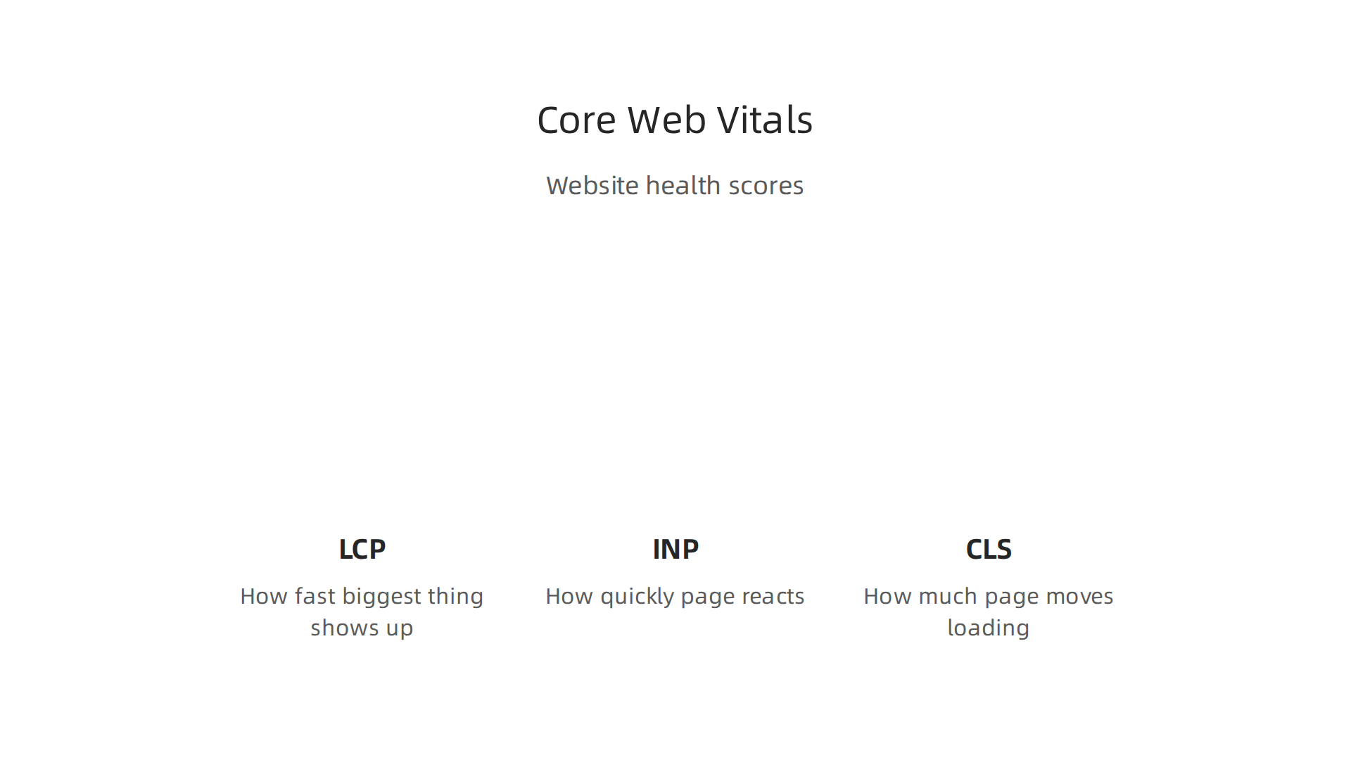
- Largest Contentful Paint (LCP): How fast the biggest thing on your page (like a large image or block of text) shows up. A good LCP is under 2.5 seconds.
- Interaction to Next Paint (INP): How quickly your page reacts when someone clicks a button or taps something.
- Cumulative Layout Shift (CLS): How much your page moves around while it’s loading. You know when you try to click something, and suddenly the whole page shifts? That’s bad CLS, and it should be as close to zero as possible.
- Google wants your site to pass these tests for most of your visitors, especially on mobile phones Web Vitals | Articles.
-
Making your single-page site fast:
- Compress Images and Videos: Big pictures and videos slow down your site. Make them smaller without losing quality. Preloading important images like the LCP element helps a lot The Ultimate Core Web Vitals Checklist (2026).
- Load Things as Needed (Lazy Loading): Don’t load every picture on the page all at once. Only load images and content when someone scrolls to that part of the page. This is called "lazy loading." This also means removing render-blocking resources that slow down your page’s first view.
- Keep Code Simple: Too much fancy code can slow things down. A clean, simple code base helps your site load faster. For many single-page website examples, a speedy site means better rankings and happier visitors.
- Server-Side Rendering (SSR) or Pre-rendering: Some single-page sites use a special way to build the page that sends a blank page first, then fills it with content. This can be slow for search engines. Using SSR or pre-rendering means the server sends a fully built page from the start, which is much better for SEO Single-Page Application SEO: Complete Guide to Ranking SPAs.
- Focus on First Visits: Making sure your page loads quickly and perfectly the very first time someone visits can really help your Core Web Vitals scores Overcoming Core Web Vitals Challenges in Single Page Applications SPAs.
By paying attention to these SEO and performance tips, your carefully designed single-page website examples can rank well and bring in more visitors. If you’re looking for help with improving your website’s visibility, consider strategies for SEO content optimization that work for small businesses.
Ready to make your website a magnet for visitors and boost your online success?
Grow Your Traffic on Autopilot
After all that work to get people to your single-page website examples, the next big step is to make sure they actually do something once they arrive.

This means turning visitors into leads or customers. It’s about having content that talks right to your visitors and clear calls to action (CTAs) that guide them to their next step.
Conversion-focused content and CTAs on a single page
Getting visitors to your website is only half the battle. The other half is making sure your single page encourages them to take action.
1. Writing clear messages and choosing the right buttons
For single-page website examples, every word counts. You don’t have many pages to explain things, so your message needs to be super clear and focused on benefits.
- Short and Sweet (Microcopy): Use small bits of text, called microcopy, that tell visitors exactly what they’ll get. Instead of saying "Submit," try "Get My Free Quote" or "Start My Free Trial." This shows value right away. Your writing should be clear about what you offer and how it helps the visitor, turning website examples from simple showcases into powerful tools.
- Highlight Benefits, Not Just Features: People care about how something helps them. So, focus on the benefits. For example, instead of "Our software has X features," say "Save time and money with our easy software." This kind of writing helps small businesses turn website visitors into customers, as explained in guides about making your small business website convert.
- Different Buttons for Different Wants: Not everyone visits your single-page site wanting the same thing. Some might be ready to buy, others might just be looking for more info. Offer different CTA buttons for these different needs.
- For those ready to commit: "Buy Now," "Sign Up."
- For those needing more info: "Learn More," "Watch a Demo," "Download Our Guide."
- For those who want to talk: "Contact Us," "Schedule a Call."
Using different CTAs can help guide visitors through their journey on your site and improve conversion rates, which is a key goal for any good website design example.
2. Testing to make your single page even better
How do you know if your content and CTAs are working their best? You test them. This is called A/B testing.
- Test Different Parts of Your Page: You can try out different versions of your sections. Maybe change the order of your sections, or use different pictures or headlines. Even small changes can make a big difference in how people interact with your single-page site. The goal is to make your single page a strong lead-generating machine, moving beyond just being one of many website examples.
- Experiment with Button Text: Change the words on your CTA buttons. Does "Get Started" work better than "Learn More"? Does "Start Saving Today" get more clicks than "Find Out How"? Even tiny changes to your buttons can greatly impact how many people click them.
- Play with Form Length: If you have a contact form, try making it shorter. Sometimes, asking for less information upfront can make more people fill out the form. You can always ask for more details later. A simple form is a good idea for single-page applications for SEO to reduce friction.
- Use Tools for Testing: There are many tools that let you easily set up A/B tests. They show half your visitors one version of your page and the other half a different version. Then, they tell you which version worked better. This helps you keep making your site better over time. If you need help with this, working with a service that handles website design and growth can be very helpful. You can get started with Weblish to see how they can help improve your website’s performance and conversion.
By constantly testing and improving your content and CTAs, your single-page website examples can become powerful tools that not only attract visitors but also turn them into loyal customers.
Once you know what your single-page website examples need to say, the next step is building the site itself.

This means picking the right tools and making sure your site runs well and stays safe.
Technical setup, hosting, CMS, and maintenance for single-page sites
Making a good single-page website means thinking about how it’s built, where it lives on the internet, and how you keep it running smoothly. Even a simple single page needs a strong foundation to be a truly good website design example.
1. How to build your single-page site
There are a few ways to create your single-page website. Each option has its own benefits, especially for small businesses (SMBs) who want easy management and great performance.
- Simple HTML/CSS: This is the most basic way. You write the code by hand. It’s fast and easy to host, but changing content means changing the code directly.
- Static Site Generators (SSGs): These tools take your content and turn it into simple, fast-loading HTML pages before anyone even visits your site. Think of them like a smart copy machine for your website. Tools like Astro and Next.js are popular choices in 2026 for building fast content sites, often with little to no JavaScript by default, which is great for speed. Many experts suggest a static-first approach for modern websites in 2026 for speed and SEO benefits. These tools can be part of a strong tech stack for good SEO and fast websites, according to experts.
- Headless CMS: This is a way to manage your content without it being tied to how your website looks. You write your text and upload pictures in one place (the "head" of your content) and then use a Static Site Generator to pull that content onto your single page. This makes updating your site much easier than changing code every time. Popular headless CMS options include Sanity and Contentful, which work well with static site generators.
- Lightweight SPA Frameworks: Sometimes, a single-page site might use a bit more advanced code to make it feel like an app, with smooth transitions. These are called Single Page Applications (SPAs). While they can be fancy, they need careful planning to stay fast and friendly for search engines. It’s important to optimize them for speed, especially for the first visit, as noted by web performance guidance.
When you’re choosing how to build, remember that some solutions are better for small business website development services because they help you focus on growth.
2. Hosting and keeping your site running
After building your single-page website, you need to put it on the internet (hosting) and make sure it stays updated and secure.
- Hosting: For static or SSG-built sites, hosting is very simple and often fast. Services like Vercel and Netlify are popular for hosting static sites because they make your site load quickly around the world.
- Update Workflows: If you use a headless CMS with an SSG, updating your content is usually easy. You change text or pictures in the CMS, and the SSG rebuilds your site automatically. This is much simpler than trying to update a complex website and helps ensure your website examples stay fresh and useful.
- Backups: Always have a plan for backups. This means saving a copy of your website’s files and content regularly. If something goes wrong, you can easily restore your site.
- Security Basics: Keep your website safe. Using secure hosting, strong passwords, and keeping your website software updated are basic steps. Even though single-page sites are often more secure by nature (less complex code to hack), being careful is still key.
- Performance and Accessibility: A good single-page website also needs to perform well and be easy for everyone to use. Google has specific measures called Core Web Vitals that check how fast your site loads, how quickly it reacts, and if things jump around on the screen. Aim for fast loading times, like your largest content appearing in less than 2.5 seconds, which is a key goal for a smooth user experience. Making your site accessible means everyone, including those with disabilities, can use it easily. Things like proper heading structure and alternative text for images are important for accessibility and help your overall seo web design generates consistent leads for smbs. Many good website design examples prioritize both speed and accessibility. In 2026, a strong default for many content sites is to use tools that focus on performance and easy updates.
Summary
This article explains what a single‑page website is, why many small and mid‑sized businesses (SMBs) choose them in 2026, and how to make them work as lead‑generating tools. It covers the core benefits—clear visitor path, lower build and maintenance costs, and strong mobile performance—then shows when a one‑page approach is appropriate and when a multi‑page site is better. You’ll find real single‑page examples (lead capture, product landing, booking, launch pages) and practical guidance on design, UX, SEO structure, Core Web Vitals, conversion copy and CTAs, testing, and technical options like SSGs, headless CMS, and hosting. The article also walks through performance and accessibility priorities, maintenance basics, and tips for turning visitors into customers so you can decide whether a single page fits your business and how to build one that actually converts.