.png)
Graphic Design Principles That Turn Your Website Into a Lead Generator
This article explains how to turn a pretty but ineffective website into a lead-generating sales tool by treating every design element as a conversion step. It c...
Introduction: The $1,000 Brochure Problem
You spent good money on a website to help grow your business. But here is the thing. Many small business sites act like expensive digital flyers. They look nice but do not generate leads. This is a huge missed opportunity.

In fact, a 2026 study found that 61% of marketers say generating traffic and leads is their biggest challenge (Source).
So what separates a static brochure from a sales engine? It comes down to the elements of design. We are talking about layout, color, fonts, and calls to action. These graphic design principles directly affect how a visitor feels and acts. Get them right, and you build trust. Get them wrong, and people leave.
This article gives you a simple, research-backed roadmap. You will learn how to choose and improve your design elements so your website works hard to bring in new customers.
Ready to fix your site today? You can start learning on your own. Check out this guide on how to make your small business website convert visitors to customers. Or, if you want a team to handle everything, look into a done-for-you growth service that builds and manages your complete online presence.
The Core Principle: Designing for Lead Generation, Not Aesthetics
Here is the biggest mistake most small business owners make. They treat their website like a piece of art. They obsess over the perfect color palette or a trendy font. But here is the truth. Your website is not a gallery. It is a sales tool.
The core principle of effective graphic design principles is simple. Every single design element must exist to move a visitor closer to a conversion. Every layout decision, every button color, every headline should answer the question: "Does this help the visitor take the next step?"
Think about that for a second. If a fancy background image makes it harder to read your call to action, it is hurting your business. If a complex layout confuses people about where to click, it is costing you money.
The balance between branding and functionality is everything. You want your site to look professional. Of course you do. But professional does not mean complicated. Research shows that a clear visual path leading to your CTAs can increase conversion rates by as much as 30% (Source). That is a huge gain just from making things clearer.
A good way to think about this is conversion-centered design. That means arranging your site to guide visitors toward a specific action, like filling out a form or calling your business

(Source). Every element of design either helps that goal or hurts it.
So what does this look like in practice? Here is a quick list of common mistakes and how to fix them.
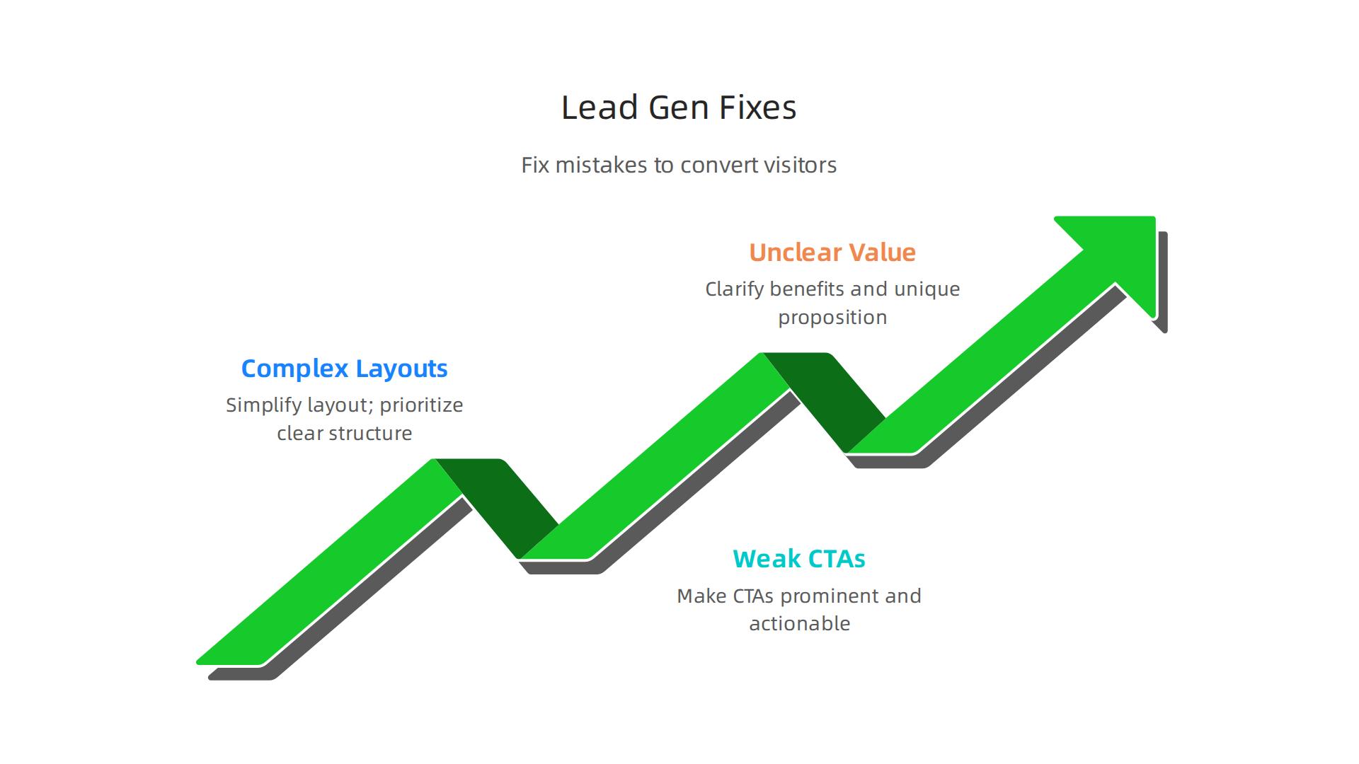
Three Common Mistakes to Fix Today
Overly complex layouts. Too many sections, too many images, too much text. Visitors get overwhelmed and leave. Simplify. Give each page one clear job.
Weak calls to action. Saying "Submit" or "Click Here" is not enough. Be specific. Tell people exactly what they get. "Get Your Free Quote" works much better.
No clear value proposition. A lead generation benchmark report from 2026 shows that 69% of small businesses say their website is a significant source of leads
(Source). But only if visitors understand what you offer in the first three seconds. If they have to hunt for it, they are gone.
The goal is to make your design elements work as a team. The headline grabs attention. The image shows the benefit. The button asks for the action. Everything flows together.
If you want to go deeper on this, check out this guide on how to make your small business website convert visitors to customers. It walks through the exact steps.
And if you are tired of guessing and want a team to handle every part of this for you, consider a done-for-you growth service that builds and manages your entire online presence. No chaos. Just a website that actually works.
Visual Hierarchy: Guiding the Visitor’s Eye to Action
Have you ever landed on a website and felt lost? You scroll up and down, not sure where to click or what the next step is.

That feeling is a sign that the design elements on that page are not working together. The visitor’s eye has no clear path to follow, so they just leave.
Here’s the thing. Your visitors do not read every word on your page. They scan. They look for the thing that matters most. Visual hierarchy is the art of using size, color, contrast, and spacing to tell visitors exactly where to look first, second, and third.
Think of it as a map. Big headlines grab attention. Bold buttons say "click here." White space around a button makes it stand out. Every element of design either pushes a visitor toward action or pulls them away.
The Patterns People Follow
Research shows that people scan screens in predictable patterns. For text-heavy pages, the F-pattern is common. Readers look at the top line, then scan down the left side. For simpler pages, the Z-pattern works. Eyes start at the top left, move diagonally to the top right, then drop to the bottom left and finish at the bottom right.
Knowing these patterns is gold for your design principles. Place your main call to action where the eye naturally ends. For a Z-pattern page, that is the bottom right corner. For an F-pattern page, it is somewhere along the left side after a strong headline.
The graphic design principles here are simple. Use contrast to make your CTA button pop. Use size to make your headline the loudest thing on the page. Use spacing to give important elements room to breathe. Research shows that the right design changes can increase conversion rates by up to 200% (Source). But that only happens when you intentionally guide the eye.
How to Check If Your Visual Hierarchy Works
You do not have to guess. Tools like heatmaps and scroll maps show you exactly where people look and click on your page. If visitors are not clicking your main button, your visual hierarchy might be off. Maybe the button is too small. Maybe it blends into the background. Maybe it is buried below the fold.
Test one change at a time. Make your button bigger. Change its color. Move it higher on the page. Then see what happens. Small tweaks can lead to big wins.
If your site still feels cluttered and no one is taking action, you might need a fresh start. A clear visual path is not optional in 2026. It is essential.
If you want to learn more about fixing a website that does not work, read this guide on why your business website is useless and how to fix it. It covers the biggest mistakes and how to correct them.
And if you are tired of guessing and want a team that builds a lead-generating site from the ground up, consider a done-for-you growth service that handles everything. No chaos. Just a clear path to more customers.
Trust Signals: The Design Elements That Build Credibility
You have a beautiful site. The layout guides the eye perfectly. But visitors still leave without buying. Why?
The answer is often simple. They do not trust you yet.
Trust is fragile online. People are cautious. One wrong vibe and they are gone. That is where design elements called trust signals come in. These are small visual cues that tell visitors, "This site is safe. Real people use it. You can click with confidence."
In 2026, trust signals are more important than ever. Data shows that customer reviews can boost revenue by 270%. Adding a security badge can lift checkout conversions by up to 42%. A money-back guarantee adds another 21% (Source). These are not small numbers. They are the difference between a browser and a buyer.
What Trust Signals Look Like
Some common trust signals include:
- Security badges (like SSL or "Verified by Visa")
- Customer testimonials with real names and photos
- Case studies showing real results
- Logos of well-known clients or partners
- Money-back guarantees
- Third-party reviews or ratings
Each one acts as a small vote of confidence. And here is the key: placement matters. Trust signals are most effective when they appear next to the conversion point, not buried in a footer or hidden on an about page (Source). Put a security badge right beside your checkout button. Show a testimonial next to your sign-up form. Place client logos near your lead capture area.
The same elements of design that guide the eye work here. Use contrast to make trust signals visible. Use spacing to let them breathe. If they blend into the background, they do no good.
The Danger of Bad Trust Signals
Here is a trap. Throwing too many badges on a page can backfire. If every square inch has a logo or a five-star rating, it looks fake. People notice. Authenticity wins. Use only badges and testimonials that are real, relevant, and current. A trust signal that feels staged destroys credibility faster than having none at all.
Start by auditing your high-stakes pages. That means your checkout page, your contact form, and your pricing page. Ask yourself: does a visitor feel safe taking the next step? If not, add one well-placed trust signal. Test it. See if conversions go up.
Trust is a graphic design principle you can build right into your layout. It does not require a huge budget. It just requires intention.
If you want to see a full breakdown of what makes a site convert, check out this guide on how to make your small business website convert visitors to customers. It covers the exact steps.
And if you are tired of guessing and want a team that builds trust right into your site, consider a done-for-you growth service that handles all the design, SEO, and ongoing optimization. No chaos. Just a clear path to more customers.
Mobile-First & Performance-Driven Design
You just built trust with your visitors. They see your security badges and testimonials. They feel safe. But then they try to fill out your contact form on their phone. The text is tiny. The button is hard to tap. The page takes five seconds to load.
They leave. Trust gone.
That is the reality in 2026. More than 60% of web traffic now comes from mobile devices. Mobile devices also accounted for over 51% of online spending in late 2025

(Source). If your site does not work perfectly on a phone, you are handing customers to your competitors.
Responsive Design Is Just the Start
Having a responsive layout used to be a bonus. Today it is the baseline. But responsive alone is not enough. The real differentiators are speed and touch-friendly design.
Think about it. When someone visits your site on mobile, they expect the page to load in under two seconds. They expect buttons that are big enough to tap without zooming. They expect text that is readable without pinching. If any of those things fail, they bounce.
Core Web Vitals Still Matter
Google continues to use Core Web Vitals as a ranking factor in 2026. These three metrics measure real user experience: Largest Contentful Paint (LCP) for loading speed, Interaction to Next Paint (INP) for responsiveness, and Cumulative Layout Shift (CLS) for visual stability (Source). If your site scores poorly, Google pushes it down in search results. Even worse, visitors get frustrated and leave.
So how do you improve these metrics? It starts with smart design elements. Compress your images before uploading. Use lazy loading so images only load when the user scrolls to them. Keep your code minimal by removing unnecessary CSS and JavaScript (Source). These small changes can cut load times in half.
Design Choices That Speed Up Your Site
Applying the basic elements of design principles here makes a big difference. Clean layouts with plenty of white space load faster. Simple navigation menus reduce clutter. Large touch targets improve the mobile experience. All of these graphic design principles also help your Core Web Vitals scores.
Here is a quick checklist for mobile performance:
- Use next-gen image formats like WebP
- Enable browser caching
- Minify your CSS and JavaScript files
- Limit the number of fonts and scripts
- Test your site on real mobile devices
Let Someone Else Handle the Heavy Lifting
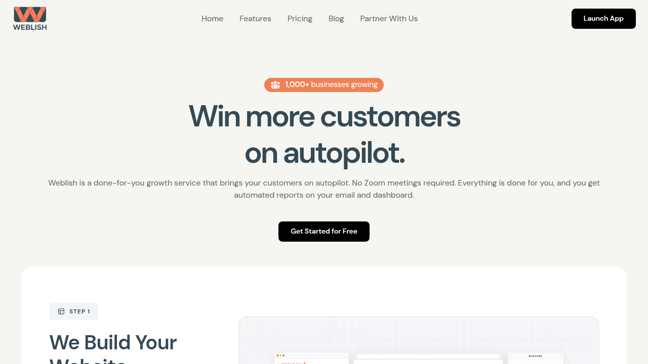
Fixing all these technical details takes time. You have a business to run. If you want a team that builds fast, mobile-friendly sites and keeps them optimized, consider a done-for-you growth service like Weblish. They handle web design, SEO, and performance tuning so you can focus on your customers.
For a deeper look at how to turn your site into a lead machine, check out this guide on how to make your small business website convert visitors to customers. It covers mobile optimization from start to finish.
The bottom line: mobile-first and performance-driven design are not optional in 2026. They are the foundation of every conversion that follows.
Typography and Content Layout for Readability and Engagement
You fixed your mobile speed and buttons. Great. But now visitors land on a page where the text is tiny, the paragraphs are giant blocks, and the important points are buried. They will scan for two seconds and bounce anyway.
Here is the thing: people do not read websites. They scan. They look for headings, bullet points, and short sentences that tell them what you offer. If your design elements make that hard, you lose them.
The Right Fonts Make Readers Stick Around
Your font choice affects how long someone stays and how much they remember. In 2026, body text should be at least 16 pixels. Line height should be around 1.5 times the font size. Lines should be 45 to 75 characters long (Source). That sounds technical, but it really just means: make your text easy on the eyes.
Good contrast is just as important. The Web Content Accessibility Guidelines (WCAG) require a minimum 4.5:1 contrast ratio for normal text (Source). Light gray text on a white background? That is a conversion killer. Dark text on a light background works best.
Layout Guides the Eye to What Matters
Applying basic elements of design to your page layout creates a clear visual path. Use clear headings to break up sections. Use bullet points to highlight key features. Add plenty of white space so the page feels clean, not crowded.
A clear visual path to your call to action can increase conversion rates by 20 to 30 percent (Source). That means your "Buy Now" or "Get a Quote" button should be easy to find, not hidden in a paragraph of text.
Accessibility Helps Everyone, Including Your Bottom Line
When you follow accessibility standards like WCAG, you make your site usable for people with visual impairments, low contrast sensitivity, or reading difficulties. But those same improvements also help every visitor read faster and understand your message better. Better understanding means more clicks and more sales.
Here is a quick checklist for typography and layout:
- Use 16px or larger for body text
- Set line height to 1.5 or more
- Keep line length between 45 and 75 characters
- Use high contrast between text and background
- Break up text with headings, bullet points, and short paragraphs
- Place your main call to action in a spot visitors see right away
Get Professional Help Without the Headache
Putting all these graphic design principles into practice takes time and skill. If you would rather focus on running your business, a done for you service like Weblish can build and optimize your site for readability and conversions. They handle everything from typography to layout to ongoing performance.
For a deeper look at how your whole website can drive sales, check out this guide on how to turn your small business website into a lead machine. It covers typography, layout, and much more.
The bottom line: good typography and layout are not just about looks. They affect how long people stay, how much they remember, and whether they click. In 2026, that is the difference between a visitor and a customer.
Form Design: Reducing Friction to Capture Leads
You got them reading with great typography and layout. They are ready to take the next step. But now they hit your form. This is the moment of truth. If your form creates friction, they leave without becoming a lead.

In 2026, mobile devices drive over 80 percent of landing page traffic (Source). That means your form must be thumb-friendly. Large tap targets, minimal typing, and simple dropdown menus are a must.
Keep It Short and Visual
Form length, field order, and visual design directly impact completion rates. Every field you add is a chance for someone to leave. Only ask for what you need. Name and email is often enough.
Use the same design elements from your page layout to guide the eye. Group related fields together. Use a single column layout instead of multiple columns. This follows the basic elements of design for creating a clear visual path. A clean form feels faster to fill out.
Micro-Interactions Reduce Anxiety
Small moments of feedback make a big difference. Inline validation checks an email format the moment a user types it. A progress bar on a multi-step form shows exactly how far they have come.
These design principles reduce frustration and abandonment. They make the user feel supported instead of confused. In 2026, this kind of real-time feedback is expected by most visitors.
Build Trust Right at the Finish Line
Trust signals are critical for form conversions. Place a privacy seal or a short line like "We respect your privacy" right next to your submit button. Security badges near checkout forms can increase conversion rates by 22 to 42 percent (Source).
But button text matters just as much. Do not write "Submit." Write "Get My Free Guide" or "Book My Consultation." This simple graphic design principle tells the user exactly what happens next. It replaces hesitation with clarity.
Get Professional Form Design Without the Headache
Putting all these graphic design principles into practice takes real skill. If you would rather focus on running your business, a done for you growth service like Weblish can build and optimize your entire site. They handle everything from form layout to ongoing conversion testing.
For a deeper look at turning your website into a complete sales tool, check out this guide on how to turn your small business website into a lead machine.
The bottom line: a well designed form is the final step in your conversion path. Make it frictionless, build trust, and watch your lead count grow.
Summary
This article explains how to turn a pretty but ineffective website into a lead-generating sales tool by treating every design element as a conversion step. It covers the core principle of conversion-centered design and walks through practical topics—visual hierarchy, trust signals, mobile-first performance, typography, and form design—showing how each affects visitor behavior and conversion rates. You’ll learn common mistakes to fix (complex layouts, weak CTAs, unclear value), how to guide the eye with size, contrast and spacing, and where to place trust markers to increase credibility. The piece also explains mobile and Core Web Vitals requirements, gives concrete rules of thumb for readable text and form fields, and recommends testing tactics like heatmaps and A/B tests. Overall, readers will get a compact, research-backed roadmap of design changes that increase leads and clear guidance on when to hire an expert or use a done-for-you service.