Unlock Lead Generation with Negative Space Graphic Design
Negative space graphic design teaches small and mid-sized businesses how to use the

For small and medium businesses (SMBs), getting noticed online in 2026 is harder than ever. Many businesses have websites or ads that feel busy or confusing. This often happens because they try to put too much information in one place. But there’s a simple idea in design that can help: negative space.
What is Negative Space Graphic Design?
Think of negative space as the empty areas around and between the main parts of your design. It’s the parts you don’t typically focus on right away. For example, if you look at a logo, the main shape is the "figure," and the empty area around it is the "ground" or negative space. This ground helps the main shape stand out clearly. It’s also known as the Principle of Figure-Ground, where your eyes naturally pick out a main object from its surroundings.
This "empty" space isn’t really empty. It’s a key part of good visual communication. It gives your eyes a place to rest and helps you understand what’s important. Good negative space graphic design makes a design feel clean and focused, improving readability.
Why It Matters for Your Business
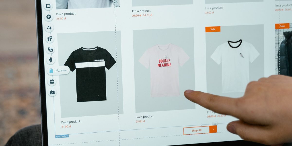
Many SMBs create websites that are like digital brochures. They cram in too much text, too many pictures, and too many buttons. This can overwhelm visitors. When a website is too crowded, people often get confused, don’t know where to look, and leave without doing anything important,
like signing up for your service or buying a product. This makes it hard to get new customers.
Using negative space can change this. When you use it well in your graphic design styles, it helps your important messages and calls to action stand out. Imagine a clean website with a clear headline and one big, easy-to-find button. The empty space around that button tells your brain, "This is important! Click here!" This makes your brand look professional and trustworthy. It also makes your website much easier to use, which is key for turning visitors into leads and actual customers.
By making your website simple and easy to understand with smart use of negative space, you guide visitors exactly where you want them to go. This boosts your chances of getting them to sign up, call, or buy. It turns your website from a "pretty brochure" into a powerful tool for lead generation. To learn more about improving your site’s visual impact, check out graphic design principles that turn your website into a lead generator.
Ready to see how a clearer, more focused website can bring in more business for you?
Grow Your Traffic on Autopilot
Core principles: figure–ground, balance, and minimalism
Now that we understand what negative space is and why it’s so important, let’s look at the basic ideas that help us use it well. These are figure–ground, balance, and minimalism.
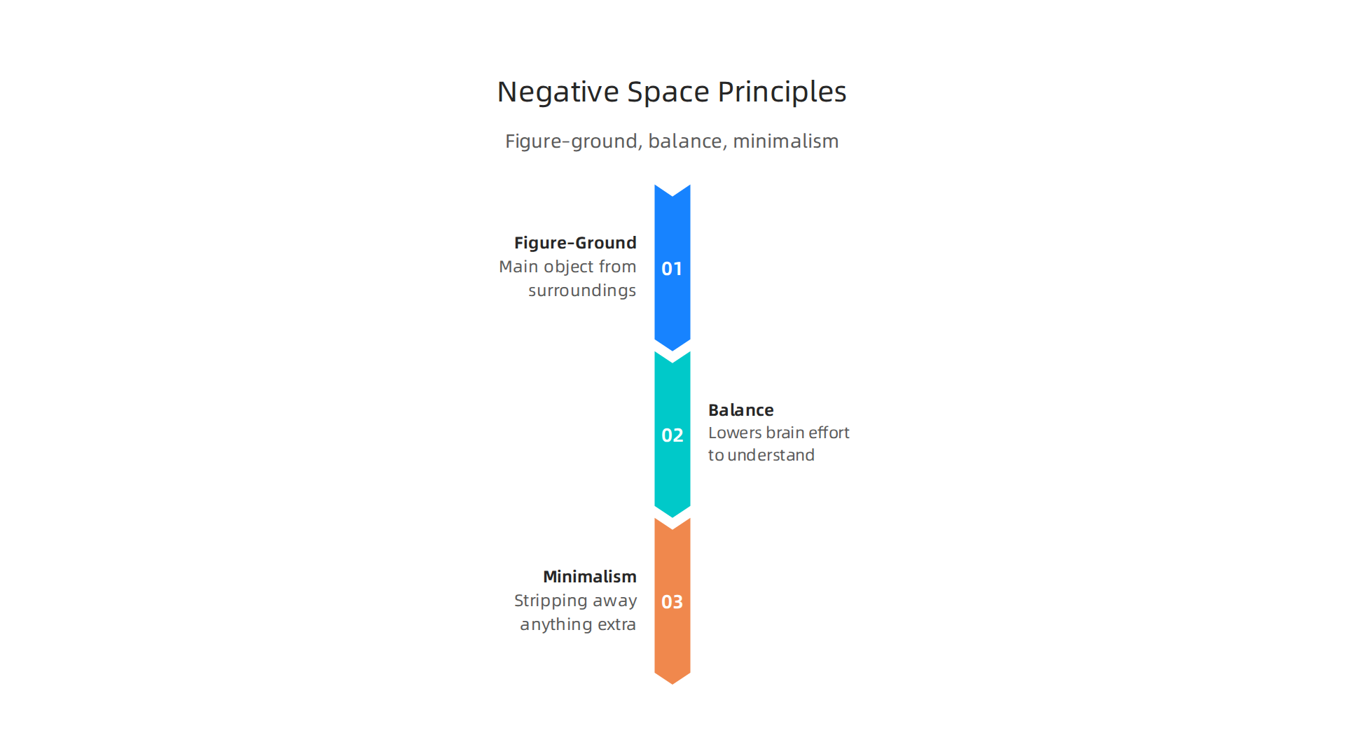
They are like secret tools that make any design, from a website to a logo, much clearer and more effective.
Figure–Ground Relationships
The idea of figure–ground is super simple: your eyes naturally pick out a main object (the "figure") from its surroundings (the "ground"). The figure is what you focus on, and the ground is the background. The interesting part is that the ground is often the negative space in your design Figure-Ground | Design Principles | Visual. These two parts work together; you can’t really see one without the other, and if you change one, the other also changes Design Principles: Space And The Figure-Ground ….
For your business, this means thinking about what you want people to see first. Is it your logo, a special offer, or a contact button? The negative space around that "figure" helps it pop out. Think of famous logos that use this trick: the empty space creates a hidden shape or message. A good graphic design background helps your main message stand out clearly. This is key for creating designs that people remember and understand quickly.
Balance and Reducing Mental Effort
Another core idea is balance. Good design doesn’t feel heavy on one side or too busy in one spot. Negative space helps create this visual balance. It gives your eyes a place to rest, like quiet areas in a room that make the whole space feel calm and organized. When a design has enough negative space, it lowers what we call "cognitive load." This just means your brain doesn’t have to work as hard to figure out what it’s seeing What is the Law of Figure-Ground? — updated 2026 | IxDF.
By using empty space smartly, you guide your visitors’ eyes to the most important information first. This helps them understand your message without getting overwhelmed. It makes your website or ad feel easy to use and professional. You are helping them move through your site with less effort, which makes them more likely to take action, like learning more about your services.
Minimalism and Message Clarity
Minimalism is a design approach that uses only what is absolutely necessary. It strips away anything extra to make the core message as clear as possible. And guess what? Negative space is a huge part of minimalist graphic design styles. When you have less clutter, the elements that are left become more powerful.
Imagine a simple, clean website. Just a powerful headline, a striking image, and plenty of empty space around them. This minimalist approach, fueled by negative space, makes your message incredibly clear and impactful. It’s like having a loud voice in a quiet room; everyone can hear you. Even in areas like streetwear graphic design, clear, simple designs often stand out because of how well they use negative space. This focus on clarity helps your brand look modern, trustworthy, and easy to understand.
Techniques: composition, grids, and whitespace management
Learning about how negative space works is great. Now, let’s get into the actual ways you can use it. These techniques will help you apply negative space graphic design ideas to make your creations truly shine. We’ll look at how to arrange things, use invisible lines to keep order, and manage all that empty space.
Smart Composition: Margins, Padding, and Text Flow
When you’re putting elements together in your design, a few simple tricks with spacing can make a big difference.
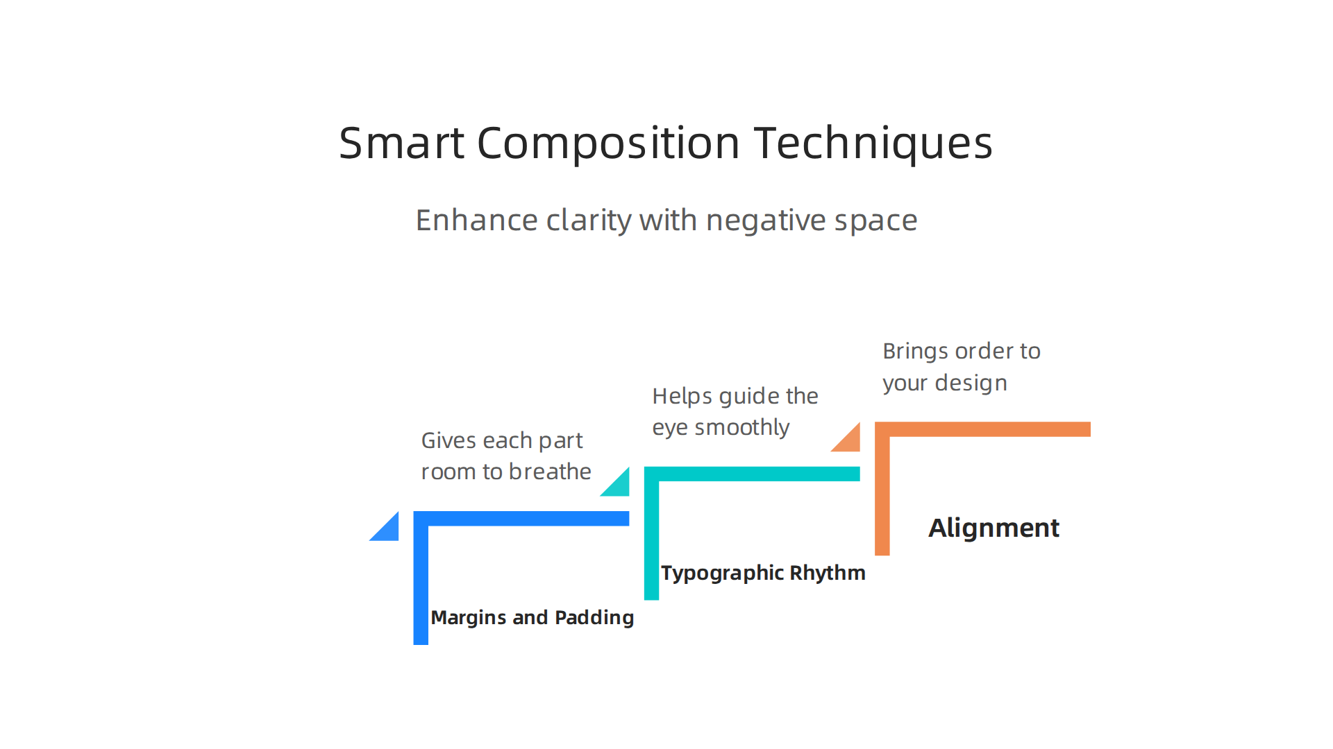
- Margins and Padding: Think of margins as the space outside an item, like the gap between a picture and the edge of a page. Padding is the space inside an item, like the cushion between text and the border of its box. Both create negative space. Using them wisely stops things from looking too crowded. If elements are too close, they fight for attention. Good margins and padding give each part room to breathe and stand out.
- Typographic Rhythm: This means making your text easy to read. It’s about how lines, paragraphs, and headlines are spaced. Just like music has a rhythm, text needs a visual flow. Plenty of negative space between lines and paragraphs helps guide the eye smoothly. This makes your message clearer and more inviting.
- Alignment: When you line things up, the empty space around them becomes organized. Whether you center text, line it up to the left, or to the right, consistent alignment creates invisible lines that bring order to your design. This makes the whole piece feel clean and professional. These ideas are part of broader graphic design principles that turn your website into a lead generator.
Grids and Responsive Spacing
For a truly polished look, especially for websites or apps, grids are your best friend. A grid is like an invisible framework of lines that helps you arrange all your design parts.
- Using Grids for Order: Grids help you place text, images, and other elements in an organized way. The empty spaces between the grid lines naturally create effective negative space. This ensures everything looks neat and balanced. Many designers follow what are spacing best practices using systems with base units, like 4px or 8px, to keep spacing consistent across all parts of a design. For example, some design systems suggest specific units, such as 4px for micro-spacing and 8px for basic padding and margins, scaling up for larger gaps Spacing – Carbon Design System.
- Responsive Spacing: In 2026, people view your designs on all kinds of screens: tiny phones, medium tablets, and big desktop computers. "Responsive spacing" means your negative space adjusts automatically to fit each screen size. A well-designed grid system makes sure that your important content still stands out, and your design still looks clean and uncluttered, no matter how big or small the screen is. This is important for a good user experience and for keeping your
negative space graphic designeffective.
Testing Your Spacing Decisions
How do you know if you’ve used negative space well? You test it!
- Quick Usability Checks: Show your design to a few people. Ask them: "What’s the first thing you see?" "Does anything feel hard to read or cluttered?" Their answers will tell you a lot about whether your negative space is doing its job.
- A/B Testing: For websites, you can try showing half your visitors one layout and the other half a slightly different one. For example, you might change the amount of negative space around a button. Then, you see which version works better, like which one gets more clicks. This helps you make smart choices based on real results.
By applying these techniques, you’ll go from just knowing about negative space to actively using it to create clear, impactful designs. If you want to make your website an even stronger tool for your business, consider how professional design can enhance your online presence. You might even want to hire a freelance graphic designer to transform your website into a lead generation machine.
Connect your website with Weblish and Grow Your Traffic on Autopilot with AI.
Now, let’s talk about how negative space graphic design makes logos special. In logos, negative space is super important. It can make a simple picture tell two stories at once.
Logos That Tell Two Stories
Think about famous logos. Many of them use the empty space around a shape to show something else. This makes the logo smart and easy to remember. It’s like a visual puzzle for your brain. When you figure out the hidden meaning, you feel good, and you remember the brand better. This smart trick helps logos stick in people’s minds, which is great for any business.
For example, the FedEx logo has a hidden arrow between the "E" and "x." Once you see it, you can’t unsee it. This arrow stands for speed and precision, which is exactly what FedEx wants you to think about them. Many successful logos use negative space to create a "double meaning," adding a deeper layer for viewers to think about 2026 Logo Design Trends: How AI-Resistant Minimalist …. This makes the logo more interesting and memorable.
This kind of clever design isn’t just for big companies. Small and mid-sized businesses (SMBs) can use these ideas too. A unique logo can help a new brand stand out from the crowd. It adds a special touch that makes customers feel a connection.
Things to Think About for Small Business Logos
Creating a logo with negative space needs some thought, especially for a small business.
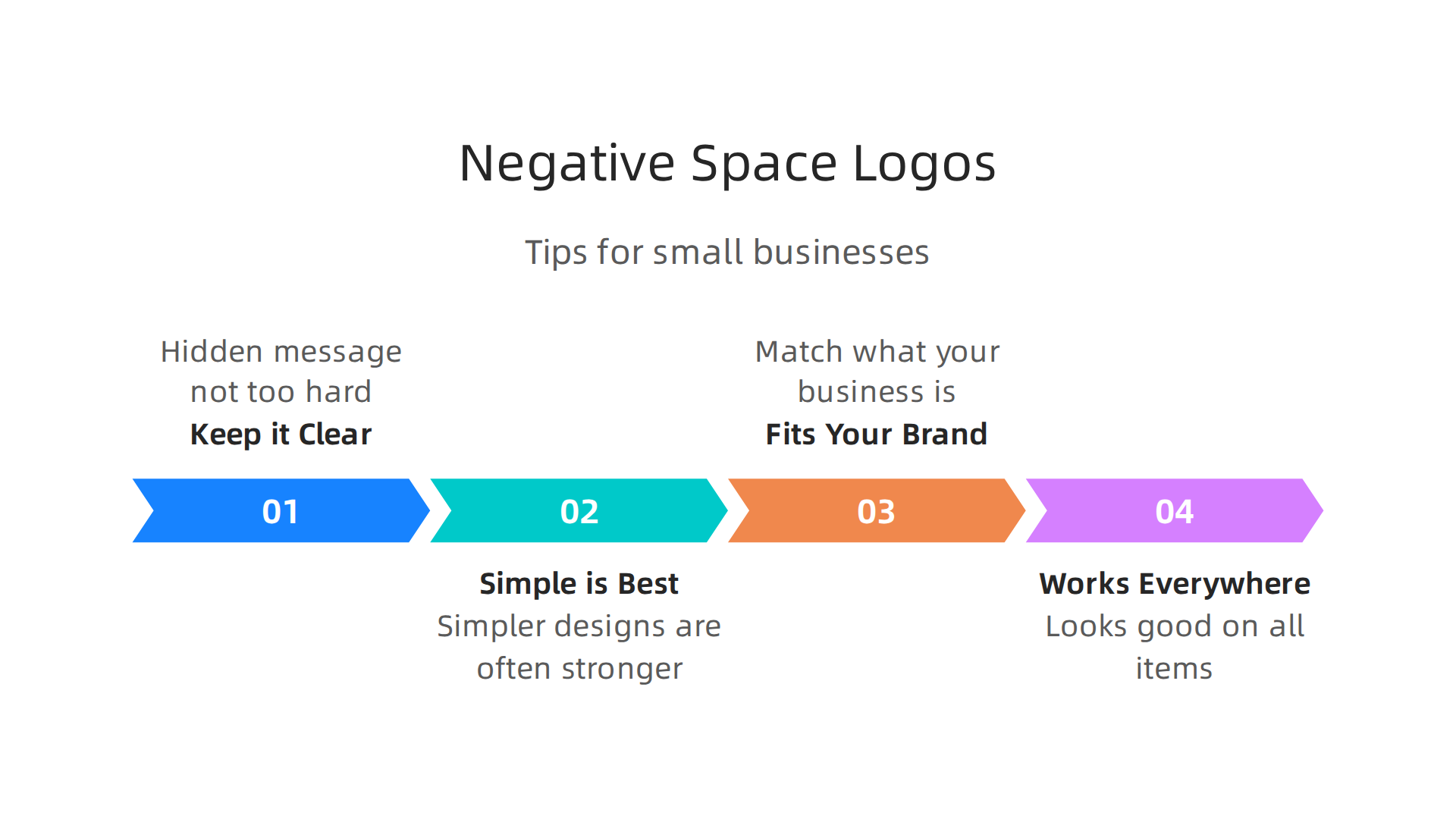
- Keep it Clear: The hidden message must not be too hard to find. If people can’t see it, it won’t work. The main design should still be clear and easy to understand even without noticing the hidden part right away.
- Simple is Best: For
graphic design backgroundand logos, simpler designs are often stronger. Too many details can make the negative space confusing. A clean, simple look helps the hidden element appear more easily. This is true whether you’re working on modernstreetwear graphic designor a professional service company’s brand. - Fits Your Brand: The hidden meaning should match what your business is all about. If you sell plants, maybe the negative space can form a leaf or a sprout. The logo should always feel right for your business’s
graphic design styles. - Works Everywhere: Your logo needs to look good on everything: your website, business cards, signs, and even small items. Negative space designs often work well at different sizes without losing their magic. Designers should always test the logo’s look on various items to make sure it is versatile Negative Space in Logo Design: A Quick Course for 2026.
Using negative space in your logo can give your brand an edge. It shows creativity and makes your business more memorable. It’s a powerful tool in the world of graphic design. To learn more about how design impacts your business, you can explore the broader topic of the graphic design definition you need to understand for business growth.
Negative space isn’t just one type of trick. It can look very different depending on the graphic design styles used. Let’s look at how this clever design idea changes across a few popular styles: minimal, geometric, illustrative, and brutalist. Each style uses empty space in its own special way to make a point or hide a message.
Minimalist Negative Space
Minimalist design is all about keeping things super simple. For negative space graphic design, this means clean lines and very few extra details. The negative space itself often forms the hidden shape clearly, without much decoration. Think about a business that wants to look sleek, modern, and professional. Their logo might use minimalist negative space to show strength and elegance. It’s great for law firms, high-tech companies, or even luxury brands that want a sophisticated graphic design background. This style aims for a powerful impact with as little as possible, making the empty space work hard to tell a story THE MINIMALIST APPROACH IN LOGO DESIGN.
Geometric Negative Space
Geometric designs use shapes like squares, circles, and triangles. When negative space is used in a geometric way, it often creates another clear, sharp shape. This style feels very organized and modern. It’s a good choice for businesses in areas like architecture, engineering, or anything that needs to show precision and structure. The hidden elements in these logos are often just as sharp and clean as the main design.
Illustrative Negative Space
Illustrative design is more artistic and often tells a story or shows a picture. With this style, the negative space can be used to create detailed hidden images. It might be a small animal, a plant, or even a person’s face. This style is perfect for creative businesses like art studios, bakeries, or perhaps even streetwear graphic design brands that want their logos to be unique and expressive. It lets you add more personality and charm to your brand’s look.
Brutalist Negative Space
Brutalist design is quite bold and raw. It often uses strong, blocky shapes and less-than-perfect looks. When negative space is part of brutalist design, it might not be as hidden or polished. Instead, it might be used to create a stark contrast or an edgy, almost unfinished look. This style is often picked by brands that want to seem rebellious, artistic, or very forward-thinking. Think of music labels, alternative fashion, or even some modern tech startups.
Choosing the right graphic design styles for your business depends on who you want to reach and what you want to say. A strong negative space design, no matter the style, helps your business stand out and be remembered. To explore more about how different designs can boost your business, consider learning about 6 types of graphic design to boost your career and business.
No matter which style you choose, using negative space wisely can turn your logo into a memorable piece of art. It makes your brand smarter and more engaging.
Ready to make your website just as smart and engaging as your new logo?
Connect your website with Weblish and Grow Your Traffic on Autopilot with AI.
Negative space is not just a trick for logos. It’s super important for how websites look and work too. When we talk about negative space graphic design on a website, it means the empty areas around text, images, and buttons. This empty space helps everyone, including people with disabilities, use your website easily.

It also helps search engines understand your site better.
Think about buttons or links you tap on a phone. If they are too close together, it’s hard to tap the right one. This is where negative space helps. Good design uses enough empty space around "touch targets" to make them easy to click. Guidelines like WCAG (Web Content Accessibility Guidelines) say that interactive elements should be at least 24 by 24 pixels in size, or have enough space around them to make sure they’re easy to tap without mistakes. This is a key part of making websites accessible and is explained further in the WCAG 2.5.8 Target Size (Minimum) implementation guide. Also, empty space helps with how readable your text is. Long lines of text without enough space can be tiring to read. A good graphic design background uses proper line spacing and paragraph breaks, making content easy to scan. For good readability, the Typography Accessibility guidelines recommend line spacing to be at least 1.5 times the font size.
A website with lots of negative space looks clean and organized. This means visitors can find what they’re looking for faster. For search engines, a clear layout means they can "read" your site’s structure better. This helps them understand what your content is about and rank it higher for relevant searches, which impacts content discoverability. Websites that are easy to use and navigate often have better "time on site" and lower "bounce rates." These are good signals for SEO. A well-designed site, no matter the graphic design styles used, makes sure your message gets across. It helps your website perform better and convert more visitors into customers. To learn more about how design can help your site attract leads, check out this guide on graphic design principles that turn your website into a lead generator. In 2026, a website needs to be both pretty and smart. It needs to look good and work well for everyone.
In 2026, having a website that looks good and works well for everyone is a must. But what if you don’t have a big design team or a lot of money to spend? Small and mid-sized businesses (SMBs) can still make great websites using smart tools and ready-made templates. These resources help manage important design parts like negative space graphic design without needing a special graphic design background.
Tools, templates, and rapid prototypes for SMBs
Today, there are many easy-to-use tools that let anyone create good website designs. Programs like Canva help you design and create prototypes with ease for your website. They have many ready-made options. Other tools are also very helpful for making quick drafts of your website, called prototypes. For example, in 2026, Figma and Sketch are top choices for best prototyping for small businesses. These tools make it simple to plan how your website will look and feel, even if you are not a professional designer. You can drag and drop parts, making sure there is enough empty space around your text and buttons. This helps with good negative space graphic design.
Beyond just tools, you can also use design templates and starter kits. Think of these as pre-built blocks for your website. They already have good layouts and spaces, so you don’t have to start from scratch. Projects like kickstartDS offer open-source starter kits. These kits come with many parts you can use to build your website quickly. Using templates helps you save time and money. They make sure your website follows good graphic design styles right from the start. This means your website will look clean, easy to read, and work well for all your visitors. It’s a smart way to get a professional look without the high costs of hiring a big agency.
Building a lead-generating website is crucial for SMBs. Tools and templates make this easier. You can create a website that not only looks great but also helps bring in more customers. To learn more about how to make a site that works hard for your business, check out our guide on how to build a lead generating website with this web development tutorial. These options are perfect for small businesses looking to grow online without breaking the bank.
If you’re ready to make your website work harder for your business, it’s time to act.
Grow Your Traffic on Autopilot
Measuring impact: KPIs, testing, and iterative improvements
Building a great website is just the first step. To make sure your site truly helps your business grow, you need to know if it’s working well. This means looking at certain numbers and making small changes over time. Good negative space graphic design isn’t just about looking good; it also helps these numbers improve.
How Layout Choices Affect Key Numbers
When we talk about measuring how well your website works, we look at things called Key Performance Indicators, or KPIs.
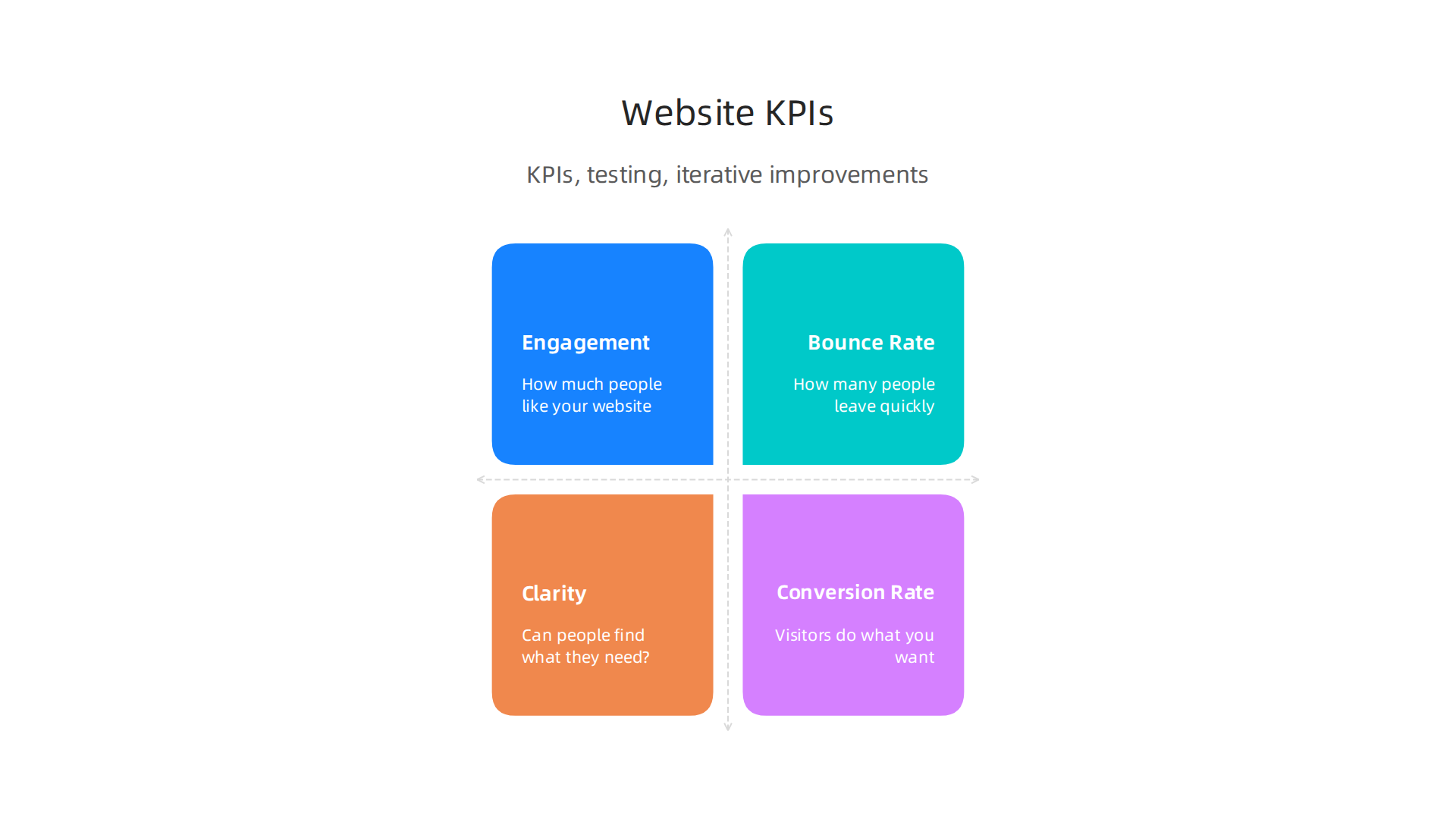
These are like a report card for your website. Here are some important ones that are tied to how you use space on your pages:
- Engagement: This tells you how much people like your website. Do they stay a long time? Do they look at many pages? When your website uses
negative space graphic designwell, it’s easier to read and explore. People stay longer and visit more pages because the site feels calm and inviting, not messy. To truly know if your site redesign worked, you can look at average session duration and pages per session, aiming for good benchmarks like 2-3 minutes for content sites and 2.5+ pages per session generally How to Actually Know if Your Website Redesign Worked. - Bounce Rate: This number shows how many people leave your website very quickly after seeing only one page. A high bounce rate means people aren’t finding what they need or the page is hard to understand. Too little negative space can make a page look crowded and confusing, which makes people want to leave. Good design with enough space helps reduce this.
- Clarity: Is your message clear? Can people find what they are looking for easily? Proper spacing makes text readable and buttons easy to spot. This helps people understand your products or services without extra effort. Also, good spacing helps with web accessibility. For example, text lines should have enough space between them to be easy to read for everyone Typography Accessibility. Buttons and links should also have enough space around them so they are easy to tap or click, especially on phones. Current guidelines suggest interactive items should be at least 24 by 24 pixels or have enough space around them WCAG 2.5.8 Target Size (Minimum).
- Conversion Rate: This is super important for small businesses. It tells you how many visitors actually do what you want them to do, like fill out a form, call you, or buy something. A clean, clear layout with good
graphic design stylesguides people to these actions. When the "buy now" button has enough negative space around it, it stands out more, leading to more sales. You can learn more about turning visitors into leads by checking out advice on small business website conversion 8 ways to turn visitors into leads.
Simple Tests for Better Design
Even if you don’t have a graphic design background, you can still test your website to make it better. One easy way is called A/B testing. This means you create two slightly different versions of a page. Half your visitors see version A, and the other half see version B. Then you look at your KPIs to see which version works better.
Here are some simple tests you can run for negative space graphic design:
- Button Spacing: Try putting more empty space around your main buttons (like "Contact Us" or "Add to Cart"). See if more people click them.
- Text Layout: Play with the space between lines of text or between paragraphs. Is it easier to read with more space?
- Image Placement: Try adding more space around important pictures. Do they grab more attention?
- Call-to-Action Blocks: Create different versions of how your "sign up" or "learn more" sections look, changing the amount of empty space around the text and buttons.
By doing these small tests and checking your KPIs, you can keep making your website better and better.
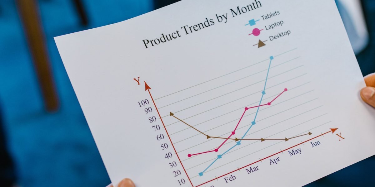
This process of testing and improving is how your website truly becomes a tool that brings in more customers. To dive deeper into what makes designs work, explore graphic design principles that turn your website into a lead generator.
Summary
Negative space graphic design teaches small and mid-sized businesses how to use the