
Small Business Website Conversion 8 Ways to Turn Visitors into Leads
Many small business websites look nice but fail to convert visitors into leads or sales, often because they act like brochures rather than sales engines. This a…

Imagine this. You put time, money, and energy into your website. It looks clean. The logo is sharp. The colors match your brand. But here is the hard truth: your website might be losing you customers instead of winning them.
Most small business websites act like pretty brochures. They sit there looking nice. They do not actually bring in leads or sales. And the clock is ticking. Visitors decide within seconds whether to stay or hit the back button. If your site does not grab them fast, they are gone for good.
The numbers back this up. The median website conversion rate in 2026 is just 2.35%. That means about 97 out of every 100 visitors leave without taking any action. Meanwhile, the top 10% of websites convert at over 11% according to the latest 2026 conversion rate benchmarks by industry. That is nearly a 5x gap. The difference often comes down to design and strategy, not budget.
Even a tiny improvement in your conversion rate can double your lead flow. That is why studying the best business website examples matters so much. You need to see what works and apply those lessons to your own site.
Your website should be a lead generation machine, not an online brochure.

If it is not pulling its weight, there is a fix. We have a full guide on why your business website is useless and how to fix it to help you get started.
And if you want a professional team to handle the heavy lifting, you can connect your website with Weblish and grow your traffic on autopilot with AI. No more guesswork. Just results.
1. Craft a Compelling Value Proposition Above the Fold
Here is a simple truth. Your visitors make a decision in about 3 to 5 seconds. They look at your headline and decide if your site is worth their time. If they do not get a clear answer to "What is in this for me?" they leave.
That is why the top of your webpage matters so much. This area, called "above the fold," is prime real estate. It is the first thing people see before they scroll. And what they see must immediately tell them who you help and what you help them achieve.
This is your value proposition. It is a short, bold statement that explains the main benefit of working with you. Think of it as a handshake. It says, "We solve your problem, and here is how."
Take a professional services firm as an example. Their old homepage had a generic banner that said, "We provide business solutions." Few people clicked. Then they rewrote the headline to focus on the customer’s outcome: "We help accounting firms close 40% more leads in 90 days." Demo requests jumped by 40%. The change was not magic. It was clarity.
The best business website examples all share one thing. They lead with a clear and specific promise. They avoid vague words like "innovative" or "best-in-class." Instead, they say exactly what the visitor gets.
For instance, well-crafted value propositions directly boost conversion rates, lower bounce rates, and keep customers coming back.
To create your own, follow these three rules:
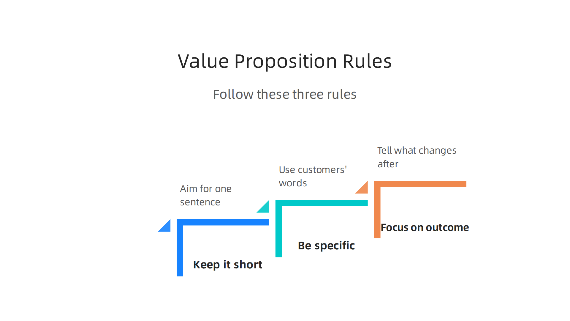
- Keep it short. Aim for one sentence, maybe two. No paragraphs.
- Be specific to your audience. Use the same words your customers use. If they say "I need more qualified leads," say that.
- Focus on the outcome. Tell them what changes after they work with you. Faster results? Lower costs? More revenue?
Once you have a draft, test it. Run two versions of your headline and see which one gets more clicks or form fills. Small tweaks often lead to big wins.
If you are unsure where to start, look at how other small businesses structure their homepage. A good resource is comparing landing pages vs homepages. It helps you see where your value proposition should live and how to make it stand out.
Remember, your headline is your first impression. Make it count.
2. Build Trust with Strategic Social Proof
Your value proposition grabbed their attention. Now they need proof that you can deliver. Visitors are skeptical by nature. They have seen too many empty promises online.
Social proof fixes that. It shows real people who trusted you and got results. The best business website examples use social proof to turn doubt into confidence.
Take a SaaS company as a simple example. They placed a row of client logos right below their headline. Next to the logos, they added a testimonial carousel with short quotes from happy customers. This setup told visitors, "Big names trust us. Other users love us." Their conversion rate went up because the proof was impossible to miss.
You have many options for social proof on your site. Here are the most effective types:
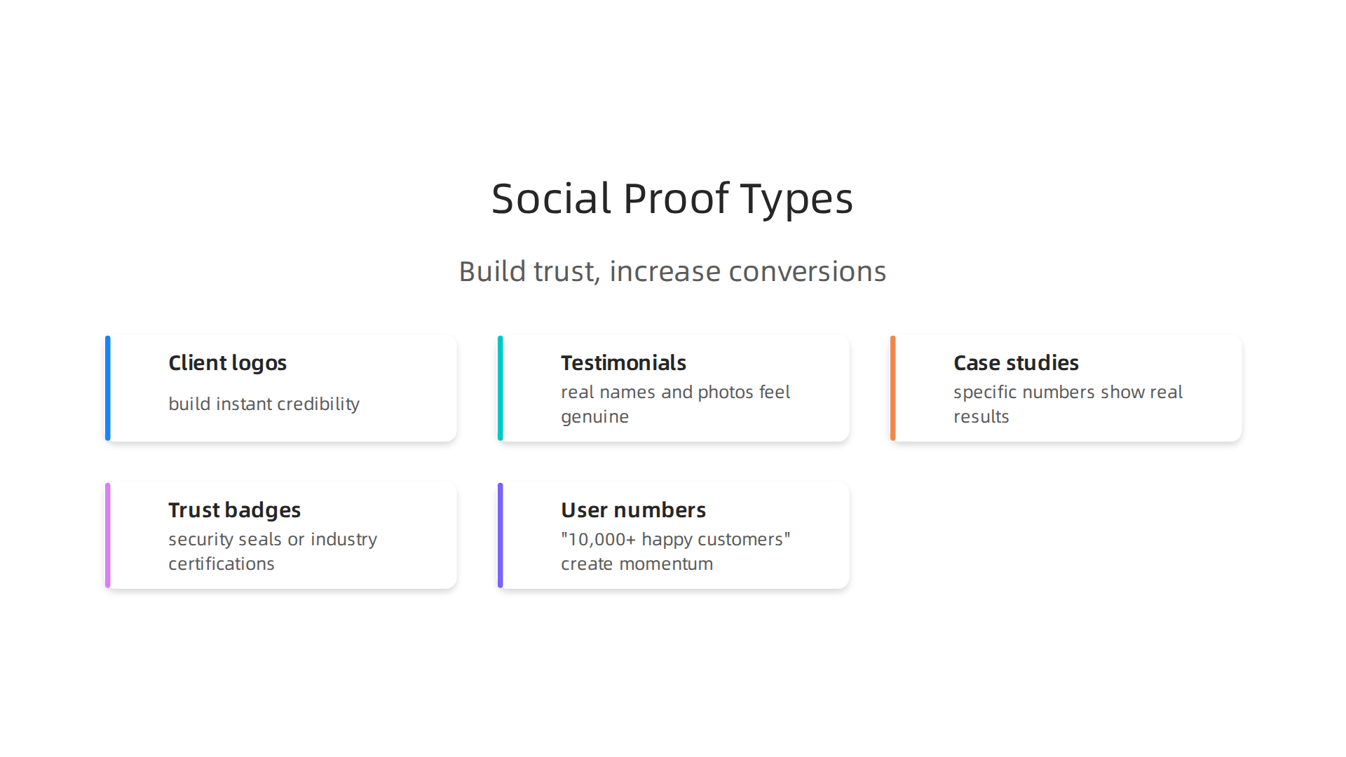
- Client logos from well known companies build instant credibility
- Testimonials with real names and photos feel genuine
- Case studies with specific numbers show real results
- Trust badges like security seals or industry certifications remove fear
- User numbers such as "10,000+ happy customers" create momentum
The trick is placing these elements where they matter most. Don’t hide all your testimonials on a separate page. Put authentic quotes right next to your call to action buttons and pricing tables. That is the moment when visitors hesitate. A short line like "This saved us 20 hours per week" can push them to click.
One of the best ways to see this done well is by looking at some of the top B2B homepage examples in 2026. They show how to position client logos near your value proposition and use specific results to support conversion points.
If your website currently has no social proof or just a single testimonial buried in the footer, start there. Add a few authentic quotes near your main CTA and see what happens.
Want to turn your whole site into a conversion machine? Connect your website with Weblish and grow your traffic on autopilot with AI.
3. Design Calls-to-Action That Get Clicks
Social proof builds trust. Now you need to ask for the sale. A call-to-action (CTA) is the button or link that tells visitors what to do next. If your CTA is weak, even the best website design examples will fail to convert.
Here is a real example. A consulting firm changed their button text from "Submit" to "Book a Free Strategy Call." That small switch doubled their form submissions. Why? Because "Submit" feels like work. "Book a Free Strategy Call" feels like a reward. The visitor sees a clear benefit.
Your CTAs should use action-oriented, benefit-driven language.

Tell people exactly what they get. Instead of "Get Started," say "Start Your Free Trial Today." Instead of "Learn More," say "See How We Doubled Sales." Be specific. Be helpful.
Place CTAs both above and below the fold. Some visitors are ready to act immediately. Others need to scroll and read first. Put a clear button near the top of the page and another one near the bottom. This catches people at different decision points.
Also test contrasting colors. Your CTA button should stand out from the rest of the page. If your site uses blue tones, try an orange or green button. Small color changes can lift conversion rates noticeably.
According to the 2026 CRO playbook from Directive Consulting, the median conversion rate for landing pages across all industries is 6.6%.
Top performers hit over 11%. The gap comes from tiny optimizations like button text, placement, and color.
Want to see how these tactics work together? Check out the SP5DER website framework that turns visitors into leads for small businesses. It shows a full system for designing CTAs that actually get clicks.
Once your CTAs are dialed in, the next step is making sure the right people see them. Connect your website with Weblish and grow your traffic on autopilot with AI.
4. Optimize for Search to Attract Passive Buyers
Not every visitor lands on your site ready to buy. Most people search Google first. They look for answers, not sales. These are passive buyers. If your website shows up when they search, you can turn their curiosity into a lead.
Here is a real example. A home services company started a blog targeting local long-tail keywords. Instead of writing "plumber," they wrote "how to fix a leaking pipe in [city name]." Their organic leads jumped 300% in six months. That is the power of search optimization.
The numbers back this up. According to recent research on the long-tail keyword strategy benefits, targeting specific industry keywords leads to much better organic traffic growth than broad terms. Passive buyers type these specific questions into Google. If your content answers them, they find you.
Good business website examples always include solid SEO basics. That means every page needs a clear title tag, a short meta description, and proper header tags (H1, H2, H3).
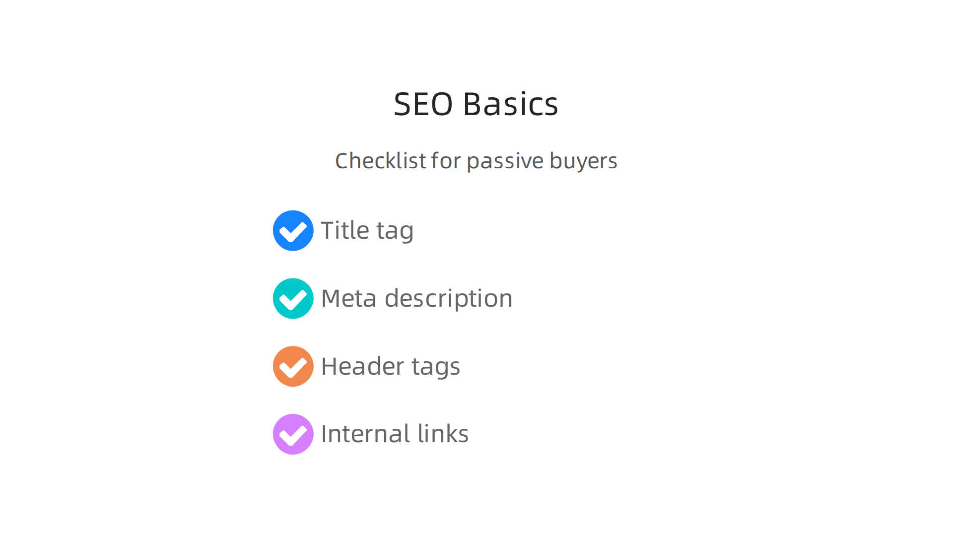
These help Google understand your page. They also help readers skim your content.
Internal links matter too. When you link from one page to another on your site, you help visitors find more helpful information. You also tell Google which pages are most important. Check out these SEO content optimization strategies for small businesses to see a full breakdown of what works.
Publishing helpful content is the real engine. Write blog posts that answer your customer’s top questions. Create guides that solve their problems. The more useful your content, the more Google rewards you with higher rankings.
When you combine thoughtful content with solid on-page SEO, your website becomes a magnet for passive buyers. They come for the answer. They stay for the solution. And some of them become customers.
Ready to put this into action? Connect your website with Weblish and grow your traffic on autopilot with AI.
5. Ensure a Mobile-Responsive, Fast-Loading Experience
Here’s a stat that might surprise you. An e-commerce site optimized its images and cut load time from 4 seconds down to 1.5 seconds. The result? Mobile conversions jumped by 33%.
That is the difference between a slow site and a fast one. And in 2026, speed is not optional. Google now uses Core Web Vitals as official ranking signals. If your site loads slowly on a phone, you lose both visitors and search rankings.
So what makes a good business website example in 2026? Mobile responsiveness. Your site must look great and function smoothly on any screen size. Most of your traffic likely comes from phones already.

Here are the basics to get right.
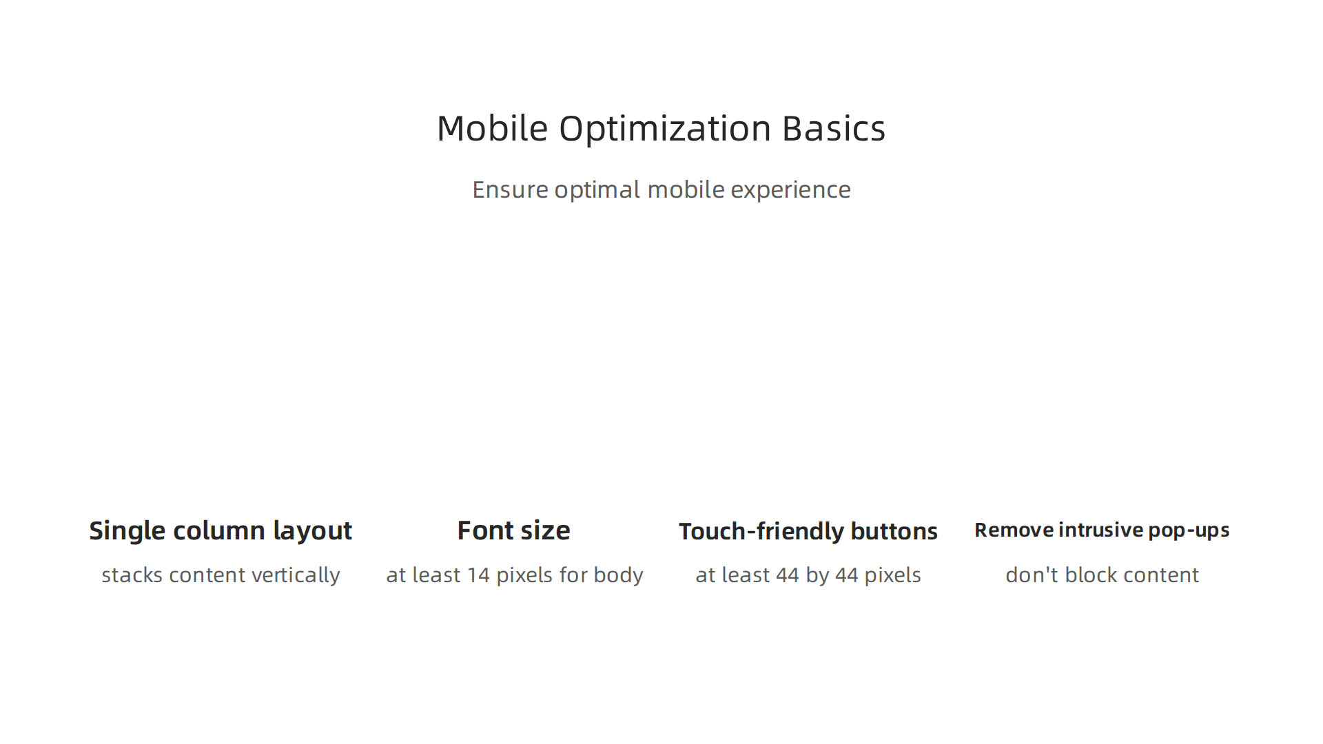
First, use a single column layout that stacks content vertically. Multi-column designs get too small on mobile screens. Second, make sure your font size is at least 14 pixels for body text. Tiny text forces users to pinch and zoom, which frustrates them fast.
Third, design touch-friendly buttons. Every clickable element should be at least 44 by 44 pixels. That prevents those annoying "fat finger" errors where someone taps the wrong link because everything is too close together.
Fourth, remove intrusive pop-ups. Nothing kills a mobile experience faster than a pop-up that covers the whole screen. Replace them with inline banners or subtle slide-ins that don’t block content.
These simple changes align with current mobile optimization best practices for B2B websites that help maintain user trust and keep people browsing.
Finally, test everything on real devices. Do not just resize your browser window. Pick up an actual phone and navigate your site. Use Google’s PageSpeed Insights tool to check your load times. Fix what is slow.
When you get mobile right, your entire customer experience improves. Visitors stay longer. They explore more pages. And more of them convert into leads.
To see how a well-designed mobile experience fits into your full marketing engine, check out this guide on how to make your small business website convert visitors to customers. It walks through the exact design and content choices that turn casual browsers into buyers.
Speed and mobile design are not extras anymore. They are the foundation of every successful business website. Get them right, and everything else gets easier.
6. Capture Leads with Effective Forms and Offers
Your website loads fast on mobile. People are browsing your pages. But if they do not fill out a form, none of that matters.
Here is a real example that shows why form design is so important. A marketing agency tested its contact form. The original had 7 fields. The team cut it down to just 3 fields. The result? Form completion rates jumped 60%.
That is the power of asking for less information.
Visitors are cautious. They do not want to hand over their phone number, job title, company size, and a paragraph about their needs before they even know if you can help. The best business website examples treat forms like a conversation starter, not an interrogation.
So what should you ask for? Name and email. That is almost always enough to begin a conversation. If you need more detail later, ask after they trust you.
But a form alone is not enough. You need a reason for someone to fill it out. That is where offers come in.
Offer something valuable in exchange for their contact info. This is called gated content. Good options include an eBook that solves a specific problem, a checklist they can use right away, a free assessment of their current setup, or a tool that gives personalized results. When the offer is genuinely helpful, visitors are happy to trade their email for it.
Now, how do you get people to see these offers? Use pop-ups or slide-ins, but be careful. Nothing annoys visitors more than a pop-up that blocks the page the second they arrive. Use exit-intent pop-ups that appear only when someone is about to leave. Or use a slide-in that appears after they have scrolled halfway down a page. These feel helpful, not pushy.
The top performing websites in 2026 convert at about 11.45 percent, while the median sits at 2.35 percent. That gap comes down to details like these, according to the latest conversion rate benchmarks and industry data from Digital Applied.
For more on how different page types work together to capture conversions, check out this comparison of landing page vs homepage roles.
If you are ready to automate your traffic growth and turn more visitors into leads, Grow Your Traffic on Autopilot by connecting your website with Weblish.
7. Showcase Results Through Case Studies and Data
Once someone fills out your form, the next step is to prove your value. They need to see that you can deliver real results. The best way to do that? Case studies.
Here is a real example that shows why this matters. A digital agency built a dedicated case studies page on its website. That single page ended up driving 20% of the agency’s total revenue. Visitors landed on the page, read how the agency solved a problem for a client, and then picked up the phone.
That is the power of showing your work.
The most effective case studies follow a simple structure: problem, solution, results.
Start with the client’s challenge. What were they struggling with? Then explain what you did to fix it. Finally, share the numbers. Did revenue go up? Did traffic increase? Did costs go down? Be specific.
For example, instead of saying “we helped the client grow,” say “we helped the client increase organic traffic by 150% in six months, which led to 40 more qualified leads per month.”
Real numbers build real trust. According to the B2B website best practices guide from Grafit, case studies are your most persuasive content asset because buyers trust other buyers more than they trust your marketing copy.
Client quotes add even more weight. A short testimonial from a real person saying something like “We saw a 3x return on our investment within the first quarter” is worth more than any paragraph you write yourself.
Do not hide your case studies either. Place them on key pages where decisions happen. Add a link to a relevant case study next to your service descriptions. Use screenshots and simple graphs to make the data easy to scan. Visual proof sticks in the mind better than text alone.
Many of the best business website examples in 2026 feature a dedicated case studies section in the main navigation. They treat these stories as a core part of the sales process. If you want to see how other small businesses use real results to win clients, check out these real marketing examples for small businesses.
Showing your past wins is one of the fastest ways to earn trust and close deals. So gather your best client stories, put them on your site, and let the numbers speak for themselves.
8. Use Clear Navigation and Visual Hierarchy
Have you ever landed on a website and felt completely lost? You click one link, then another, and suddenly you are five pages deep with no idea how you got there. That feeling kills trust fast. And it makes visitors leave.
Great small business website examples do the opposite. They guide you like a friendly tour guide. Every click feels obvious. You always know where you are and where to go next.
Here is a real example that shows why this matters. A law firm redesigned its navigation menu. It cut the number of menu items from 15 down to just 5: Services, About, Contact, Resources, and Blog. That simple change reduced the bounce rate by 18%. More visitors stayed. They explored. They converted. You can find similar insights in the latest B2B website design best practices for 2026.
The lesson is simple. Less clutter means more clarity. Your primary pages should be accessible within one click. Do not bury your Services page behind a dropdown inside another dropdown. Put it front and center.
Visual hierarchy is just as important as navigation. Guide the eye using size, color, and whitespace. Make your main headline the biggest thing on the page. Use a contrasting color for your call-to-action button. Leave plenty of breathing room around key elements.
Think about the last good website design examples you saw. They probably used whitespace generously. They made sure the most important content stood out immediately. Your visitors should never have to hunt for what they need.
If you want to see more business website examples that get this right, check out these real marketing examples for small businesses that use smart navigation and strong visual hierarchy to generate leads.
Now, here is the thing. You can have the best navigation in the world, but if your site loads slow or your content is weak, visitors still leave. Clear navigation is just one piece of the puzzle. Once you have it sorted, you need to keep the momentum going.
Ready to take the next step? Grow Your Traffic on Autopilot by connecting your website with Weblish and letting AI handle the heavy lifting.
Summary
Many small business websites look nice but fail to convert visitors into leads or sales, often because they act like brochures rather than sales engines. This article explains why conversion rates matter, cites 2026 benchmarks, and walks through practical fixes: crafting a concise, outcome-focused value proposition above the fold; using social proof and case studies to build trust; writing benefit-driven CTAs; optimizing for search to capture passive buyers; ensuring mobile responsiveness and fast load times; and simplifying forms and navigation to boost form completions. It shows real examples and simple rules of thumb—like reducing form fields or testing button text—that produce measurable lifts. The guide also points to frameworks and tests you can run, and highlights how aligning design, content, and technical performance turns a pretty site into a reliable lead generator.